
Recommended
More Related Content
What's hot
What's hot (18)
Viewers also liked
Viewers also liked (14)
Similar to Helping hand presenation
Similar to Helping hand presenation (20)
Recently uploaded
Recently uploaded (20)
Helping hand presenation
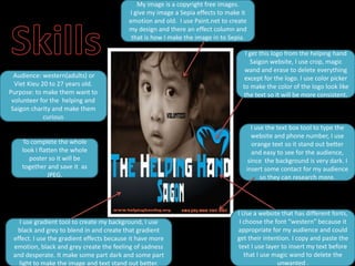
- 1. My image is a copyright free images. I give my image a Sepia effects to make it emotion and old. I use Paint.net to create my design and there an effect column and that is how I make the image in to Sepia. I get this logo from the helping hand Saigon website, I use crop, magic wand and erase to delete everything Audience: western(adults) or except for the logo. I use color picker Viet Kieu 20 to 27 years old. to make the color of the logo look like Purpose: to make them want to the text so it will be more consistent. volunteer for the helping and Saigon charity and make them curious I use the text box tool to type the website and phone number, I use To complete the whole orange text so it stand out better look I flatten the whole and easy to see for the audience, poster so it will be since the background is very dark. I together and save it as insert some contact for my audience JPEG. so they can research more. I Use a website that has different fonts, I use gradient tool to create my background, I use I choose the font “western” because it black and grey to blend in and create that gradient appropriate for my audience and could effect. I use the gradient effects because it have more get their intention. I copy and paste the emotion, black and grey create the feeling of sadness text I use layer to insert my text before and desperate. It make some part dark and some part that I use magic wand to delete the light to make the image and text stand out better. unwanted .
- 2. Simple is Nice: I try making my poster as simple as I can, I didn’t make it very complex. I only put an image, title & logo, contact and that all I put into my poster because I can make my audience curious. Fantastic fonts: I use Get Attention: I use a image of a 1001freefonts.com to choose my Vietnamese child, I get it because fonts, I choose “western” font she look sad and desperate for because my audience is help, with a puppy eye it make the foreigner so it will be image very emotion and can touch appropriate for my audience, it the audience heart. I make my could be very formuliar to them images as my focal point so I make and it catch their eyes. the image very large so people will pay attention to the image. Display good balance: I spread all of the information and images around the poster so it not going to look like a big Color correctly: I use black and grey for my chunk. I have 5 parts and a focal background because black represent hate point. I make my images big and tired, grey represent sadness and because it is my focal point and desperate. It describe the situation the kid is the less important information I in, it contain a lot of emotion so that why I make it smaller. choose black and grey.