1. Induction 3: JUSTIFICATION FOR TV Logo
The TV programme that my logo is for – the
setting, the characters and the type of
storylines the programme might have.
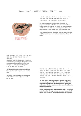
My programme’s logo represents and shows that the
programme is set in a school and the characters are based
around stereotypical nerds. The idea of the programme is to
switch around the attitude of a stereotypical nerd and show
their efforts to try and change their ways to become ‘cool.’
PLACE LOGO HERE
Their attempts of trying to become ‘cool’ fail most of the time
and therefore the characters end up in detention (hence the
title.)
HOW YOU MADE THE LOGO (USE THE NEW
TOOL AND EFFECT TERMS YOU HAVE
LEARNED)
First off, to make the glasses have a shadow, I
duplicated the glasses layer, changed the colour
to black and turned the opacity down and
smudged it a bit to give a shadowy effect.
(I did the same with the text.)
The skin colour of the nerd is simply a paint HOW DO YOU RATE THE FINAL LOGO? Say what you
brush, and the spots are just a paint brush as think is good about it. Say what you hope
well. people will understand about the programme
from looking at it. Write about one or two
The mouth was cut out with the magic select things you could do better when your skills
tool and I feathered the edges to smooth improve.
out the sides.
My final logo is how I pretty much planned it. I think it
represents my show well as the nerdy aspect of the title
and the school like font of the font. I think people will
understand that this is a show set in a school and how the
characters are nerds.
I think the logo is clean and simple but gives a nice effect
as its clear that the logo is about nerds and has a school
theme. This will make the show obvious to the audience