Call Girls 🫤 Connaught Place ➡️ 9999965857 ➡️ Delhi 🫦 Russian Escorts FULL ...
Helping Hands Saigon project
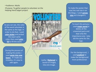
1. • Audience: Adults
•Purpose: To gather people to volunteer on the To make the poster that
Helping Hand Saigon project size( the real size is on
the blog,), I used canvas
size and changed it.
As you can see, the color To insert this picture, I
of the word volunteer is used magic wand to
the same as the logo. In delete all the
order to do that, I used unwanted parts and
color picker and picked kept only the
the exact same importance one. I also
color, then used color did the same for the
fill to fill the word. logo.
During the process of
making the poster, I For the background, I
used paste into new used gradient to
layers . If I make any make the background
mistakes, it’s easy to Lastly, I flattened a more professional.
edit again. bunch of images
into one image.
2. Color correctly Balance
Because the background was Volunteer and shaking hands
black, I chose blue and white are the biggest because I want
for the fonts so it seems fit the audience to really aware of
with the background and the that, to focus on that instead of
logo. Also, for aiming sadness other unimportant details, such
and sorry to the as the Helping Hands Saigon
audience, therefore the logo. It is just an extra
background was black. information for the audience.
Besides, the shaking hands Making a difference is smaller
had colors because I want to than the word: volunteer
emphasis the audience to because it is not as powerful as
volunteer in this project. volunteer. If there is no
volunteering, then making a
difference is just an abstract
Simple idea. Lastly is the background.
My poster is simple, not that too Again, it is not the focal point
complicated that it looks like a other than a piece of
mess. During the process of information of who the
making this poster, it requires 6 audience will help.
layers to complete but
obviously, after I flattened
it, there are only 3 parts :
text, picture and logo. The Fantastic Fonts
picture helps convey the meaning In this poster, I used 2 fonts.
of what I want to say. As a
Focal point
Most people would seem that my focal point is Number 1, because it is clear. It
replacement for writing “Make a isn’t really curvy that makes
difference for children”, I use the the background. However, the official one is the
word volunteer and the picture of shaking hands. people have a hard time to read.
picture of the children to Number 2, it seems to have a bit
describe it. For text, I keep it Mainly because I’m looking forward for
everybody to participate and to cooperate with of pity and sorry and might
simple, nothing much to say but create emotions for the
it has the potential to draw Helping Hand to save children’s life.
audience.
people get involve. As for the
logo, it’s just for showing the
organization.