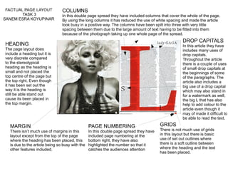
1. HEADING
The page layout does
include a heading but it is
very discrete compared
to the stereotypical
heading as the heading is
small and not placed the
top centre of the page but
the top right. Even though
it has been set out the
way it is the heading is
still be able stand out
cause its been placed in
the top margin.
PAGE NUMBERING
In this double page spread they have
included page numbering at the
bottom right, they have also
highlighted the number so that it
catches the audiences attention
COLUMNS
In this double page spread they have included columns that cover the whole of the page.
By using the long columns it has reduced the use of white spacing and made the article
look busy in a positive way. The columns have been spilt into three with very little
spacing between them due to the large amount of text having to be fitted into them
because of the photograph taking up one whole page of the spread.
DROP CAPITALS
In this article they have
includes many uses of
drop capitals.
Throughout the article
there is a couple of uses
of small drop capitals at
the beginnings of some
of the paragraphs. The
article also includes a
big use of a drop capital
which may also stand in
for a watermark as well,
the big L that has also
help to add colour to the
article even though it
may of made it difficult to
be able to read the text.
MARGIN
There isn’t much use of margins in this
layout except from the top of the page
where the heading has been placed, this
is due to the article being so busy with the
other features included.
GRIDS
There is not much use of grids
in this layout but there is basic
use of set out outlines where
there is a soft outline between
where the heading and the text
has been placed.
FACTUAL PAGE LAYOUT
TASK 3
SANEM ESRA KOYUPINAR