Call Girls Begur Just Call 👗 7737669865 👗 Top Class Call Girl Service Bangalore
Evaluation
1. Evaluation
Q1
In what ways does your media product use, develop or challenge forms and conventions of
real media products?
Front Cover:
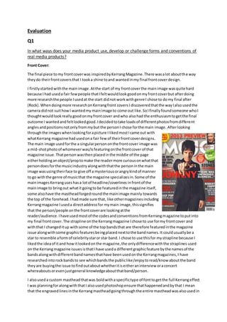
The final piece tomy frontcoverwas inspiredbyKerrangMagazine.There wasalot aboutthe way
theydo theirfrontcoversthat I tooka shine toand wantedinmy final frontcoverdesign.
I firstlystartedwiththe mainimage.Atthe start of my frontcoverthe mainimage wasquite hard
because Ihad useda fair fewpeople thatIfeltwouldlookgoodonmyfrontcoverbut afterdoing
more researchthe people Iusedat the start didnot workwithgenre I chose to domy final after
(Rock).Whendoingmore researchonKerrangfront coversI discoveredthatthe wayIalso usedthe
camera didnot suithowI wantedmy mainimage to come out like.SoIfinallyfoundsomeone whoI
thoughtwouldlookreallygoodonmyfrontcover andwho alsohad the enthusiasmtogetthe final
outcome I wantedandfeltlookedgood.Idecidedtotake loadsof differentphotosfromdifferent
anglesandpositionsnotonlyfrommybut the personI chose forthe main image. Afterlooking
throughthe imageswhenlookingforapicture I likedmostIcame out with
whatKerrang magazine hadusedona fair few of theirfrontcoverdesigns.
The main image usedforthe a singularpersononthe frontcover image was
a mid-shotphotoof whomeverwas/isfeaturingonthe frontcover of that
magazine issue.Thatperson wasthenplacedinthe middle of the page
eitherholdinganobject/proptomake the readermore curiousonwhatthat
persondoesforthe musicindustryalongwiththatthe personinthe main
image wasusingtheirface to give off a mysteriousorangrykindof manner
to go withthe genre of musicthat the magazine specializesin.Some of the
mainimagesKerranguseshasa lotof headline/coverlines infrontof the
mainimage to bringout whatit goingto be featuredinthe magazine itself,
some alsohave the mastheadforgedroundthe mainimage mainly towards
the top of the forehead. Ihadmade sure that, like othermagazinesincluding
Kerrangmagazine Iuseda directaddressfor mymain image,thissignifies
that the person/people onthe frontcoverare lookingatthe
reader/audience. Ihave usedmostof the codesandconventionsfromKerrangmagazine toputinto
my final frontcover. The strapline onthe Kerrangmagazine Ichose to use formy frontcover and
withthat I changeditup withsome of the top bandsthat are therefore featuredinthe magazine
issue alongwithsome graphicfeaturesbeingplacednexttothe bandnames.It couldusuallybe a
star to resemble aform of celebritystaror star band. I chose to use thisfor mystrapline because I
likedthe ideaof itand howitlookedonthe magazine,the onlydifferencewiththe straplines used
on the Kerrangmagazine issuesisthatI have useda differentgraphicfeature bythe namesof the
bandsalongwithdifferentbandnamesthathave beenusedonthe Kerrangmagazines,I have
researchedintorockbandsto see whichbandsthe publiclike/enjoytoread/know about the band
theyare buyingthe issue tofindoutaboutwhetheritiseitheraninterview oraconcert
whereaboutsorevenjustgeneral knowledgeaboutthatband/person.
I alsouseda custom mastheadthatwas boldwitha specifictype of fonttogetthe full Kerrangeffect
I was planningforalongwiththatI alsousedphotoshopensure thathappenedandbythat I mean
that the engravedlinesinthe Kerrangmastheadgoingthroughthe entire mastheadwasalsousedin
2. my mastheadformy front coverfinal.Ichangedmy mastheadintoaraster layeron photoshopto
give me the abilitytocute linesoutof my mastheadquite like the Kerrangmasthead,the cutout
linesonmymastheadare not in the exactpositionorlengththatKerranghave usedfortheirsso I
have not totallyusedthe ideaforthat.
Contents Page:
The final piece tomy ContentsPage wasmostlyself-inspiredbut
alsogettingideasfromdifferentcontentspagesfromsome
magazinesunderthe namesof NME & Kerrangmagazine.
I have chosento use 3 columnsonmycontentspage at the
bottomof the page withimagesrelatingtothe articlesbeing
featuredorregulatedinthe magazine. There are 3 titlesIhave for
each individual columnthe firstone onthe leftbeing“Features”
for the articlesthataren’talwaysinthe magazine issue,justa
certainmagazine issue.The secondone being“Regulars”forall of
the articlesinthe magazine itself havingeachseparate article
withtheirownsectionforeveryissue thatispublished,this
therefore makingitmatchthe codesand conventionsalso
includedinareal musicmagazine. Ihave alsoincludedmyown
little sectionusedformymagazine withthe titleinthe third
columnbeingcalled“BandIndex”thisisthe sectionusedtohelp
people findoutwhatisthe highestvotedbandoutof all of them,
it includesupto10 differentbandsgoingfrom1-10, 1 beingthe
highestand10 beingthe leastoutof the 10 differentbands
chosenforthat issue eachtime the magazine isreleased.
To helpfindoutwhichisthe besteach new issue thatisbroughtout 10 random bandnamesare
broughtout and placedtowhere the publichelpdecidewhichbandtheyprefer/enjoyoutof all the
bandsused.
The imagesusedformy contentspage are placedina randomorder dependingonthe size of the
image ineach sloteachmagazine issue usuallywilluse upto5-6 imagesinthe contentspage like
Kerranghas done withthisissue righthere.The imaginingorderIhave usedonmy contentspage
isn’tas randomlookingasthisissue of KerrangI have usedan orderof the firstimage usedbeingin
the top leftcornerthenleadingrightontothe nextimage whengettingtowardsthe endof the page
it leadsbelowthe firstimage thengoingacrossto the rightagain(only2 horizontal columnswill be
publishoneachcontentspage).1 image maybe a lotbiggerthanothersdependingonwhatthe
article isaboutand if it requiresalargerimage to fitwhat is featuringinthatspecificarticle.
I have addedthe mastheadat the top of the page andbeside the mastheadIhave alsoaddedthe
title “Contents”withthe date justabove it(theyare bothinthe same fontonlythe date is slightly
smallerthanthe title).The page numberislocatedatthe bottomof the page below the 3 columns
on the leftside.The fontusedforthe headlinesusedinmycontentspage were the same fontalong
withthe size too,I had alsochose to put boarderlinesroundthe 3 headlinestomake themstand
out like Kerrangmagazine usesBOLDheadlines withadifferentcolourforthe fontsaswell
(Kerrang’scolourchoice forthe headlinesisabrightyellow). There are page numbersnexttoeach
article onFeaturesandRegularsto helpthe publicaudiencequicklyskiptothe article theywantto
readthe most.
3. Double Page Spread:
The final piece tomy Double Page Spreadwasalsoslightlyself-inspiredlike mycontentspage,Idid
getsome ideasfromNME & Kerrangalsolike mycontentspage.
I have decidedtouse some
ideasfromthe codesand
conventions frombothNME&
Kerrangmagazine alsowithmy
ownideas…
WhenmakingmyDouble Page
SpreadI chose to have the
backgroundimage take upboth
pagesof the DPSto give the full
double page effectforthe
audience whowouldchose to
purchase my magazine.Itdid
not fade like mostDPS’s,when
I tookthe photoI made sure it
was bigenoughto cover both
pages.I likedthe thoughtof the
mainimage of the featuring
persononthe DPSwas goingto be on one page while onthe otherthere wasgoingto be writingand
for the DPS I have chosentodo and interview formyDPS so that it includesanintroductiontowhat
the interview isgoingtotalkabout. I decidedtoaddsome quotesintomyDouble Page Spreadto
give itthe connotationsthatothermusicmagazinesdo.
The quotesI have chosenforthe connotationsinmyDPSwere “Practice makesperfect”or“Enjoy
and expressyourself inanopenmanor”. Ithendecided thatthey wouldbothlookgoodas beingina
differentfontandbeingboldina box withthe quote(s) intogive itthateye-catchinglook.The
actual textitself includingthe introductioninalsoinabox to make it standout more whenbeing
editedontothe backgroundimage soitcan be readbut alsoto give ita bit more style forthe
audience toread/look at,withthatbeingputintothe DPS I have alsoincludedastandfirstlike other
magazinesdowhetherornotit ismusicrelated. Formy standfirstI have put a capital letterat the
beginningwithitbeinginadifferentfontthansome of the othertextandalsoa biggerletteringsize
unlike the restof the textinthe Double Page SpreadandI have made the standfirsttextboldtoo,
the text“Charlotte Smith…”thathas beenwritteninthe standfirstI have putin a biggerlettering
size thanthe rest of the standfirstalongwitha differentcolourtomake itstandout alsowhothe
interview isabout. The intervieweesname isinbigwritingonthe firstpage on the DPS locatedinthe
top leftcornersoas you openthe page you can start to getintothe article fromthe getgo. The page
numbersare locatedonthe bottomleftcornerof the firstpage of the DPS and the secondpage
numberison the bottomrighthand corner.
The main image Ihave used issimilartowhat NME magazine useswiththe personbeingonone of
the pagesand the textbeingonthe otherpage. I have also useda propin the makingof the final
designonthe mainimage to give the audience thatmysteriouslookthatmake the readerinterested
(eye-catching).