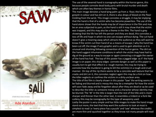
1. The use of the severed hand is iconography within the horror genre, this
because people connote dead body parts with brutal murder and death
which are often key themes in horror films.
The main image denotes a hand lying palm up from a floor, the hand is
greyish in colour and has dirt on it, there is also drops of blood on the floor
trickling from the wrist. This image connotes a struggle, it may be implying
that the hand is that of a victim who has become powerless. The use of the
hand alone shows that the hands may be of importance in the film and may
be an area subjected to pain, as the hand is still it may show that the victim
was trapped, and this may also be a theme in the film. The hand is grey
showing that the life has left the person and they are dead, this connotes a
loss of life and hope in which no one can escape without dying. The cut hand
doesn’t give a meaning away which attracts the audience as they will want to
know if the victim cut their hand of as a means of escape / why the hand has
been cut off, the image if very graphic and is used to gain attention as it is
unusual and shocking following convention of the horror genre. The dirt on
the hand suggest inhumane conditions in which the victim may have had to
dig at the ground as a way to escape or again connoting a struggle the owner
of the hand has had. The top of this poster has a jagged edge as if the hand
image is on paper, this sharp edges connote danger as well as this paper is
usually torn to get that effect in a rough manner, this may be trying to
connote how the murderer is going to kill the victim(s) in a rough and cruel
manner. On top of the rip there seems to be a concrete wall texture that has
cracks and dirt on it, this connotes neglect again this may be a hint on how
the killer neglects or confines the victims in a dirty unclean area.
The title of the film is clearly shown in this poster ‘Saw’ the writing seems to
be fading and blurred and is messy this may be a metaphor for how the victim
will soon fade away and be forgotten about after they are dead or ay be used
to describe the killer as someone messy and a character whose identity may
be blurred. The ‘W’ in the title is larger than the rest of the title and is more
sharper and thinner than the other text, it resembles a trident or a fork like
cutlery, this may be iconography for the type of weaponry used.
Lastly the poster is very simple and has little images to make the hand image
stand out more, the text that they want the audience to look at most is
simplest to read i.e ‘every piece has a puzzle’ and ‘saw’ whereas the credits
are more thin and squished together as they know not many people will read
it.
Ade Aiyedun
2. This poster follows convention as at the bottom we have the film website, this is used to advertise the film and help
promote the film to fans that have a further interest, as they will be able to go on the website link and find out more about
the film. Following the rule of z the websites and companies sponsoring the film are at the bottom as this will be one of the
last thing people look at on the poster, therefore the website is placed In the middle and is of a clear text similar to the title
of the film to help potential audiences remember the logo of the film, this is to attract them to either go and see the film if
they remember the logo from the poster or to go on the website where they can further build interest and promote the film
through the use of web 2.0 and other means that allow the producers and the audience to interact.
The film poster also shows the tag line “every piece has a puzzle” this quote is used as it mysterious and adds dramatic
effect which engages the audience to want to watch the film and find out more about what the puzzle may be. It also
connotes that the film is going to be full of mystery and indicates it may be of the thriller/horror genre.
Lastly the film poster has key actors/actresses and some quotes from acclaimed people/companies, this is to again promote
the film and encourage a wider audience, this is because if trusted new papers for instance are calling the film good people
are more likely to spend their money to go and watch it in cinemas.
Ade Aiyedun
3. The main focus point on the poster of a young woman who is wearing a red
dress and is covered in blood. The use of the black poster background is often
a convention in horror films to reflect the dark themes within them, the
blood is iconography connoting death or murder, often someone's blood will
be shed due to the state of mind of the murderer. The poster uses direct
address as the girl is looking straight at the camera i.e at the audience of this
poster however through the facial expression which looks evil as her eyes are
narrow and she is not smiling, furthermore her arms seem to be tense
connoting anger or bitterness putting the audience are in a position to dislike
this character and/ or already class her as a villain (this is also a common
convention in horror posters when portraying villains). A second analysis is
that the hands could be a source of power the character and through the
direct address it is as if the character is trying to draw the audience in
through her hands and facial expression.
The red dress is blood stained and long, long skirts are often associated with
witches and the blood as well as the position of the characters hands may
suggest the character has evil powers and is a witch. Red also has
connotation of danger and blood shed, which are often conventional film
within the horror genre, therefore the red dirt y bloodied dress as well as the
facial expression of the character make the genre more obvious.
The dress however is low cut and because the character is still portrayed as
being attractive this is because the character is a young female and not
following convention the character also has no facial disfigurement or any
body disfigurement which are usually portrayed in horror films as being a
body part of a monster, however because this character is wearing a tight
dress and is still portrayed as attractive I believe this is a sign of male gaze
theory, this is because the tight dress and youth of the female character put
the audience in the position of a heterosexual male, this is done to add some
sort of sex appeal to the film and attract more males to watch the film, as
well as females (who may look up to the actress Chloe mortez), this I believe
is because the audience would want to understand why the attractive
character is evil as this until recently isn't the traditional convention of a
villain in a horror film.
Ade Aiyedun
4. Carrie is the second largest thing on the poster making it obvious that it is the name of the film, the writing is in serif font
making it easy to read, it also makes it seem old fashioned further adding to the creepy effect, the outline of has hints of
red, which go with the colour scheme of red, white and black as well as connoting danger to the characters name, lastly the
writing is a white/silvery colour and is slightly see-through showing lines and splodges, this is used to add a supernatural
element again trying to portray the character as someone with supernatural powers.
Following convention the tag line is on the poster, “you will know her name” this is direct address to the audience
suggesting that the character wants to be known and that in the film them being unnoticed may be a central theme and
may be the cause of events within the film i.e murders.
This poster follows convention as at the bottom we have the film website, this is used to advertise the film and help
promote the film to fans that have a further interest, as they will be able to go on the website link and find out more about
the film. Following the rule of z the websites and companies sponsoring the film are at the bottom as this will be one of the
last thing people look at on the poster, therefore the website is placed In the middle and is of a clear text similar to the title
of the film to help potential audiences remember the logo of the film, this is to attract them to either go and see the film if
they remember the logo from the poster or to go on the website where they can further build interest and promote the film
through the use of web 2.0 and other means that allow the producers and the audience to interact.
The credit section shows key cast members and the production company with the logo of the sponsors and partner
production company, this is because if the production is well known for making quality films and people see the logo they
are more likely to be interested in the film as the audience will be used to other films by the company and if those film are
good the audience may believe that Carrie is good and will go out to watch it.
Ade Aiyedun
5. The film poster main point of focus is the image of a clown. This clowns
image follows iconography of villains within the horror genre, this is due
to the clowns makeup and the long sharp discoloured fingers of the
clown. Firstly the clown looks evil already making it obvious to the
audience that the clown is the villain. The eyebrows are sharp and thin
and drown on in a way that makes them arched, often a conventional look
of villains are to have super arched eyebrows which make them look
devious, secondly the eyes are dark and the clown has unconventional
clown makeup which makes the clown look scary rather than funny, the
eyes create direct address with the audience which puts the audience in a
position of feeling anxious or uncomfortable especially as many people
suffer from a fear of clowns, the long discoloured fingers with the pointy
nails is iconography used when portraying a conventional horror monster,
the long black talon like nails connote danger, as well as this the red hair is
un brushed and messy which is normal of a clown however because of the
makeup and facial expression used it connotes a crazy evil clown rather
than comical children clown.
Similar to the other posters analysed this poster uses the conventional
colours of red, white and black. These colours are often used because
they have connotation of things associated with the horror genre.
The contrast of the white background and the dark black background the
clown is in connote the difference between good and evil the villain and
the victim these binary opposites are often explored within horror films.
The red symbolises danger and bloodshed which is another theme often
displayed within films of the horror genre, therefore by using these
colours together people are more able to identify the genre of the poster.
The way the clown seems to have ripped the paper could be seen as
symbolism of unleashing the darkness into the world, which could be seen
as the world of the characters whose faces are below the film title. This
also links to the tagline “the master of horror unleashes everything” as
the audience get the feeling the clown is the master of horror.
Ade Aiyedun
6. Stephen king is mentioned with the film title, this is because the film
is based on the Stephen kings book it, therefore the audience this
film is being promoted towards are likely to be fans of Stephen king’s
work, so by adding his name to the film poster it is further attract an
audience and promoting the film as fans of Stephen king are likely to
watch his work.
The film title is red and bold and stands out against the background
connoting the “it” character is something that cannot easily be
removed, the font is also jagged around the edges again connoting
danger and struggle. The title ‘it’ is ambiguous, this would draw
readers in as they would want to find out more about what ‘it’ is if
they have no previous knowledge of the book.
Under the title there are 7 faces of humans, these characters are
placed on the poster showing they are of importance. All the
characters look slightly suspicious as they are giving the audience
direct address however none of the characters are smiling or seem to
be distressed which makes the audience question which character (s)
good and bad.
Again following convention the posters has a tag line “the master of
horror unleashes everything you were afraid of” the tagline tells us
more about the what the film is about, the tagline implies that the
film is based around fears and may make the audience question what
there fears may be.
The use of the clown is popular iconography not only in film but in
popular fears people have, as well as this the clown is symbolism of
all the fears put together. However the tagline is ambiguous and
doesn’t give out the complete meaning of the film further adding to
the suspense.
As this is an older film the poster just shows the Warner logo and the
Warner link, however because Warner are a popular film institution
people may watch this film because its owned by Warner and they
may view Warner as making good films, therefore it may encourage
them to watch this film or go to the link displayed and watch other
Warner videos.
Ade Aiyedun