Cash Payment Contact:- 7028418221 Goa Call Girls Service North Goa Escorts
Dramatic Soap Cover Finale
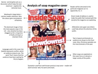
1. Banner and strapline acts as a decoration which helps the text stand out – exploits the exclusive issue. Analysis of soap magazine cover Reader will be attracted to this particular magazine as it is apparently ‘no. 1’. Masthead in large letters – catches readers attention. Also, the colours give connotations of festivity. Direct mode of address is used to make the public feel involved with the storyline the magazine are exploiting. Alliteration and upper case letters used help attract the attention of the public. The dominant image is from the most popular soap in the UK – also storyline has been dragged out for a long time is finally coming to a dramatic finish. Text is topical and dramatic so audience are drawn to this front cover. Also, Christmas episodes are the most dramatic of the year. Language used in this cover line (battle) represents conflict, which an audience enjoy to see. The word ‘final’ means that the audience have been waiting for this to happen. Other soaps are exploited on the cover line so it attracts a larger variety of the public. Quotation used from well-known previous soap actor – reader will want to know ‘why’ he wont come back.
2. Strapline emphasises how it is an exclusive magazine, which is up-to-date, and also addresses a storyline which the public have been following for a period of time –this will grab their attention. Images are exclusive as they are labelled ‘first pics’, and the main text is again written in bright colours to emphasise it’s importance. Masthead in large letters and bold colours to attract the attention of the public. The dominant image and direct mode of address is used to attract the readers attention. Large text used, which is first thing the reader will see – instantly grabs their attention with an interesting subject, and contrasting, bold colours. Caption used will attract audiences attention, as it is the death of a well-known character. Also, the words ‘kill’ and ‘pregnant’ are in fluorescent colours, which emphasises the drama for effect. Only soap written about that isn’t Eastenders, which may not have a great effect as they should have a variety of different soaps to attract a wider range of readers from the public. Text in bubble is brightly coloured, and exaggerates how the magazine has the latest information, which is what the reader will want. Numerous storylines are exploited so the reader has more than one thing to read about – a variety of characters could attract a variety of readers.
3. Analysis of Soap Magazine Cover. The direct mode of address that is used here is creating a strong image as they are aiming their stories at you. Here the masthead is in large capital block letters, this grabs the viewers eye straight away, and also because the colour they have used stands out. The title is also a rhetorical question so this makes the reader think about it and want to watch the programme to see what happens. Here in this quotation there is ellipsis used so this is shown to give an uneven decision about what the character is going to do in the next episodes. This again is giving of the same type of message but for a different soap, as the word ‘Killed’ is highlighted again with bright red, this was used early on. It is a good caption to use to get the readers view interested. This is another caption that is also going to make the reader interested as ‘Dot’ is an iconic character that is very well known. The banner used here includes bright colours as they want to attract other stories from following episodes as well. The word ‘Murder’ is especially highlighted with red, so this grabs the interest quickly.