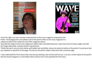
1. From first sight I can see a massive improvement on the music magazine compared to the
Prelim. The background is not edited a tall on the prelim while on the music magazine it is
edited out which then makes the rest of the magazine clearer.
Secondly the image on the music magazine is better taken and edited because I took more time to choose angles and edit
the image afterwards, making a drastic improvement.
Thirdly the text is set out more clearly, with bolder text and better colours to stand out while on the prelim it is just basic text
put anywhere it would fit on the page. The text on the prelim makes it look more like a contents page.
I now understand for front covers they must be eye catching, clear and be well set out. I can see a similar layout to the prelim
But the second magazine is much better done and has much more potential for the future.
2. Firstly the background of these pages is a major factor. The prelim has something you would find
on the background of a primary school photo with poor colour blending, while on the music page in is
clear black which helps the other colours be viewable.
Secondly the image on the prelim looks both intimidating and not taken well, it is just a snapshot. The main image on the
music magazine is better taken, planned out, and edited which makes a massive difference.
Finally the text on the prelim is thrown everywhere and anywhere so the reader would have to scan round too much. On
the music magazine, the text is set out into columns and boxes where you can look and find what you want very easily.
The colours on the music page are also much better than on the prelim as that page looks very ugly and unappealing.
I now know that contents pages have to be easy to read as you need to get to the page you want and everything must be
well positioned, you cant just throw everything in and hope for a good look of the page.
3. I can see definite improvements on the mast heads. The size for a start is very different with
the prelim being small and not in capitals while the music one was large, bold and eye
catching.
Secondly the font was a big difference because I chose any random font for the prelim but
for the music magazine I looked for the best font to stand out and look visible.
4. The music magazine images on the other
hand are much better in my opinion
because they have been planned, better
taken and are of better quality.
They differ from the crazy poses of the
prelim task and aim towards being a music
magazine style rather than just a quick
snapshot. It is also better that I used five
models for the music magazine overall
than just one on the prelim.
The clothes and props have also been
arranged on the music photos rather than
just finding the best place at the time. I
have used guitars, sunglasses and a more
relevant choice of clothes for the music
photos.
Overall I think a significant improvement
has been made on the music photos
I think the pictures for the prelim I took compared to the prelim because I have
were not well planned or taken. They took thought, time, better camera, editing,
also seem a bit over the top with weird props etc.
poses and facial expressions from the
model I used.