1. As I have said numerous times, Nabilla J is a quirky,
vintage artist who introduces new elements in the music
industry that no other artist has done. She is not afraid
to try new things or to mock other genres as she knows
her target audience will understand her creative and
controversial ways in music videos and ancillary
products.
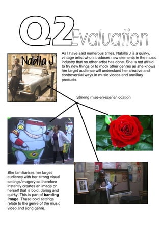
Striking mise-en-scene/ location
She familiarises her target
audience with her strong visual
settings/imagery so therefore
instantly creates an image on
herself that is bold, daring and
quirky. This is part of banding
image. These bold settings
relate to the genre of the music
video and song genre.
2. The font for Nabilla J is elegant and
simple so that it can allow any
strong/bold imagery she will have in her
album cover to overtake it, but work in
harmony with the background.
The handwritten font design originally
came from Kate Nash who also used
handwritten fonts for her album cover
because her lyrics were like a diary. The
font will represent the lyrics and remind
the audience that once they are listing to
her songs, they have permission to look
‘inside her diary’.
Consistency of fonts on advert
and digipak, fonts will become
recognisable towards the target
audience.
As well as consistency in fonts, we
thought the costume of Nabilla J is
very important as first impressions
count. Her iconic hairstyle is striking
and therefore remains the same/similar
throughout her music video and in the
digipak and advertisement. Our target
audience like to experiment with
hairstyles
From Digipak From Music video