Creating an effective contents page for a rock magazine
1. 9th January 2014
First I coloured the background to my contents page,
as the colour can change the appearance of any image
or text that I put on the page. It wasn’t hard to get
the colour, because I had said in my proposal that I
wanted to keep it the same as the front cover.
Then I added the title of the page and used the same
font and colour, to ensure that my target audience
could develop an identity for the magazine.
Furthermore, when I had done my research, I had
found that many rock magazines had used the same
style they had used for their masthead on their front
cover as their contents page.
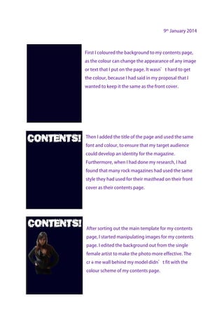
After sorting out the main template for my contents
page, I started manipulating images for my contents
page. I edited the background out from the single
female artist to make the photo more effective. The
crème wall behind my model didn’t fit with the
colour scheme of my contents page.
2. 14th January 2014
A convention on all magazines is having a page
reference to the image which has been placed on the
page, so I decided to use a star to reference the image
my original idea was to have a sharp 3 point shape to
reinforce the aggressive rock attitude. I used the
polygon tool and
I started to create the box for the
editorial. I used the line tool to create a
shape at the bottom of the page. I then
increased the weight of the lines to
make them visible.
15th January 2014
I used the text tool to put my editorial in. to stick with the
colour scheme, I coloured the text white and stayed
consistent with the font on the front cover.
3. After this, I added in a white line underneath the contents
to make it stand out more. I also manipulated the image of
George and added that into the contents page. I made the
image smaller and cropped it to get rid of the internet
café in the background.
Then, I added three rounded rectangular shapes for the
different sections of the contents. I made one shape and
then just copied it twice to make sure that they were the
same size and thickness. Also, I counted the space apart
each of the rectangles were from each other to make sure
they were the same space apart. Furthermore, I added a
star to George’s photo as I would need to reference the
image later on.
After this, I then had to work out what to put in the
contents and what pages they were going to be on. For
this, I had to estimate how many pages a certain article
was going to take up to make it feel realistic. On top of
that, I had to think about the images I had used, as I had to
reference these with the pages I put in the contents.
4. 13th February 2014
A few lessons later, after concentrating on my double page
spread, I got the opinions of my teacher, and she
recommended that I put a border round the contents and
add the masthead in the corner. I also realised that I needed
another image for my magazine, so I used an image which
would represent the editor. I used a very small image, as the
readers aren’t interested in this.