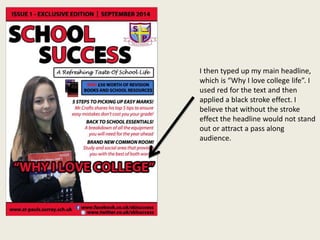
1) The document describes the process of designing a magazine cover and contents page for a school magazine called "School Success". Key elements included adding a masthead, headline, images, school logo, and social media links.
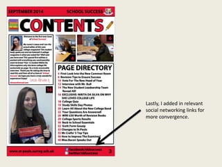
2) For the contents page, the designer repeated the masthead, added page numbers and descriptions of stories, images related to articles, and social media links to promote convergence.
3) Minor changes were made, such as adding an editorial photo and updating text, before the contents page was finalized.