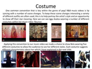
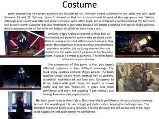
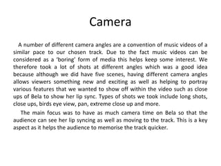
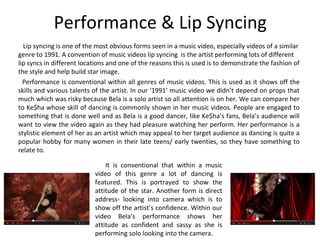
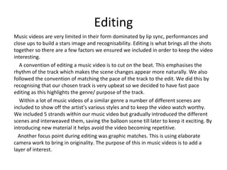
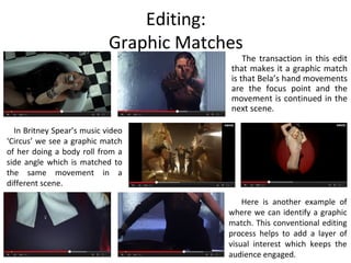
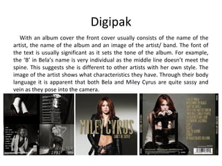
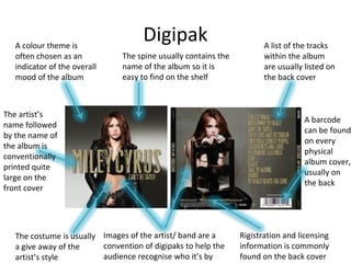
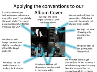
CALL ON ➥8923113531 🔝Call Girls Takrohi Lucknow best Female service 👖
Evaluation 1: Conventions
1. Evaluation 1:
In what ways does your
media product use,
develop or challenge
forms and conventions of
real media products?
2. Props
One convention of a music video is to have props. This is to
help keep the video interesting as it can mean there is more to
look at. They can also be used to further the style of the artist as
they are usually used in a way which may suggest interests of
the artist.
Another convention of music videos is to show the band
playing the instruments. We made a decision to not show this as
we thought it would be more effective to just show Bela as we
wanted her to be the main focus. Therefore, as Bela was the
main focus of the video, we gave her some props to enhance her
performance as well as emphasising her traits (for example
waving the fan whilst looking down in the camera with sass).
3. Props
Rihanna is seen in a
bath in one of her music
videos. This prop is
something everyone can
recognise. We chose to
have Bela in a bath tub
to show her in an
intimate setting.
We opted for a bath scene because a bathroom is a private setting which means the audience get to see Bela in
an intimate setting. Also, like Rihanna, we made sure Bela still looked glamorous in the bath as this emphasises her
style as they still look made up and attractive in the bath. This develops the convention of real media products.
Like Beyonce, we shot
Bela holding/ dancing
with a sceptre. A sceptre
can be associated with
people of a high status
which portrays Bela’s
dominating character.
Also aids her
performance.
When researching for ideas for our music video it was apparent that a common thing was to show a prop in a
scene then the prop would be gone in the next shot of the scene. This discontinuity is one way to play with the
audiences interest as they may be tempted to watch it again. This is what we did with the sceptre.
4. Costume
One common convention that is key within the genre of pop/ R&B music videos is lip
syncing with a number of scene changes. To keep these scene changes interesting a variety
of different outfits are often used; this is to help portray the artist’s style and an opportunity
to show off their star meaning. Here we can see Iggy Azalea wearing a number of different
costumes within her music video ‘Bounce:
Applying this convention to our music video we made a choice to show Bela wearing five
different costumes to allow the audience to see her different styles. Each costume suggests
different characteristics about her which I have explained in the next slide.
5. Costume
Similarly to Iggy Azalea we wanted to show Bela as
dominating and powerful which is why we chose a suit.
White is usually associated with innocence whereas they
subvert this convention as they’re similar characteristics
represent rebellion but in a classy manner. Her suit
contrasts to the waiters which emphasises her feminine
power. It acts as a symbol of authority. The white fabric
of the suit is very feminine.
One convention of this genre is that you expect
different costumes to have different meanings. The
black shiny sparkles costume shows power. The black
sparkles shows wealth which portrays her as wealthy,
successful, sophisticated and luxurious. Compared to
Dizzee Rascal with gold chains her wealth is shown
subtly and not too ‘showy-off’. It gives Bela more
confidence and she’s not shouting ‘I got money’, just
hinting. Feminine class sophistication.
When researching into target audience we discovered that the main target audience for our artist was girls aged
between 16 and 25. Primary research showed us that this a conventional interest of this age group was fashion.
Although every outfit was different all her costumes were either black, red or white (or a combination) as this formed a
link to each scene. Costume was also important in our video because we added a clothing line within Bela’s website.
Bela’s costumes show off her style and help to establish her identity as a star.
Her bath scene dress is sheer fabric; This shows she is confident in her sexual attractiveness/
sensual. It is revealing as it is see through yet sophisticated, keeping her looking classy. The
delicate/ expensive fabric is very feminine. The one shoulder and slit on one side of her leg is
quite suggestive and again shows her confidence.
6. Camera
A number of different camera angles are a convention of music videos of a
similar pace to our chosen track. Due to the fact music videos can be
considered as a ‘boring’ form of media this helps keep some interest. We
therefore took a lot of shots at different angles which was a good idea
because although we did have five scenes, having different camera angles
allows viewers something new and exciting as well as helping to portray
various features that we wanted to show off within the video such as close
ups of Bela to show her lip sync. Types of shots we took include long shots,
close ups, birds eye view, pan, extreme close up and more.
The main focus was to have as much camera time on Bela so that the
audience can see her lip syncing as well as moving to the track. This is a key
aspect as it helps the audience to memorise the track quicker.
7. CameraSimilar to Lady Gaga we
took a few mid close up
shots as this gives a hint of
the artist’s body language,
facial expression and
reveals a slight view of
their costume and upper
half of their body. It is also a
good angle to identify the
lip syncing of the artist.
A birds eye view shot
allows the audience to
see the scene from a
whole new perspective
and puts them in a
dominant position
looking over her as she
takes a bath. This lets
the audience view her
as a sexual object.
Close up shots are very common.
This has a number of purposes
including a close view for the
audience to admire the artist’s
looks and also to help underscore
the track as well as a way of
connecting to the audience by
looking into the camera. It also
shows confidence combined with
her performance and makes her
look very dominant.
8. Performance & Lip Syncing
Lip syncing is one of the most obvious forms seen in a music video, especially videos of a similar
genre to 1991. A convention of music videos lip syncing is the artist performing lots of different
lip syncs in different locations and one of the reasons this is used is to demonstrate the fashion of
the style and help build star image.
Performance is conventional within all genres of music videos. This is used as it shows off the
skills and various talents of the artist. In our ‘1991’ music video we didn’t depend on props that
much which was risky because Bela is a solo artist so all attention is on her. We can compare her
to Ke$ha whose skill of dancing is commonly shown in her music videos. People are engaged to
something that is done well and as Bela is a good dancer, like Ke$ha’s fans, Bela’s audience will
want to view the video again as they had pleasure watching her perform. Her performance is a
stylistic element of her as an artist which may appeal to her target audience as dancing is quite a
popular hobby for many women in their late teens/ early twenties, so they have something to
relate to.
It is conventional that within a music
video of this genre a lot of dancing is
featured. This is portrayed to show the
attitude of the star. Another form is direct
address- looking into camera which is to
show off the artist’s confidence. Within our
video Bela’s performance shows her
attitude as confident and sassy as she is
performing solo looking into the camera.
9. Editing
Music videos are very limited in their form dominated by lip sync, performances and
close ups to build a stars image and recognisability. Editing is what brings all the shots
together so there are a few factors we ensured we included in order to keep the video
interesting.
A convention of editing a music video is to cut on the beat. This emphasises the
rhythm of the track which makes the scene changes appear more naturally. We also
followed the convention of matching the pace of the track to the edit. We did this by
recognising that our chosen track is very upbeat so we decided to have fast pace
editing as this highlights the genre/ purpose of the track.
Within a lot of music videos of a similar genre a number of different scenes are
included to show off the artist’s various styles and to keep the video watch worthy.
We included 5 strands within our music video but gradually introduced the different
scenes and interweaved them, saving the balloon scene till later to keep it exciting. By
introducing new material it helps avoid the video becoming repetitive.
Another focus point during editing was graphic matches. This is using elaborate
camera work to bring in originality. The purpose of this in music videos is to add a
layer of interest.
10. Editing:
Graphic Matches
The transaction in this edit
that makes it a graphic match
is that Bela’s hand movements
are the focus point and the
movement is continued in the
next scene.
In Britney Spear’s music video
‘Circus’ we see a graphic match
of her doing a body roll from a
side angle which is matched to
the same movement in a
different scene.
Here is another example of
where we can identify a graphic
match. This conventional editing
process helps to add a layer of
visual interest which keeps the
audience engaged.
11. Website
A form that artist’s have nowadays is a website for the fans to keep up to date with
the artist and to admire their work. There are conventions that are applied to these
websites which we have followed and adapted.
o Images on the website are a form to show off the artist and to
allow the audience to admire their look. The large image of
Bela on the front stands out showing she is the focus point
and her body language suggests she is very confident. We
broke this convention as websites usually have a collection of
images but we wanted to show her in a picture where she
stands out and takes the attention.
o The photo gallery is a form of allowing fans to admire her and
her style. Galleries are commonly on another page, as seen on
Ellie Goulding’s website but we had it on the front to
emphasise her looks are a key feature to her fans.
o The font in Bela’s is unusual, modern, futuristic, stylish which
has all been done on purpose to help portray her traits.
o The spike frame surrounding the main image and the sharp tip
on the links suggests a slight edginess.
o Links, news feed, gallery and the name of artist on top are all
things you would expect to find on an artist’s website. To help
make it interesting and different to others we interpreted the
conventional layout and certain features. For example we had
a gallery on the front and the only links on the front page
were for the navigation to other pages.
12. Digipak
With an album cover the front cover usually consists of the name of the
artist, the name of the album and an image of the artist/ band. The font of
the text is usually significant as it sets the tone of the album. For example,
the ‘B’ in Bela’s name is very individual as the middle line doesn’t meet the
spine. This suggests she is different to other artists with her own style. The
image of the artist shows what characteristics they have. Through their body
language it is apparent that both Bela and Miley Cyrus are quite sassy and
vein as they pose into the camera.
13. Digipak
A barcode
can be found
on every
physical
album cover,
usually on
the back
Images of the artist/ band are a
convention of digipaks to help the
audience recognise who it’s by
The costume is usually
a give away of the
artist’s style
The artist’s
name followed
by the name of
the album is
conventionally
printed quite
large on the
front cover
The spine usually contains the
name of the album so it is
easy to find on the shelf
A list of the tracks
within the album
are usually listed on
the back cover
A colour theme is
often chosen as an
indicator of the overall
mood of the album
Rigistration and licensing
information is commonly
found on the back cover
14. Applying the conventions to our
Album Cover
We chose to show off
three cosutmes featured
in the music video
A stylistic element we
decided on was to have one
image that wasn’t completely
black and white. This image
also emphasises her fashion
which is a key USP.
We chose a vein
image that was also
slightly revealing to
attract the target
audience
The pillar adds to
the glamourous
lifestyle look
We went for a subtle yet
unusual font for her name as it
isn’t distracting attention away
from the image of her but
unusual enough to recognise
We decided to follow the
convention of the track
names in the middle but
aligned them neatly
We tilted the bar
code sideways to
make it look slimmer
We kept the spine
simple to contrast with
the busier covers
We kept the form
of having only
images of our
artist