Tech Startup Growth Hacking 101 - Basics on Growth Marketing
Q1
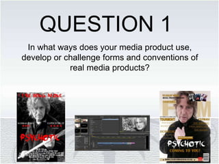
1. In what ways does your media product use,
develop or challenge forms and conventions of
real media products?
QUESTION 1
2. SIMULARITIES
A BIG TITLE SO BOTHS
CHOSEN TARGET
AUDIENCE CAN EASILY
IDENTIFY THEM.
MAIN FOCUS IS OF THE
MAIN CHARACTER SO
ONCE AGAIN THEIR
AUDIENCE CAN EASILLY
IDENTIFY THEM.
A SLOGAN TO TELL A
LITTLE ABOUT THE FILM
TO SELL IT TO A NEW
AUDIENCE.
A BILLBOARD LISTING
ALL PRODUCERS, CAST,
EDITORS AND SO ON,
1 MAIN COLOUR
AGAINST BLACK AND
WHITE TO MAKE THE
POSTER STAND OUT.
STRUCTURED LAYOUT,
SIMPLE YET EFFECTIVE
BOTH POSTERS ARE
PORTRAITURE TO GIVE
A CLEAR VIEW OF THE
MAIN CHARRACTER.
3. DIFFERENCES
I HAVE A STAR RATING FOR
MY POSTER TO
ENCOURAGE PEOPLE TO
SEE THE FILM. A RATING IS
A TYPICAL CONVENTION
OF A FILM MAGAZINE.
STAR TREK SHOWS A PART
OF THEIR FUTURISTIC
SCENE IN THE SHOT
WHEREAS MINE FOCUSES
ENTIRELY ON THE MAIN
ACTOR HIMSELF.
MY SLOGAN IS A LOT
BIGGER AND NOTICEABLE ,
THIS I FELT WOULD MAKE
IT A MAIN FOCUS POINT TO
ATTRACT POTENTIAL NEW
FANS.
DIFFERENT SHOT TYPE
USED, MINE IS A MIDSHOT
WHEREAS STAR TREKS IS
MORE OF A CLOSE UP.
4. HOW OUR POSTER
CHALLENGES STAR TREK’S?
I feel as if our poster strongly challenges Star Trek’s due to professionalism,
conventions and mise en scene. Our poster includes one major factor that Star
trek’s doesn’t, we include a star rating, star ratings can be a massive factor into
whether someone goes to see a movie or not, a good star rating can be what
encourages them. Everyone listens out to reviews before going and seeing a
new released film so we thought it would be a good feature to add.
Our poster challenges Star Trek’s by a good quality image, good credits
featured in the billboard so people know its being made by a good company
and also good ratings which will encourage people to go see it.
For our poster image, we’ve tried to capture the most psychotic picture of Tony
to really tell the story of the film. By seeing Tony with an axe viewers will
automatically assume it’s a horror and gather the storyline through the title
which will hopefully bring in our target audience. Whereas Star Trek’s poster
doesn’t really tell you much about the film other than its futuristic setting.
People will see our poster and automatically get an idea to the storyline and
genre which will hopefully draw them in straight away whereas Star Trek’s you
wouldn’t be so sure about so I feel as if we challenge their poster in that
respect too. I feel as if our poster is professional and has all the correct
conventions so it can therefore easily compete with and challenge all other film
posters.
5. SIMULARITIES
SIMULAR FACIAL
EXPRESSION, NOT
REVEALING MUCH
ABOUT THE MOOD TO
KEEP THE AUDIENCE
WANTING TO KNOW
MORE
WE’VE BOTH INCLUDED
A LINK TO OUR ONLINE
WEBSITES TO SHOW
THAT WE BOTH HAVE
OUR OWN WEBSITE TO
SO YOU CAN ACCESS
OUR MAGS FROM THE
COMFORT OF YOUR
HOME.
VERY SIMULAR
LAYOUTS DUE TO THIS
BEING THE MAGAZINE
ME AND ROSIE TOOK
INSPIRATION FROM.
WE BOTH INCLUDE A
LONG LIST OF
FEATURES TO ATTRACT
OUR TARGET
AUDIENCE.
6. DIFFERENCES
DIFFERENT COLOUR
SCHEMES – IVE CHOSE
MINE TO BE A BEIGE
SORT OF THEME DUE TO
THAT BEING A COLOUR
SCHEME THAT DOESN’T
PICK OUT ONE CERTAIN
AUDIENCE.
MY MAGAZINE HAS A
MUCH MORE
TRADITIONAL LOOK
WHEREAS TOTAL FILM IS
MORE MODERN. I’VE
DONE THIS SO I CAN
APEAL TO ALL AGES.
I’VE INCLUDED OTHER
IMAGES REFERRING TO
OTHER SCENES IN THE
MAGAZINE VISUALLY
WHEREAS TOTAL FILM
DOESN’T INCLUDE THAT
FEATURE.
7. HOW OUR MAGAZINE
CHALLENGES TOTAL FILMS?
Despite both magazines being very similar I feel as if Everything Film can
challenge Total Film. We both have similar layouts, main images, sell lines and
so on but one thing we both vary on is our colour themes. Total Film go for a
blue look, which looks very futuristic and modern whereas our magazine went
for more of a traditional looking colour scheme, we done this, not to attract an
older audience but to welcome it up to all social groups. By having this colour
scheme there's not one particular gender nor age associated whereas Total
Film you tend to see it as more male based which could potentially put of
females, Everything Film welcomes all social groups to our magazine which
could potentially give us a higher target audience. We feel as if we challenge
Total Film in this sense.
Another feature our magazine has whereas Total Film doesn’t is other images.
We felt by including other images we could attract people visually, people will
see an image of their favourite actor or favourite film when passing by the
magazine aisle which could brag their attention and lead them in to buying our
magazine.
Despite being incredibly similar I still believe our magazine can challenge the
likes of Total Film and all other film magazines, due to the correct use of
conventions we’ve used, the strong main image and the bold and eyegrabbing
masthead.