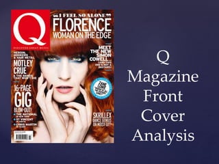
{ 
Q 
Magazine 
Front 
Cover 
Analysis
 The masthead is simply the letter ‘Q’. 
It’s very recognisable as it is a well established 
brand. 
 The size is fairly big on the page. The placing in 
the top left hand corner automatically grabs 
your attention and the colour is very bold, 
grabbing your attention. 
 ‘DISCOVER GREAT MUSIC’ lets us know that 
it’s a music magazine and that their aim is to 
help us discover great music. 
The Masthead
 The main image is of the artist featured in the 
magazine. It links in with the caption and it is 
very clear that the caption links in with the 
picture and is very appropriate. 
 The image size is also appropriate. The pose the 
artist is in entices you in. 
 With the cover line being ‘Women On The 
Edge’ the use of make up and hair colour 
makes the meanings of the words a lot stronger. 
Image and Caption
 The cover lines are all appropriate. They say just enough to draw 
you in with out telling you too much. 
 The white letter against the artists ginger hair really stand out and 
are clear to see. 
 The pug is clear and pull quote on it makes you a little confused 
and you want to know more. The blue is a strong and inviting 
colour. ‘New Column’ makes you intrigued and the use of capital 
letters make the words more in ‘your face’ and bolder. 
 All spelling and punctuation is accurate. The themes are all 
consistent. 
 The sell and strap lines give a clear indication that it is a music 
magazine as they mention bands and artists. 
 The use of the rhetorical question makes you feel important as it 
feels like the magazine is talking to you directly. 
 The word ‘bastard’ being used shows us that the target audience is 
more mature. 
Language and Pug
 The over all layout and design is conventional for a 
music magazine. The colours are all strong and 
nothing is lost on the page. 
 Its stuck to the formula of one artist per page and 
the main image works really well and represents 
music. 
 Its all very clear and organised. 
 To me, the magazine is very appealing and 
ascetically very pleasing. 
 Overall the colour scheme works well. The blue has 
been pulled from the artist and used in the pug and 
break up lines so it all links together nicely. The 
white and red also work well and the use of white 
makes it all more clear. 
Layout and Design

Q magazine analysis

  • 1.
    { Q Magazine Front Cover Analysis
  • 2.
     The mastheadis simply the letter ‘Q’. It’s very recognisable as it is a well established brand.  The size is fairly big on the page. The placing in the top left hand corner automatically grabs your attention and the colour is very bold, grabbing your attention.  ‘DISCOVER GREAT MUSIC’ lets us know that it’s a music magazine and that their aim is to help us discover great music. The Masthead
  • 3.
     The mainimage is of the artist featured in the magazine. It links in with the caption and it is very clear that the caption links in with the picture and is very appropriate.  The image size is also appropriate. The pose the artist is in entices you in.  With the cover line being ‘Women On The Edge’ the use of make up and hair colour makes the meanings of the words a lot stronger. Image and Caption
  • 4.
     The coverlines are all appropriate. They say just enough to draw you in with out telling you too much.  The white letter against the artists ginger hair really stand out and are clear to see.  The pug is clear and pull quote on it makes you a little confused and you want to know more. The blue is a strong and inviting colour. ‘New Column’ makes you intrigued and the use of capital letters make the words more in ‘your face’ and bolder.  All spelling and punctuation is accurate. The themes are all consistent.  The sell and strap lines give a clear indication that it is a music magazine as they mention bands and artists.  The use of the rhetorical question makes you feel important as it feels like the magazine is talking to you directly.  The word ‘bastard’ being used shows us that the target audience is more mature. Language and Pug
  • 5.
     The overall layout and design is conventional for a music magazine. The colours are all strong and nothing is lost on the page.  Its stuck to the formula of one artist per page and the main image works really well and represents music.  Its all very clear and organised.  To me, the magazine is very appealing and ascetically very pleasing.  Overall the colour scheme works well. The blue has been pulled from the artist and used in the pug and break up lines so it all links together nicely. The white and red also work well and the use of white makes it all more clear. Layout and Design