
Recommended
More Related Content
What's hot
What's hot (18)
Viewers also liked
Similar to Advanced portfolio evaluation 1-magazine
Similar to Advanced portfolio evaluation 1-magazine (20)
More from mmmillie13
More from mmmillie13 (20)
Recently uploaded
Recently uploaded (20)
Advanced portfolio evaluation 1-magazine
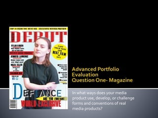
- 1. In what ways does your media product use, develop, or challenge forms and conventions of real media products?
- 2. I decided to call my magazine Debut as I felt it reflected new film in one word in a nice way. LikeTotal Film I decided to add text into the first letter, mine saying ‘The Latest Film’ so my audience would feel like they were getting the most up to date new in the movie world. I used red as I feel it helps to really grab the audiences attention as it stands out against the background and is a colour that is often used for movie magazines. The size of the font is large and takes up a large proportion at the top of the magazine. The font itself is very bold and stylistic making it more striking for an audience to look at. I used the black strikes on some of the letters to add detail and definition to the word. I didn’t use the line on the letter U so it would slightly stand out more and with theT being silent it makes you pronounce the U more prominently and helps to engage the audience.
- 3. In previous examples I've looked at the background helped to show a lot of the narative for the film. However, in this the background is just plain grey and it is more about the character. I originally felt that the background for my magazine should portray the narrative of my trailer but I felt this cluttered my cover. I decided to make my cover more actor lead, however I left her in costume and still with the symbol on her hand. As if the experience of the film hasn’t left her and she’s still branded from the movie. The characters facial expression is very stern and serious and the use of eye contact helps to connect with the audience. I wanted her body language to have a strong stance showing the powerful woman, a statement I wanted to make though my cover. I used the typical placement for my movie title and splash as I felt it would work well with my image. I challenged conventions by using the same title I used on my trailer as I wanted to develop continuity throughout my products. I used the caption World Exclusive as I felt it would excite and engage my audience. In the trailer we established that the film is based on a best selling book so it already has a large following meaning that my audience would want to know as much as they can and follow the film.
- 4. The magazines cover lines are done in black, the fonts don’t change drastically but are bold and stand out well on the page. Challenging conventions I decided to add little details to make the text easier to comprehend and to also make certain aspects stand out. I decided to make the actors names bigger as this is what I want my audience to notice first. In this day and age following people on twitter and Facebook are normal and people, my target audience want to know what there favourite actors are doing so seeing their names on the front cover would want to make them purchase the magazine. My cover lines are related to films and to movie related topics I feel my audience would engage with and feel excited to read.As I am in my target audience I felt I knew what would interest my reader so used this to my advantage. I wanted to portray my magazine as an already well established brand. So decided to use cell lines mentioning ‘ Debut Film Awards’. I used direct address to engage my reader. I decided to incorporate multi-platform links by using social media links. This was to attract my younger audience in the modern technology era. I feel my cell lines, colour-scheme and fonts conform with the typical codes and conventions of magazine posters.
- 5. Generically I used my pug to state something I wanted my audience to know. I used direct address so it would make my audience feel more involved with the magazine and feel like more of a collective, making them feel like if they voted it would be important and matter. I used yellow to make it stand out on my page and the black text to make it bold and more powerful and easy to read. These colours are often used in movie magazines. • I again used the same colour scheme as the pug as it was again something I wanted to stand out on the magazine. I used phrases that I thought would entice my audience to want to know more and ultimately purchase the magazine.