
Recommended
More Related Content
Viewers also liked
More from mmmillie13
More from mmmillie13 (18)
Recently uploaded
Recently uploaded (20)
Poster drafts for blog
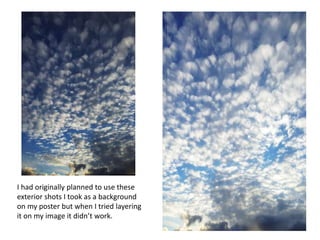
- 1. I had originally planned to use these exterior shots I took as a background on my poster but when I tried layering it on my image it didn’t work.
- 3. This was my first draft (above) of my poster but after getting some feedback from our focus group, people felt the stance was wrong with her hand on her hip and they felt there was too much to the left which made it look almost ‘pretty’. I also didn’t like how sharp and blunt my billing block looked so needed to change this.