1. Hip Hop
The slogan of the word “ Hip Hop at a higher level” on
the right hand side of the magazine emphasis that Hip
Hop is expanding to higher volumes of mass
recognition in the world of music, which has a state of
meaning that Hip Hop has move throughout the ranks
of getting respected and more airplay off its artist's.
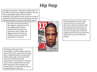
The colour of how the company
XXL magazine is labelled as red in
the background this clearly
emphasis that the colour red
represents a sign of anger and
aggressive tone of volume by
making it stand out more and
appealing to its audience.
The layout of the word “Jay-Z
Untouchable” actually emphasis that the
layout of the colour using red on the word
Jay-Z in big bold writing in red and that it
relates to the anger and serious look to
the artist himself and the word
underneath it “Untouchable” in the black
colour context emphasis that the colour
black represents a sign of power and
control, which can mean that this artist is
a powerful figure to Hip Hop.
The facial expressions of the artist
shows that he has a serious look
about him, which this emphasis that
the purpose of the artist eye is as if
when people buy theses magazines,
his eyes is stirring at you to buy this
magazine and find out more about the
artist, which says on the left hand
bottom.
2. Rap
The word above the KING magazine that
says “ Hip- Hop magazine no1 in Russia”
actually emphasis that this particular Hip
Hop magazine has a great fan base in
Russia with most of the audience in Russia
reading the magazine and getting an
insight to what the magazine is delivering
to them.
The headlines that surround the magazine
shows that it has a set of particular colours
to go along with, whereas some has artist's
names in bold and small writing in black, grey
and yellow colour content layout to the form
which emphasis that the artist's names on
the front cover of the magazine shows an
artist with a big reputation, in which the
target audience would have a insight on and
for the other artist's names on the right hand
bottom side are probably just use a back up
for the audience to read on, but the purpose
of the magazine is however focusing on the
artist's who has had a big look up on by the
media .
The colour of the magazine “KING” is in a black
colour layout, which emphasis that the content
of this magazine is it is more to do with the
purpose of it being unknown as well as hidden
and secretive.
The artist in the magazine has a serious look
about him because of his facial expression and
holding his head up by looking at the people
who plan on buying this magazine by stirring
through the eyes of that person in forcing them
to buy this magazine and the purpose of what
the magazine has to offer. This however tells
the audience that this is a Hip Hop artist just by
the display of how he dress, facial expression
and the amount of jewellery he is wearing
around his neck and watch around his wrist.
The picture layout of this magazine especially in
the background has no form of colour to what
type of colour the artist is wearing or his skin
tone, which clearly emphasis that the artist is a
mighty force figure and has gain a
representation of creditability for his purpose
as a artist.
3. R&B
The actual layout of this magazine
shows that this artist is not the only
main issue, but has other headlines to
do with other artist in which none of
their names are not in big bold writing
this actually states that there are used
as just back up through the deliverance
of this magazine, but mainly use her as
the main important towards her fans
that like her music to buy this magazine
and see what has happened to her
recently.
The name of the magazine Vibe is in big bold
writing and the colour effects to it has a yellow
layout and the colour yellow actually emphasis
that it is a mean of fun, happiness and uplifting
because it actually relates to the artist of this front
cover and the headlines that is on the left hand
side that state she is a new person with a new look
by the way she dress and uplifting herself from all
the worries that may do with her relationship.
The background of this magazine is in
blue, as it represents a sign of calmness
and that it has no form of negative issues
of the artist and it is actually for everyone
to read at a standard age whether in their
teens or adults.