SlideShare a Scribd company logo
1 of 24
Download to read offline
Get Started With Scribus
A Beginner’s Tutorial on Publication Design
Document Version: 0.1
Project: UNESCO/DigiArts
Contributed By: Sarai, India. (sarai.net)
Author: Niyam Bhushan (niyam.com)
Date: 23 April 2004
Copyright: © Niyam Bhushan 2004
License: Free Documentation License − FDL (gnu.org)
Availability: The latest version of this ongoing document could possibly
be found at the websites of DigiArts, Sarai, niyam.com, Linux-Delhi.org
or via web-search engines.
Software: Scribus
Platforms: GnuLinux, Windows, Macintosh
Category: DTP, Typography & Design
Version: 1.16 or higher (preferably built from CVS)
Website: www.scribus.net
Level: Beginner
What Can You Do With Scribus
Two things. Use Scribus to design and produce
magazines, newsletters, print-advertising, brochures,
calendars, and pretty much anything that requires text to
look visually appealing on paper. Scribus is also a great
tool for authoring PDF documents with advanced
features such as forms, buttons, passwords, and more.
You can make your PDF documents even more
'intelligent' by using Javascript from within Scribus. Our
tutorial focusses on how to use Scribus for professional-
grade design of publications. It also shows a brief glimple
of how to create an intelligent PDF. So let's get started.
For our project, we'll design seven pages for a magazine,
including its cover page. Yet within these seven pages,
you'll learn enough to create an entire 100-page
magazine, or even a full-blown newspaper.
G E T S T A RT E D W I T H S C R I B U S • B y N i y a m B h u s h a n f or S a r a i . n e t • A p r 2 0 0 4 • 1
Scribus And Its Sisters
[Download Yesterday Night's Version] Visit www.scribus.net and head
to the downloads section. Please read the instructions in the
documentation section on how to install Scribus for your platform (mac,
win, linux, *bsd). You could start with the stable download available. As
your skills grow, may I strongly recommend you discard the stable
version, and click on the 'changelogs' or 'CVS' button instead. This,
because Scribus evolves rapidly on an almost nightly basis. The CVS
version is equally stable, and quite often, more stable than the official
stable version. It is also significantly ahead of the stable version in its
features and capabilities. Every two or three days, I tend to issue the
simple two-line commands from my PC, and get hold of a freshly-baked
Scribus with a slew of new features added. Try it. You'll love it. Just
follow the simple instructions on the Scribus site on how-to install from
CVS. For those who don't know, CVS stands for Concurrent Versioning
System, a clever way for several programmers from diverese
geographical locations to store their software at a central repository as
they dynamically work on it.
Do read the requirements page on the site. This because Scribus needs
some rather important files installed on your system. For GnuLinux
users, I specially recommend just installing the latest release of your
favourite distribution. As an example, I spent nearly three weeks trying to
install Scribus 1.1.6 under RedHat8. Each time I added a required file,
another dependency would crop up. Finally, I just installed the latest
Fedora in a separate partition, and Scribus installed within 20 minutes
without a murmur.
[Get Acrobat Reader, even for GnuLinux] Scribus is a great tool for
creating PDFs. Yet not all PDF viewers are created equal. Especially
under GnuLinux. So, head to adobe.com and download and install the
latest, native version of Acrobat Reader for your platform, even for
GnuLinux. Should you find a newer release of Acrobat Reader for
Windows, say Version 6 for Windows, while you have Version 5 for
GnuLinux, download the Version 6 for Windows, under GnuLinux. The
developers of Scribus recommend you run this version using a
Windows-emulator software under GnuLinux, such as WINE or
CrossOver, to run this native Windows application under GnuLinux.
However, this is not mandatory. You could still work with the older
version, or view your files under Windows if dual-booting, or on another
machine.
[Match Colors That Print] Finally, if you wish to design publications, you
need to ensure colors you see on screen match colors that print. For
this, you need to install a special and separate piece of software, called
a Color Management System, or CMS. Windows and Macintosh come
with a CMS built-in, called ICM and ColorSync, respectively. Under
GnuLinux, you need to install a free CMS, called LittleCMS. Download
and follow the instructions at littlecms.com. You can also install versions
of this under Windows and Macintosh. For this tutorial, LittleCMS is not
necessary, though quite helpful.
G E T S T A R T E D W I T H S C R I B U S • B y N i y a m B h u s h a n fo r S a r a i . n e t • A p r 2 00 4 • 2
[You Can Use Your Existing Fonts Collection] Do you have a
collection of fonts that you wish to use under GnuLinux? Install your
existing TrueType, Postscript, or OpenType format fonts under
GnuLinux. You'll find the simple steps mentioned in the documentation
section of the Scribus site. For our tutorial, we don't need to install any
special fonts. So you can start right away with your first sample
publication.
[Sane Workflows] Our magazine is called 'FreedomYug' and it contains
a lot of pictures and text. A magazine with a few hundred pages could
also have several Scribus files, each with eight to 20 pages. So, it is best
to create a folder for each publication. I've created one called 'Fyug'.
Inside this, create atleast two distinct folders, 'Text,' and 'Images'. Using
a wordprocessor, such as OpenOffice.org, author your articles and save
them in the Text folder. For the moment save a version in simple text
format, with the extension .txt. While I write this tutorial, the developers
at Scribus assure me that soon you can save your text as Rich Text
Format (.rtf) and import it into Scribus, with all your typesetting, such as
bold, italic, and bold-italic text and other formatting intact.
Similarly, scan or enhance photographs and store them in the 'Images'
folder, mostly as *.JPG files.
Empty, White Spaces
A magazine or a publication design is not about text and images on the
page. It is about empty, white spaces on the page. The text and images
merely punctuate this emptiness. These 'breathing' spaces are
important, much like gardens, parks, and other open-air sites are
important to any high-density metropolis. So launch Scribus, go to the
File menu, and click on New. For the rest of the tutorial, I will use the
following convention to describe menu choices: File>New.
[New Emptiness] The New command displays this dialog box. Click on
the 'Default Unit' drop-down box, and choose 'Millimetres (mm)' rather
than the default 'Points'. Click on the drop-down menu of 'Size' and
choose 'Custom' for the page-size of our magazine. Enter the above
dimensions for width and height. Note the level of precision beyond the
G E T S T A RT E D W I T H S C R I B U S • B y N i y a m B h u s h a n f or S a r a i . n e t • A p r 2 0 0 4 • 3
decimal-point to the right, offered by Scribus. Click on 'Facing Pages' so
you can view pages side-by-side, as in a realworld magazine. Enter the
above margin area, that marks off the actual printing area, inside the
physical paper. Click 'OK' to view your first blank page in Scribus.
Cover Page
If you see too many gridlines on your blank page, goto View>Hide
Grid. You will see blue-colored lines marking the outer margins of
your page. The concept of Scribus is quite simple: To place a photo
on the page, first you must create a photo-frame and then import
the photo into this frame. Similarly, to place text on the page, you
must create a text-frame first, and then insert, or type, text into this
frame. You'll soon discover that this approach has some great
advantages.
[Insert Picture] Here is a screenshot of a panel that contains all the
Tools that Scribus offers. Glide your mouse over each icon to find
out what each tool does. Click on the third one. That's the one that
allows you to insert a Picture frame in the page. That's what you
want for placing the cover picture. Drag your mouse from the top-
left of the scribus page, to the bottom-right. Don't worry if you don't
get it exactly right. You'll find a picture frame drawn on your page,
in the shape of a large rectangle, with black-colored diagonal lines
forming a large 'X' through it. This is a traditional printing-industry
custom, to distinguish
picture frames from text
frames. That 'X' won't
ever print, so don't
worry.
[Soul of Scribus] From the menus, go to Tools>Properties.
Along comes a dialog-box that is at the heart and soul of
Scribus. All objects you add to the page, from picture
frames, text frames, or even actual photos, text, or lines, are
all controlled from this central dialog box. Make sure the
picture frame you just created is highlighted. Usually red-
colored or other colored square dots will mark all the four
corners as a visual cue. If not, in the Tools palette, click on
the first icon, and just click on the picture frame. The
Properties dialog box will instantly show all its details.
Give a human-readable label to this picture-frame, such as
'CoverPhotoFrame' in the 'Name' field of Properties. In case
you do not see the 'Name' field, just click once on the top
tab, that says 'X,Y,Z'. Next, precisely place the top-left of
your picture frame on the top-left edge of your page. In the
X-Pos and Y-Pos fields, type in the values of 0mm, each.
Pos is obviously a short-form of Position. Type in the Width
and Height at 210 mm and 280 mm respectively. Your frame
is precisely placed on the page.
G E T S T A RT E D W I T H S C R I B U S • B y N i y a m B h u s h a n f or S a r a i . n e t • A p r 2 0 0 4 • 4
[Get Picture] Click to select the top-icon in the Tools palette, and then
right-click anywhere inside this picture frame. You will see a menu pop-
up right under the mouse cursor. Select 'Get Picture' from this menu. A
dialog-box opens up for you to navigate into your FYug folder, and then
into the images folder, so you can select the 'TitleFX.jpg' sample image.
Click on the OK button. The picture frame on your Scribus page is
immediately filled with the TitleFX.jpg image.
[Nudge Picture to Left] Note the sculpture in the image is too much to
the right. We must drag the picture inside the picture frame to the left, so
that the sculpture is positioned in the centre of the picture frame. Extra
parts of the picture will get automatically cropped out of view beyond the
boundaries of the picture frame. So, to move the picture, make sure the
picture frame is selected, go back to the Properties dialog box, and click
on the top-right tab titled 'Image'. In the field marked X-Pos, just type in
the value “-90mm” to move the image 90 mm to the left. Note how the
image is shifted inside the picture frame.
[Color Karma] At the bottom
of the Properties dialog box,
you may have noticed a
section called 'Input Profiles.'
This will only show if the
LittleCMS on your PC is
correctly installed and
configured. The color of your
images may look markedly
different on your screen, and
even more when you print
them. This little area
minimizes such color
mismatch. From the pop-up
for 'Input Profile', choose a
color profile that closely
matches your monitor. Scribus
immediately re-renders the
image on the screen to
display colors according to
that profile.
The actual install of LittleCMS and how to use it under Scribus is actually
quite simple, but beyond the scope of this tutorial. But here are some
good tips:
1) Download a set of free profiles from the adobe site, so you can send
images between Mac, Windows, and GnuLinux. 2) Create a custom
color profile of your own monitor and use that instead of any other.
[Save] You may want to save your file before proceeding. So head over
to File>Save and type the name 'Fyug.sla' for your file. Save it in the
FYug folder. You can also just click on the floppy icon in the taskbar,
right underneath the menus, to save your file.
G E T S T A RT E D W I T H S C R I B U S • B y N i y a m B h u s h a n f or S a r a i . n e t • A p r 2 0 0 4 • 5
[Masthead Band] The cover page of any magazine has its name
emblazoned across the top. This is called the Masthead. Ours is titled,
“FreedomYug.” We'll start by creating a semi-transparant band for the
Masthead. Go to Edit>Preferences>General. Click on Display, and make
sure this checked: “Use PDF1.4 Transparancy Features.” Click OK. Your
document now supports transparant objects.
Click the fourth tool in the Tools palette. Should you hover your mouse
over this, the roll-over text would display “Draw Various Shapes” or
something similar. Select the rectangle shape from the drop-down menu.
Click anywhere near the top-centre of the page and draw a rectangle.
Make sure the rectangle is selected, and immediately go to the
Properties palette, click on the 'X,Y,Z' tab, and enter the following
values: X-Pos: 30mm. Y-Pos: 0mm. Width: 150mm. Height: 33mm. Give
it a name, such as 'MastheadBand' in the Names field.
Then click on the 'Colors' tab in Properties. Click the Pencil tool to select
the stroke or outline border. Click on 'None' in the colors list. Then, click
the bucket icon to select the fill color. Click on 'Black' from the list of
colors, and in the opacity field, enter 69%. You will see the band has
turned semi-transparant, and partly shows the image through itself, in
darkened colors. Experiment with Opacity and other colors to your taste.
[Add More Bands] Draw another rectangle towards the centre of the
image. In the Properties, give X-Pos: 93mm. Y-Pos: 160mm. Width:
115.35mm. Height: 13.75mm. Again in 'Colors', set the stroke to None,
and the fill with Black at an opacity of 69%. Call this the 'HeadlineBand'.
A third rectangle, named 'SubHeadBand' can be drawn slightly
underneath this, at X-Pos: 100mm. y-Pos: 180mm. Width: 109.7mm.
Height: 18.35mm. The fourth and final rectangle, this time a little square
box, will have the following Properties: X-Pos: 20.5mm. Y-Pos: 245mm.
Width and Height will both be 9mm.
G E T S T A RT E D W I T H S C R I B U S • B y N i y a m B h u s h a n f or S a r a i . n e t • A p r 2 0 0 4 • 6
[Create Colors] Hold on! Don't fill this with the same 69% Black. Let's give it a fresh lime green color.
Go to Edit>Colors... in the menus. A dialog box listing existing colors displays on your screen. Click on
'New' and give your new color swatch a name, 'Lime Green'. In the second dialog-box that opens up,
choose 'CMYK' as the Color Model. This closely follows the inks of Cyan, Magenta, Yellow, and Black,
used in your desktop printer and in printing plants, that mix inks to create new colors. With the sliders at
the bottom, give C:69%, M: 10%, Y:100%, and K: 0%.
[Locked Bands] Click
OK in this dialog box,
and then click OK again
in the Colors dialog
box, where you'll notice
your new color added.
Go back to your page,
click on the small
square you just created,
and in the 'Colors' tab of
Properties palette, give
it a stroke of None, and
a fill of LimeGreen, at
100% opacity. You
cover should look like
the screenshot here,
with all the bands for
text.
One last thing. Select
each semi-transparant
band individually, and in
the Properties palette,
in the 'X,Y,Z' tab, click
on the icon of the
padlock at the bottom.
This ensures you
accidentally do not
move or resize each
locked object.
Similarly, lock the CoverPicture Frame as well, and the green square,
using this padlock. Also, uncheck 'Text flows around frame' for each of
these rectangles. This keeps text that will overlap the rectangles, from
jumping away from it.
Working With Layers On A Page
[Why We Need Layers] We are going to format the text for the
magazine's masthead, the headline, and the subhead. Imagine if this
magazine is published in several languages. One way to then produce
this magazine would be to recreate the magazine layout for each
language. The other way, is to have the text for each language on
another layer. Think of layers like transparant sheets that overlap one
another. You could hide or view layers, for example: hide the English
text layer, and show the Hindi text layer.
G E T S T A RT E D W I T H S C R I B U S • B y N i y a m B h u s h a n f or S a r a i . n e t • A p r 2 0 0 4 • 7
Layers bring a lot of convenience into page-design. For
our magazine, I will keep the background image and
bands in one layer, and have the text contained in
another layer. Go to Tools>Layers. In the dialog box,
you will see one existing layer, that contains all your
objects so far. Uncheck the 'eye' icon to the right of
this, and all elements of this layer disappear, leaving
you with your empty page.
Click inside the name of this layer, and change it to 'Bg
Photo'. Click the bottom-left icon, that adds a new layer
on top of the existing layer. Change the name of this
layer to 'CoverText'. Make sure this layer is highlighted,
so Scribus knows whatever elements you create will
exist on this layer. Ensure the 'eye' icon is checked so
you can view your layer.
[Enter Text in a Text Frame] Ensure the CoverText layer is highlighted
in Layers. Click on the the text-frame in tools and drag a text frame
across the MastheadBand. For the moment, make the text frame as
wide as the page and nearly double the height of the MastheadBand.
Click the 'Story Editor' icon in Tools. This is next to the 'Edit Frame
Content' icon. In the
screenshot here, it is circled in
orange. A dialog box displays,
where you can enter the text
you wish to have published in
the text frame. Think of the
Story Editor dialog box as a
mini note-pad or word-
processor for each text frame.
This is the second-most
important dialog box in
Scribus, after the Properties
dialog box we saw earlier.
Type the text: “FreedomYug” in
the Story Editor. Then click on
the File menu inside the Story
Editor, and choose 'Save and
Exit.' This publishes your text
into the text frame, and exits
the Story Editor from your
screen.
[Make Text Look Beautiful] 'FreedomYug' will look attractive if the gaps
between the letters are reduced, and if the text fits into the
MastHeadBand. The overall gap between letters is called 'Tracking.' To
reduce this tracking, right-click on the text frame, and from the pop-up
menu, choose 'Show Properties'. In 'X,Y,Z' uncheck 'Text flows around
frame'. On the buttons at the top of this dialog box, click on 'Text'.
G E T S T A RT E D W I T H S C R I B U S • B y N i y a m B h u s h a n f or S a r a i . n e t • A p r 2 0 0 4 • 8
[Track] From the drop-down menu of Fonts in the Properties dialog box,
choose 'Georgia Regular' or else Times Roman or any other font you
fancy. Make the size: 84 points. Traditionally, a point is a unit of measure
in the printing industry. 72.27 points make an inch. In digital print
publishing, this is rounded-off to 72 points make an inch. Text size is
usually measured in points. Select 'Red' from the drop-down menu next
to the bucket icon, which stands for 'Fill Color' for our text. In the field
labelled Kerning, enter -5 pts. Line Spacing at 72 pts. You will find the
gaps between the text has squeezed, and the text has changed to the
color red.
[Kern] Stop reading the headline text. Look at it. You will find a larger
gap between the 'm' and 'Y' of 'FreedomYug'. You will also find
seemingly irregular gaps between other letters, such as between 'd' 'o'
'm', and 'Y' 'u', and even between 'u' and 'g'. This is because the shape of
the Y curves in, creating an optical illusion of a bigger gap. The 'o'
curves in from all sides, again creating the illusion of a bigger gap. Use
the 'Edit Frame Content' icon, the one that looks like a hand next to a
cursor. Click directly at the text, specifically between 'm' and 'Y'. In the
Properties palette, enter '-11 pts' in the 'kerning' field. The gap shortens
even more. Similarly, tighten the spaces between all the other letters
individually, until the text 'FreedomYug' looks tightly kerned and tracked.
Finally, drage the corner red sqaures of the text frame to the
MastHeadBand, and click the padlock icon to lock its position.
Use the same technique, put the text 'The new era of computing' under
G E T S T A RT E D W I T H S C R I B U S • B y N i y a m B h u s h a n f or S a r a i . n e t • A p r 2 0 0 4 • 9
'FreedomYug' taking care to uncheck 'Text flows around frame'. Here,
the text is actually set to loose tracking. I entered '+5pts' in the kerning
field. For 'Why Khajuraho Needs Gnu/Linux' you need to press the return
key after the word 'Khajuraho' in the Story Editor. Similarly, draw a text
frame next to the green box, and enter the yellow-colored text. Use the
image on Page 1 of this tutorial as a reference for all text elements. Or
check the PDF file or the Scribus file of this sample magazine.
Design Multiple Pages
[Many Unique Page Designs] This mag's pages are 210mm x 280 mm.
However, not all pages will have the same look. I need three pages with
a layout meant for a Features article, with perhaps two columns, and a
generous white space on the outer left or outer right edge of the page.
Another page could look like a feedback form, which could have only
rows and tables. Still another page could be the Contents page.
Interestingly, once I decide that a Features page
needs two columns, and a half-column of empty white
space on the outer-left or outer-right, with a section
name on the band on top, I want every page that runs
a Feature story to look consistently the same. Thus, I
need a 'Template Page' for Features, that defines all
the columns and other common graphic elements for
the Feature pages. I can then add as many pages as I
wish into the actual Scribus file, from this template
page, and add the actual text and photos to these
pages.
[Make A Page Template] Go to Edit>Templates.... A
dialog box listing existing templates opens up. You will
only see one default template, called 'Normal.' That's
the one you've been using for the cover page. Click on
the button 'New'. In the resulting dialog-box, name the
template 'FeatureL' and choose 'Left Page' from the
drop-down menu. You end up with a blank page, with
blue lines marking the outer margins.
G E T S T A RT E D W I T H S C R I B U S • B y N i y a m B h u s h a n f o r S a r a i . n e t • A p r 2 0 0 4 • 1 0
With the 'Edit Templates' dialog box still showing, and
your new empty pages on-screen, go to
Page>Manage Guides, in the menus on top. We are
going to add some horizontal and vertical guides,
which are lines that won't print, but guide your eyes
into placing columns of text, and graphics, with perfect
alignment.
[Operators] The left page has a 20mm margin from
the left edge. Inside this margin, I wish to leave a half-
column of white space, of 45mm. So in the 'Manage
Guides' dialog box, click on 'Add' under the 'Vertical
Guides', and in the X-Pos field, type “20+45”. Yes,
Scribus will use simple math operators in all fields that
require a numerical entry. (You can even enter “30
mm + 1.5 in” to operate between different units). Add
the other vertical guides at 122.5 mm and 127.5mm.
Look at the numerical precision with which Scribus
places it. Add a Horizontal guide at 265 mm.
Important: click the 'Lock Guides' button at the bottom
so your guides don't accidentally move on the page.
Click OK. Your page will have guides similar to the
screenshot here.
[Page-Numbers] Add the Red band on top, place a text frame with that
loose-tracked text 'Khajuraho' at the top. Follow the steps you learnt in
the previous section. Similarly, add a text frame at the bottom for the
magazine name, issue detail, and page number. Except you don't type a
static page number. Just press the control key + # combination. To
counter-check your command, go to Edit>Preferences>General. Click on
the button 'Keyboard Shortcuts...'. Scroll the list to find your shortcut.
G E T S T A RT E D W I T H S C R I B U S • B y N i y a m B h u s h a n f o r S a r a i . n e t • A p r 2 0 0 4 • 1 1
[Right Page] To create the Features page for the right hand side, click
on New in Templates, choose 'Right Page' from the drop-down menu,
name the template 'FeaturesR'. Bring up Page>Manage Guides, and
enter the following for adding Vertical guides: 82.5mm, 87.5mm,
145mm. Add a Horizontal guide at 265mm. Like with FeaturesL, add the
red band on top with text, and the page number details at the bottom.
Click the 'Close' button on the Templates dialog box. You find yourself
back in your Scribus document's regular pages.
[Drag-'n-Drop Pages] Go to Tools>Page Palette in the
menus. In the palette, you will find your existing front cover
as page one, and three templates in the above section,
Normal, FeaturesL, and FeaturesR. To add another page,
click and drag FeaturesL from 'Available Templates' to the
'Document Pages' area, below-left to the Normal first page.
Page 2 is thus automatically added, to the left side.
Similarly, drag and drop a page 3 with FeaturesR, and page
4 with FeaturesL. Zoom in on the actual document pages
and note the page numbers are automatically generated.
[Two-Columns of Text Per Page] Using the guide-lines on
each page as a cue, click and drag to create a text frame
from the top-left of the first column of each page, to the
bottom-left of the second column of each page. Yes, this
will be one text frame per page. Select each text frame, go
to the Properties palette, click on 'Shape' and at the bottom,
type '2' in the
'Columns' field,
and '5' in the
'Gap' field. Each
text frame now
contains two
columns.
Uncheck 'Text
flows around
frame' on the
'X,Y,Z' tab of the
palette, for each
text frame.
[Use Consistent Paragraph Styles] Good publication design
is about using consistent styles. The formatting for the main
story, called the 'Body Text' must be the same for all pages,
and all stories. Similarly, headline, captions, and sub-heads
styles must also be consistently used throughout a publication
or a section. Rather than manually punch in the specific font,
size, and other settings each time, it helps to define the style
once, and then just click on it to set a selected paragraph in
that style. Automatic for the people.
G E T S T A RT E D W I T H S C R I B U S • B y N i y a m B h u s h a n f or S a r a i . n e t • A p r 2 0 0 4 • 1 2
[Define Paragraph Styles] Here is a screenshot of all the
paragraph styles in my document. You can access the list
using Edit>Paragraph Styles... from the menus. Let's
create a new style in your document, called 'Body Text'.
Click on 'New' in the Paragraph Styles palette, and in the
opening dialog box, choose your font, alignment of text,
size, line-spacing, and other aspects. The important thing
to note here is 'Baseline grid'. A professional feature, this
ensures that text across columns align to one another.
Try playing with it to see how it works. This kind of
precise alignment of elements across a page or a double-
spread page is what differentiates professional
typography from amateur work.
Please define paragraph styles for all possible styles: headline, sub-
head, caption, box story, or whatever. The best way to do this is to
create some sample text for each type, and once satisfied, jot down all
its typesetting features, and manually create a paragraph style for each.
[Flow Your Text] Right-click the first text frame, on page two. From the
pop-up menu, choose 'Get Text...' and hop over to the Text folder in
FYug. Select the khajuraho.txt file, and press 'Open'. You will see the
text flow into two columns on this page. At the bottom-right of the text
frame you'll see a 'X' mark in a box, which means there's more text than
can fit in this text frame. Click the first frame to select it, go to the Tools
palette, and click on the second-last button with a tool-tip that displays
“Link Text Frame.” Click on the text frame on the next page. Voila! Text
flows from the text frame on page two, to the text frame on page three.
Similarly, add links between frames for each additional page.
G E T S T A RT E D W I T H S C R I B U S • B y N i y a m B h u s h a n f o r S a r a i . n e t • A p r 2 0 0 4 • 1 3
[Format To Body Text] You'll notice the text on each page is in some
random plain-text formatting. Just rclick on the first text frame of this
multi-page story. That's the one on page two. Go to the Properties
palette, click on the 'Text' tab, and choose 'Body Text' from the
paragraph styles in the drop-down menu next to 'Style'. Note you can
even choose a language from the drop-down menu below. As I write
this, the developers at Scribus are working towards integrating Indic
languages so you can soon have Scribus formatting text in Hindi, Tamil,
or other Indian languages.
Create Final Page Layouts
[Make space for Photos and Headline] You've got the
general idea of how Scribus creates templates,
paragraph styles, and works with text frames and picture
frames. Time to design all the feature pages of the cover
story. Go to page two. This you can do by clicking on the
page icon in the page palette, or at the extreme bottom
of your screen, you will see a go forward button, a go
back button, and pop-up list in-between where you can
choose the page you want to visit.
Click the text frame on page two, and in Properties, in 'XYZ' key-in X-
Pos: 65mm, Y-Pos: 201.5, and Height: 48.5mm. The text frame shrinks
to the bottom of the page. Note how the text automatically flows to the
next page. Link the text frame on page three, to the subsequent text
frame on page four, so text flows from page to page.
[Insert Picture] Select the picture frame icon from Tools, just like you
did for the cover page. This time, draw a random picture frame on the
top of page two. In Properties, give it X-Pos: 20mm, Y-Pos: 35 mm, W:
135mm, H: 100mm. Right-click this picture frame. From the pop-up
menu, choose 'Get Picture...'. Go to the images folder inside the FYug
folder, select the file 'EnterTitle.jpg' and click 'Open.'
[Resize Picture] In the Properties palette, click on the 'Image' tab, check
'Free Scaling' and then key-in X:0mm, Y:-30mm, X-Scale and Y-Scale at
32% each. This will shift the photograph 30 mm to the left, inside the
frame, and then scale it down to 32% for that perfect crop.
[Typeset Headline] Draw a text frame. X-Pos: 20mm, Y-Pos: 142mm,
W: 165mm, H: 39mm. In the 'Text' tab, choose Georgia Roman 48 pts
on line spacing of 42 pts. You could choose Garamond or Times if you
wish. Set kerning to -1.0pts. Then zoom in and manually kern the
individual letters until you get a crisp, neatly tucked-in headline.
[Hanging Drop Cap] If you go back to Edit>Paragraph Styles... in the
menus, and edit any existing style, you'll note an automatic drop-cap
feature available, for your preferred number of lines. But let me show
you how to create hanging drop-caps, and you'll also learn how to
handle wrap-arounds the Scribus way. Take the 'Draw Shapes' tool, draw
a rectangle, at X:59, Y:200, W:19, H:24.3. Fill and stroke this with 'None'
in 'Colors' so it does not show. Check 'Text flows around frame' and
G E T S T A RT E D W I T H S C R I B U S • B y N i y a m B h u s h a n f o r S a r a i . n e t • A p r 2 0 0 4 • 1 4
you'll see the first para of your article flowing around this “empty” space.
Next, draw a text frame at X;52, Y: 195, W: 24.5, H: 36. Uncheck 'Flow
text around frame' for this. Using either the story-editor or the hand-
cursor icon, enter the letter 'D' in this text frame. In Properties, set this to
Georgia Roman, 87 point, with leading at 104 points. Fill this with Black.
Click on 'Shade' choose 'Other' from the drop-down manu, and type
69%. Your drop-cap is done. Should you want to select the invisible
rectangle used for wrapping text, and end up selecting this text frame
stacked on top of it, press control+shift click and repeatedly press until
you select the correct object in the stack.
[Done!] Go to View menu and hide the guides, frames,
margins, and grids. Your layout will look like the above
screenshot. On page three, the sculpture picture frame has
an invisible rectangle behind it, that wraps around the text.
Just like we did with the drop-cap. The captions are just a
text frame in the half-column. The generous white space at
the bottom of the first column, is likewise just an invisible
rectangle with 'flow text around frame' checked. Study the
provided FYug.sla file for further details.
[Gradient-Filled Box Story] The body text flows to page
four. A single text frame in the half-column on the left
contains the story and photo credits. The box-story at the
bottom is a text frame that is formatted with various
paragraph styles. The gradient in the text frame is applied
in the 'Colors' tab of Properties. Underneath the 'bucket'
icon a drop-down menu with the word 'Normal' reveals
'Vertical Gradient' among others. Choose LimeGreen at
40% as color#1, and CyanBlue at 20%. The text has a gap
of 2.5mm from top, bottom, left, and right of the text frame.
This is set in the 'Shape' tab of Properties. A red square is
drawn to mark the story end.
G E T S T A RT E D W I T H S C R I B U S • B y N i y a m B h u s h a n f o r S a r a i . n e t • A p r 2 0 0 4 • 1 5
Design With Graphics and Freedom
[Many Unique Page Designs] Page five jumps into
graphics-oriented, creative freedom where page
geometry is conformed to with defiance. Take a look at
the screenshot here. It looks dramatic, but thanks to the
power of Scribus, is quite easy to produce.
[Copy Elements to Template] First, start by creating a
new template in Edit>Templates.... Choose a right page
from the drop-down, call it '7steps'. A blank page graces
your display. Then, click on your earlier FeatureR
template, and drag the mouse from the top-left to the
bottom-left of the page to select the red band on top with
the text, and the page folio and page number text frame
at the bottom. Click on your new '7steps' template. Right-
click anywhere and select 'Paste.' Alternatively, go to
Edit>Paste from the menus. The elements are pasted
into the exact position they belong to, thanks to the
intelligence coded into Scribus. Change text to 'Newbies'.
[Visual Guidance] Amazingly, the layout has 15 columns
that align elements. Check the next screenshot. So, go to
Page>Manage Guides.... Add a Vertical guide at 36mm.
Then add 11mm to this to create another guide. Continue adding 11 mm
to the result of the previous guide, until you read 179mm. Check 'Lock
Guides' and click OK. Close the templates palette and add page five to
your document, in the Pages palette, by dragging the '7steps' template
to after page 4 in the page palette.
G E T S T A RT E D W I T H S C R I B U S • B y N i y a m B h u s h a n f o r S a r a i . n e t • A p r 2 0 0 4 • 1 6
[Seventh Wonder] In a new text frame that you draw on the page, enter
the letter '7' in Georgia Roman, at say, 200 points. Right-click the text
frame, and from the popup menu, choose, 'Convert To > Outlines'. The
letter '7' is converted into a graphics outline. Align it to the top-left of
your margin, and drag the lower-right to the second-last column, bottom-
right. The graphic '7' automatically scales to fit the whole page.
Do you want to tweak the shape of '7'? Go to the Properties palette, to
the 'Shape' tab, and click on 'Edit Shape.' Enjoy. Finally, padlock the '7'.
Important: For each text frame or other element that is placed on this
page, please uncheck 'Text flows around frame' so you dont' have text
jumping to another position suddenly.
[Shapes for Text] Drawing the shapes is easy. Click and hold on the
square icon in Tools, and discover more than 16 shapes you can freely
drag and draw in Scribus. Click on the 'Polygon' tool and you can even
draw stars with as many corners as you wish and other options. For each
shape, choose Fill 'None' and Stroke 'Black'. The thickness and style of
the line is in the 'Line' tab of Properties, where i chose a 1 point thick
solid line. Discover more styles and options for yourself here. The design
looks good because all shapes are aligned to any two random vertical
guides. In effect, that makes the width of each shape a multiple of
11mm, since the guides are all 11mm apart.
Right-click each shape, and choose 'Convert To > Text Frame'. Then,
enter the text using the story editor, or type it in directly, and apply a
special '7steps body text' paragraph style, defined earlier.
G E T S T A RT E D W I T H S C R I B U S • B y N i y a m B h u s h a n f o r S a r a i . n e t • A p r 2 0 0 4 • 1 7
[Use Scrapbook for Steps] For the label 'Step 01' draw a box, fill it with
a color, draw a text frame on top with the text 'Step 01', draw a red line
to connect it to its relevant shape, and then group the whole label with
its line, using Item>Group in the menus.
Go to Tools>Scrapbook menu. A dialog box displays,
called the 'Scrapbook' meant for oft-used elements. Drag
and drop the label into it. Also drag and drop the red-
colored story-ender box. You can then drag and drop the
label to any other shape, edit the text, re-draw or edit the
red line to connect to it, and have lots of fun.
[Rotated Text] In another fresh text frame, typeset
'Seven Steps To Software Samadhi' in all-caps, red
letters. In the Properties palette, rotate it to 60 degrees in
the 'X,Y,Z' tab. You could fine-tune the angle until it fits
perfectly. Add all the other text on the page in their text
frames, and you're done.
Set Fire With SVG Graphics
[Graphics R Us] The flame logo is a special type
of graphic, called a 'Scalable Vector Graphic' or
SVG for short. It can be enlarged to any size
without loss of quality, and even the shape of the
flame can be edited in Scribus. Yes, even the
colors are imported from the image into the Colors
palette of Scribus, and colors from within Scribus
can be applied to the image, as has been done
here to multiple copies of this graphic. Note how
the text is set on a curve created within Scribus,
and the automatic drop-caps to the text column.
[Ignite] Start with a new Template, call it 'GyaanL'.
Copy and paste the red band, text, and page folio
and page number from another left-page template.
Change the text to 'Education' in all-caps. In
Page>Manage Guides, add two vertical guides at
65mm and 70mm. Lock them, and close the
templates palette. Add another page using this
template, in the Page palette. Or you could use
Page>Insert... menu.
G E T S T A RT E D W I T H S C R I B U S • B y N i y a m B h u s h a n f o r S a r a i . n e t • A p r 2 0 0 4 • 1 8
[From Flame to Flame] You don't need a Picture frame to
place an SVG, you can do it directly. Go to
File>Import...>Import Svg-Image. Navigate to the 'Images'
folder of FYug, and select the 'Highly-Inflammable.svg'
image to import. A huge graphic fills the page. Just select it,
and in Properties, give it the height and width of 45 mm.
Position this graphic to the top-left margin of the page.
Check Edit>Colors... and you will find the orange color in
the image has been marked and imported into the Colors
palette.
[Colorize] Select both the frame and the orange box, go to Item>Group.
Then copy and paste it right underneath the first one. In the Properties
palette, type '+5mm' at the end of the Y position, to automatically move
it down by 5 mm. Thus, copy and paste until you have five copies of the
graphic on the page, with a 5mm gap between each one vertically.
Select each graphic, ungroup it, select the background color, and
change the color of each in the Properties palette.
[Dragged Guides] From the horizontal rulers just below the taskbar and
above the page, click and drag a horizontal guide to the bottom of each
box. Toggle 'View Guides' so in the View menu, so you can see the
guide. Finally, draw text frames to the height of each graphic in the
column on the right, and type in the text. Define a Paragraph style that
has a drop-cap of two lines, and apply that style to each text frame.
[Page Number on Top] Did you note
the problem of the last graphic
overlapping the page number and the
page folio text? Go back to the
Templates palette, copy the page folio
text frame that contains the page
number. Close the Templates palette,
go back to your page, and just paste it
on top. The page number comes in
automatically to this text. Draw a white
box above the original page folio.
Place the flame graphic above this, and
finally paste the new folio text frame
above this. You can use the up and
down arrows in the Properties palette
to change the stacking order of
overlapping objects. Do ensure that the
page folio you paste, is into the top-
most layer of your page. Counter-
check in the Layers palette.
G E T S T A RT E D W I T H S C R I B U S • B y N i y a m B h u s h a n f o r S a r a i . n e t • A p r 2 0 0 4 • 1 9
[Text on Path] The text on the curve is pretty
easy. Write the text in a text frame. Draw a
curve using the 'Insert lines' tool. Use the
tool that has a pencil with a line shaped like
an 'S' around it. To draw the curve, just click
once at the starting point of the curve, and
drag briefly to the top-right. Then release the
button, click at the end position of the curve,
and drag briefly to the bottom-left. Once you are satisfied with the
curve shape, just right-click the mouse and your curve is done.
Select both the text frame and the curve, and select Item>Attach
Text to Path. The text will follow the curve. You can play with
alignment and other settings in the Properties palette. Rotate the
whole curve slightly for a better fit.
Publishing Demands Freedom. PDF.
[PDF-authoring] The screenshot
shows the GnuLinux version of
Acrobat Reader. Yes, a free
version is available from the
Adobe site for GnuLinux as well.
The document you see inside it, is
a scoreboard created from Scribus,
the free desktop publishing
software. The background is an
SVG graphic with a tint, and the
fields, check boxes, and even the
'Click to Submit' button has been
authored inside Scribus. Yes, the
PDF elements contain Javascript
embedded from within Scribus.
You guessed it. Scribus is a
mature PDF-authoring software.
Use it to create PDF forms, PDF
documents, and you can even
digitally sign your PDF documents
with Scribus.
Look carefully. The headline bands
are semi-transparant. The flame
shows through. Scribus supports
PDF 1.4 transparancy too. For
your convenience, this is a
separate file: FyugScoreCard.sla.
Also check out its PDF version.
G E T S T A RT E D W I T H S C R I B U S • B y N i y a m B h u s h a n f or S a r a i . n e t • A p r 2 0 0 4 • 2 0
[Design The PDF Layout] The design looks dramatic, but the layout is
quite simple. It has only one column, which contains all the questions, in
one text frame, on the left. The half-column on the right contains some
information in a text frame. The headline and the Name, Address, etc,
are in a text frame that spans the entire width of the page. The colored
bands to mark the sections are obviously colored rectangles drawn
behind the section sub-heads. The logo in the background is just the
flame from the 'inflammable' SVG graphic. This time it is colored to Red
at 20% shade. It is kept on another Layer stacked at the back.
[Clickable PDF Elements] The real questions are, how are
the text fields, number fields, check buttons, and 'submit'
button drawn that they work interactively inside Acrobat
Reader or other PDF viewer programs? Use
the special PDF tools in Tools>Toolbars>PDF
Tools. Chances are you already have it open on
your screen. An almost complete array of PDF
elements can be authored in Scribus.
Once drawn, use the Properties palette for
some cosmetic finishes. Then right-click the
PDF element, and choose 'Is PDF Annotation'
from the pop-up menu. Right-click again, and
this time choose 'Field Properties.' You could
also double-click the PDF element to
configure it for PDF options. All PDF features
are expressed here as screenshots. Enjoy.
G E T S T A RT E D W I T H S C R I B U S • B y N i y a m B h u s h a n f or S a r a i . n e t • A p r 2 0 0 4 • 2 1
[PDF for Press] Scribus' greatest feature is that it can
create PDF files which can be handed to a publishing
house or printing plant for production. Yes, PDF comes in
many flavours. One size does not fit all. The flavour for
pre-press is called PDF/X-3. It basically signifies a PDF
based on the Postscript Language 3, and contains ICC
color profiles for handling independent color-managed
workflows. Anywhere on the planet.
To create a PDF/X-3, or a more generic flavour of PDF
that works for your desktop printer, or for the web, click
the PDF icon in the taskbar at the top. One-click PDFs
are always cool! The dialog box contains all you need to
customize your PDF. Explore.
G E T S T A R T E D W I T H S C R I B U S • B y N i y a m B h u s h a n fo r S a r a i . n e t • A p r 20 0 4 • 22
[Choose Your Flavour] In the dialog-box, start by clicking
on the 'General' tab, and selecting PDF/X-3 from the
drop-down menu for 'Compatibility.' It's a good idea to
Downsample images to 300 dpi, at the bottom left here.
[Color Management] In the 'Fonts' tab, choose to embed
all fonts and 100% of all characters. Then click on the
'Color' tab. Note you can use a source ICC profile for the
file, choose its rendering intent, and also choose whether
to use the source profile of the Images, or to discard it
and choose your own. If you don't understand this, don't
worry. It is quite simple.
Head out to littlecms.com and read the documentation available there.
Also read the documents on the Scribus website, and check out the links
to the excellent reference material on Scribus' page.
[Press Inks] Finally, click on the 'PDF/X-3' tab. You have
to choose the output profile, which is basically selecting
the kind of ink and paper you are printing your magazine
on, and giving the job a mandatory 'Info String'. Give the
name of your file here. You can also handle some
amount of trimming, which is changing an existing paper-
size in a document to a slightly smaller size to
accommodate a print-job.
Before sending your job to the press, please go to
Extras> Print Preview. You can see a soft-preview of your
file in the inks of Cyan, Magenta, Yellow, and Black, and
even simulate a progressive proof on-screen.
[Native Scribus File To Press] If you are blessed to have
a Scribus-savvy printing plant, and wish to deliver a native
Scribus file, go to File>Collect For Output. Select a folder
and Scribus will copy your file, as well as put copies of all
graphics and images, and even font files, in this directory.
Transfer this folder to your press. May I recommend you
throw in a copy of Scribus in this folder too. A clueless
person can discover the joys of Scribus. Go ahead, this is
perfectly legal, thanks to the power of GPL.
G E T S T A RT E D W I T H S C R I B U S • B y N i y a m B h u s h a n f or S a r a i . n e t • A p r 2 0 0 4 • 2 3
Travel At The Speed Of Scribus
[Advanced Features] Scribus has some pretty advanced and mature
features that you will appreciate as you grow familiar with its interface.
For instance, Once you have dozens of pictures linked into a Scribus
document, managing such links can be a nightmare, unless you use the
Manage Pictures feature under the Extras menu. Broken links can then
be repaired or newer versions of images can be used without having to
manually delete and replace images.
For special accents, diacritical marks, and special glyphs, edit text in a
text frame, and click on Insert Special under the Extras menu. The
complete collection of characters of a chosen font are displayed, so you
can just point and click. Try it.
Do you wish to quickly navigate through your pages to find a particular
element? Go to the Tools menu, and select Outline. A structured view
of your document, with all items per-page in a collapsible list, shows up.
Scribus supports the Python language, so lots of people have written
amazing scripts that automate several tasks for you, from creating
custom calendars to printing out font families, all with a single click.
That's what the Script menu on top does for you. If you know Python,
you could create some pretty sophisticated scripts to assist your work,
while you design your publication.
Using the free tools at the site of LittleCMS, i
managed to calibrate my monitor under
GnuLinux, much like you would do yours with
the Adobe Gamma utility under Mac or
Windows. Here's a screenshot of my monitor's
profile, plotted against a CIE color model for
comparison. Ain't that cool!
The 'Tables' button in the main Tools allows
you to quickly generate tables in your layout. It
is rather rudimentary at this moment, but within
a few weeks I expect it to evolve rather rapidly.
Similarly, Indic support will be available in the
same time-frame.
Finally, the greatest strength of Scribus is the
set of people behind it. They work 24-hours,
creating a new version every night. Should you
get stuck, they walk you through your
installation, and even assist you live over
Internet Relay Chat. As you continue working,
and find yourself lost for a feature, just hop
over and request them.
Hope you found this tutorial helpful. Please add
to it, improve it, and share it with others. It
belongs to everybody. [ends]
G E T S T A RT E D W I T H S C R I B U S • B y N i y a m B h u s h a n f or S a r a i . n e t • A p r 2 0 0 4 • 2 4

More Related Content

What's hot

Vectors and Pen tool
Vectors and Pen toolVectors and Pen tool
Vectors and Pen toolclewis86
 
Adobe illustrator cs6
Adobe illustrator cs6Adobe illustrator cs6
Adobe illustrator cs6Ila Azmil
 
Adobe Illustrator: 6 Essential Tips and Tools
Adobe Illustrator: 6 Essential Tips and ToolsAdobe Illustrator: 6 Essential Tips and Tools
Adobe Illustrator: 6 Essential Tips and ToolsNguyet Minh
 
Adobe Illustrator for beginners
Adobe Illustrator for beginners Adobe Illustrator for beginners
Adobe Illustrator for beginners suniltalekar1
 
Mapping with Adobe CC
Mapping with Adobe CCMapping with Adobe CC
Mapping with Adobe CCDUSPviz
 
Intro to inkscape
Intro to inkscapeIntro to inkscape
Intro to inkscapeDUSPviz
 
Intermediate Adobe Illustrator CS3 welcome & course outline (2009)
Intermediate Adobe Illustrator CS3 welcome & course outline (2009)Intermediate Adobe Illustrator CS3 welcome & course outline (2009)
Intermediate Adobe Illustrator CS3 welcome & course outline (2009)Matteo Wyllyamz
 
Intro to Tableau Public
Intro to Tableau PublicIntro to Tableau Public
Intro to Tableau PublicDUSPviz
 
Adobe Illustrator Basics
Adobe Illustrator BasicsAdobe Illustrator Basics
Adobe Illustrator BasicsChris Maxwell
 
Intro to Adobe Illustrator
Intro to Adobe IllustratorIntro to Adobe Illustrator
Intro to Adobe IllustratorDUSPviz
 
Adobe illustrator getting started
Adobe illustrator getting startedAdobe illustrator getting started
Adobe illustrator getting startedDanielle Oser, APR
 
Adobe illustrator cs4 tutorial
Adobe illustrator cs4 tutorial Adobe illustrator cs4 tutorial
Adobe illustrator cs4 tutorial Agung Yuwono
 
0313 adobe-illustrator-cc
0313 adobe-illustrator-cc0313 adobe-illustrator-cc
0313 adobe-illustrator-ccbyline2010
 
10 Tips and Tricks to Improve Your Workflow in InDesign CS5
10 Tips and Tricks to Improve Your Workflow in InDesign CS510 Tips and Tricks to Improve Your Workflow in InDesign CS5
10 Tips and Tricks to Improve Your Workflow in InDesign CS5Pix By Nix
 
Adobe indesign cs6
Adobe indesign cs6Adobe indesign cs6
Adobe indesign cs6Ila Azmil
 
PHOTOSHOP IN LANDSCAPING
PHOTOSHOP IN LANDSCAPINGPHOTOSHOP IN LANDSCAPING
PHOTOSHOP IN LANDSCAPINGMani raj
 

What's hot (20)

Vectors and Pen tool
Vectors and Pen toolVectors and Pen tool
Vectors and Pen tool
 
Adobe illustrator cs6
Adobe illustrator cs6Adobe illustrator cs6
Adobe illustrator cs6
 
Adobe Illustrator: 6 Essential Tips and Tools
Adobe Illustrator: 6 Essential Tips and ToolsAdobe Illustrator: 6 Essential Tips and Tools
Adobe Illustrator: 6 Essential Tips and Tools
 
Adobe Illustrator for beginners
Adobe Illustrator for beginners Adobe Illustrator for beginners
Adobe Illustrator for beginners
 
Mapping with Adobe CC
Mapping with Adobe CCMapping with Adobe CC
Mapping with Adobe CC
 
Sketch 3 manual
Sketch 3 manualSketch 3 manual
Sketch 3 manual
 
Intro to inkscape
Intro to inkscapeIntro to inkscape
Intro to inkscape
 
Intermediate Adobe Illustrator CS3 welcome & course outline (2009)
Intermediate Adobe Illustrator CS3 welcome & course outline (2009)Intermediate Adobe Illustrator CS3 welcome & course outline (2009)
Intermediate Adobe Illustrator CS3 welcome & course outline (2009)
 
Intro to Tableau Public
Intro to Tableau PublicIntro to Tableau Public
Intro to Tableau Public
 
Adobe Illustrator Basics
Adobe Illustrator BasicsAdobe Illustrator Basics
Adobe Illustrator Basics
 
Digitizing a logo
Digitizing a logoDigitizing a logo
Digitizing a logo
 
Intro to Adobe Illustrator
Intro to Adobe IllustratorIntro to Adobe Illustrator
Intro to Adobe Illustrator
 
Adobe illustrator getting started
Adobe illustrator getting startedAdobe illustrator getting started
Adobe illustrator getting started
 
Adobe illustrator cs4 tutorial
Adobe illustrator cs4 tutorial Adobe illustrator cs4 tutorial
Adobe illustrator cs4 tutorial
 
dr_1
dr_1dr_1
dr_1
 
0313 adobe-illustrator-cc
0313 adobe-illustrator-cc0313 adobe-illustrator-cc
0313 adobe-illustrator-cc
 
10 Tips and Tricks to Improve Your Workflow in InDesign CS5
10 Tips and Tricks to Improve Your Workflow in InDesign CS510 Tips and Tricks to Improve Your Workflow in InDesign CS5
10 Tips and Tricks to Improve Your Workflow in InDesign CS5
 
Adobe indesign cs6
Adobe indesign cs6Adobe indesign cs6
Adobe indesign cs6
 
PHOTOSHOP IN LANDSCAPING
PHOTOSHOP IN LANDSCAPINGPHOTOSHOP IN LANDSCAPING
PHOTOSHOP IN LANDSCAPING
 
Indesign Basics
Indesign BasicsIndesign Basics
Indesign Basics
 

Viewers also liked

14000sq.ft Office on Lease in Westgate at Prahladnagar-SG Highway
14000sq.ft Office on Lease in Westgate at Prahladnagar-SG Highway14000sq.ft Office on Lease in Westgate at Prahladnagar-SG Highway
14000sq.ft Office on Lease in Westgate at Prahladnagar-SG HighwayVikas25185
 
Doa sangkatak2
Doa sangkatak2Doa sangkatak2
Doa sangkatak2manrary
 
Presentacion de computacion
Presentacion de computacionPresentacion de computacion
Presentacion de computacionsofialoza
 
Introdução a biblia efeta
Introdução a biblia efetaIntrodução a biblia efeta
Introdução a biblia efetaWebExecutivo1
 
Fujifilm X-Series: Tips and Tricks
Fujifilm X-Series: Tips and TricksFujifilm X-Series: Tips and Tricks
Fujifilm X-Series: Tips and Tricksmanrary
 
Bab i pendahuluan
Bab i pendahuluanBab i pendahuluan
Bab i pendahuluanrizky putra
 
O espirito de familia
O espirito de familiaO espirito de familia
O espirito de familiaWebExecutivo1
 
Bab II Sistem kemudi dan suspensi
Bab II Sistem kemudi dan suspensiBab II Sistem kemudi dan suspensi
Bab II Sistem kemudi dan suspensirizky putra
 
Bab iv sistem kelistrikan ac
Bab iv sistem kelistrikan acBab iv sistem kelistrikan ac
Bab iv sistem kelistrikan acrizky putra
 
Sinopse Antigo Testamento
Sinopse Antigo TestamentoSinopse Antigo Testamento
Sinopse Antigo TestamentoWebExecutivo1
 
Mudik aman dan nyaman
Mudik aman dan nyamanMudik aman dan nyaman
Mudik aman dan nyamanahfa42
 
презентация 1 кафедри вчителів предметів естетичного циклу
презентация 1 кафедри вчителів предметів естетичного циклупрезентация 1 кафедри вчителів предметів естетичного циклу
презентация 1 кафедри вчителів предметів естетичного циклуcytqlth1988
 

Viewers also liked (16)

14000sq.ft Office on Lease in Westgate at Prahladnagar-SG Highway
14000sq.ft Office on Lease in Westgate at Prahladnagar-SG Highway14000sq.ft Office on Lease in Westgate at Prahladnagar-SG Highway
14000sq.ft Office on Lease in Westgate at Prahladnagar-SG Highway
 
Novo testamento
Novo testamentoNovo testamento
Novo testamento
 
Doa sangkatak2
Doa sangkatak2Doa sangkatak2
Doa sangkatak2
 
Presentacion de computacion
Presentacion de computacionPresentacion de computacion
Presentacion de computacion
 
Introdução a biblia efeta
Introdução a biblia efetaIntrodução a biblia efeta
Introdução a biblia efeta
 
Fujifilm X-Series: Tips and Tricks
Fujifilm X-Series: Tips and TricksFujifilm X-Series: Tips and Tricks
Fujifilm X-Series: Tips and Tricks
 
Bab i pendahuluan
Bab i pendahuluanBab i pendahuluan
Bab i pendahuluan
 
Resume (1)
Resume (1)Resume (1)
Resume (1)
 
Pag educ36
Pag educ36Pag educ36
Pag educ36
 
O espirito de familia
O espirito de familiaO espirito de familia
O espirito de familia
 
Bab II Sistem kemudi dan suspensi
Bab II Sistem kemudi dan suspensiBab II Sistem kemudi dan suspensi
Bab II Sistem kemudi dan suspensi
 
Bab iv sistem kelistrikan ac
Bab iv sistem kelistrikan acBab iv sistem kelistrikan ac
Bab iv sistem kelistrikan ac
 
Sinopse Antigo Testamento
Sinopse Antigo TestamentoSinopse Antigo Testamento
Sinopse Antigo Testamento
 
Mudik aman dan nyaman
Mudik aman dan nyamanMudik aman dan nyaman
Mudik aman dan nyaman
 
презентация 1 кафедри вчителів предметів естетичного циклу
презентация 1 кафедри вчителів предметів естетичного циклупрезентация 1 кафедри вчителів предметів естетичного циклу
презентация 1 кафедри вчителів предметів естетичного циклу
 
Espirito santo
Espirito santoEspirito santo
Espirito santo
 

Similar to Get Started With Scribus

Std 11 Computer Chapter 2 Animation Tool: Synfig
Std 11 Computer Chapter 2 Animation Tool: SynfigStd 11 Computer Chapter 2 Animation Tool: Synfig
Std 11 Computer Chapter 2 Animation Tool: SynfigNuzhat Memon
 
Computer application
Computer applicationComputer application
Computer applicationSudamRaut2
 
2D CAD Module by gonzalochris
2D CAD Module by gonzalochris2D CAD Module by gonzalochris
2D CAD Module by gonzalochrisChris Gonzalo
 
CreativeEssentials_0503
CreativeEssentials_0503CreativeEssentials_0503
CreativeEssentials_0503tutorialsruby
 
CreativeEssentials_0503
CreativeEssentials_0503CreativeEssentials_0503
CreativeEssentials_0503tutorialsruby
 
Introduction to flash cs4
Introduction to flash cs4Introduction to flash cs4
Introduction to flash cs4Vishal Raja
 
Freemind
FreemindFreemind
FreemindDertyD
 
How to work with code blocks
How to work with code blocksHow to work with code blocks
How to work with code blocksTech Bikram
 
Desktop-Publishing.pdf
Desktop-Publishing.pdfDesktop-Publishing.pdf
Desktop-Publishing.pdfFunkYou2
 
Adobe illustrator lesson 11
Adobe illustrator lesson 11Adobe illustrator lesson 11
Adobe illustrator lesson 11SAN ANTONIO
 
Photoshop getting started part2
Photoshop getting started part2Photoshop getting started part2
Photoshop getting started part2Kermit Agbas
 
11 Best Animation Tools You Should Definitely Try.pptx
11 Best Animation Tools You Should Definitely Try.pptx11 Best Animation Tools You Should Definitely Try.pptx
11 Best Animation Tools You Should Definitely Try.pptxe-Definers Technology
 
Macromedia flash presentation2
Macromedia flash presentation2Macromedia flash presentation2
Macromedia flash presentation2Zeeshan Ahmed
 
codeblocks-instructions.pdf
codeblocks-instructions.pdfcodeblocks-instructions.pdf
codeblocks-instructions.pdfRavinderKSingla
 

Similar to Get Started With Scribus (20)

Xpression CG Handbook
Xpression CG HandbookXpression CG Handbook
Xpression CG Handbook
 
Std 11 Computer Chapter 2 Animation Tool: Synfig
Std 11 Computer Chapter 2 Animation Tool: SynfigStd 11 Computer Chapter 2 Animation Tool: Synfig
Std 11 Computer Chapter 2 Animation Tool: Synfig
 
Computer application
Computer applicationComputer application
Computer application
 
2D CAD Module by gonzalochris
2D CAD Module by gonzalochris2D CAD Module by gonzalochris
2D CAD Module by gonzalochris
 
Photoshop by Shannon
Photoshop by ShannonPhotoshop by Shannon
Photoshop by Shannon
 
CreativeEssentials_0503
CreativeEssentials_0503CreativeEssentials_0503
CreativeEssentials_0503
 
CreativeEssentials_0503
CreativeEssentials_0503CreativeEssentials_0503
CreativeEssentials_0503
 
teacherinset.pptx
teacherinset.pptxteacherinset.pptx
teacherinset.pptx
 
Introduction to flash cs4
Introduction to flash cs4Introduction to flash cs4
Introduction to flash cs4
 
Freemind
FreemindFreemind
Freemind
 
Apps in a Flash HCI
Apps in a Flash HCIApps in a Flash HCI
Apps in a Flash HCI
 
How to work with code blocks
How to work with code blocksHow to work with code blocks
How to work with code blocks
 
Desktop-Publishing.pdf
Desktop-Publishing.pdfDesktop-Publishing.pdf
Desktop-Publishing.pdf
 
Adobe illustrator lesson 11
Adobe illustrator lesson 11Adobe illustrator lesson 11
Adobe illustrator lesson 11
 
Photoshop getting started part2
Photoshop getting started part2Photoshop getting started part2
Photoshop getting started part2
 
Gimp 2
Gimp 2Gimp 2
Gimp 2
 
Photoshop
PhotoshopPhotoshop
Photoshop
 
11 Best Animation Tools You Should Definitely Try.pptx
11 Best Animation Tools You Should Definitely Try.pptx11 Best Animation Tools You Should Definitely Try.pptx
11 Best Animation Tools You Should Definitely Try.pptx
 
Macromedia flash presentation2
Macromedia flash presentation2Macromedia flash presentation2
Macromedia flash presentation2
 
codeblocks-instructions.pdf
codeblocks-instructions.pdfcodeblocks-instructions.pdf
codeblocks-instructions.pdf
 

Recently uploaded

Professional Resume Template for Software Developers
Professional Resume Template for Software DevelopersProfessional Resume Template for Software Developers
Professional Resume Template for Software DevelopersVinodh Ram
 
办理学位证(UQ文凭证书)昆士兰大学毕业证成绩单原版一模一样
办理学位证(UQ文凭证书)昆士兰大学毕业证成绩单原版一模一样办理学位证(UQ文凭证书)昆士兰大学毕业证成绩单原版一模一样
办理学位证(UQ文凭证书)昆士兰大学毕业证成绩单原版一模一样umasea
 
React Server Component in Next.js by Hanief Utama
React Server Component in Next.js by Hanief UtamaReact Server Component in Next.js by Hanief Utama
React Server Component in Next.js by Hanief UtamaHanief Utama
 
Try MyIntelliAccount Cloud Accounting Software As A Service Solution Risk Fre...
Try MyIntelliAccount Cloud Accounting Software As A Service Solution Risk Fre...Try MyIntelliAccount Cloud Accounting Software As A Service Solution Risk Fre...
Try MyIntelliAccount Cloud Accounting Software As A Service Solution Risk Fre...MyIntelliSource, Inc.
 
BATTLEFIELD ORM: TIPS, TACTICS AND STRATEGIES FOR CONQUERING YOUR DATABASE
BATTLEFIELD ORM: TIPS, TACTICS AND STRATEGIES FOR CONQUERING YOUR DATABASEBATTLEFIELD ORM: TIPS, TACTICS AND STRATEGIES FOR CONQUERING YOUR DATABASE
BATTLEFIELD ORM: TIPS, TACTICS AND STRATEGIES FOR CONQUERING YOUR DATABASEOrtus Solutions, Corp
 
Cloud Data Center Network Construction - IEEE
Cloud Data Center Network Construction - IEEECloud Data Center Network Construction - IEEE
Cloud Data Center Network Construction - IEEEVICTOR MAESTRE RAMIREZ
 
(Genuine) Escort Service Lucknow | Starting ₹,5K To @25k with A/C 🧑🏽‍❤️‍🧑🏻 89...
(Genuine) Escort Service Lucknow | Starting ₹,5K To @25k with A/C 🧑🏽‍❤️‍🧑🏻 89...(Genuine) Escort Service Lucknow | Starting ₹,5K To @25k with A/C 🧑🏽‍❤️‍🧑🏻 89...
(Genuine) Escort Service Lucknow | Starting ₹,5K To @25k with A/C 🧑🏽‍❤️‍🧑🏻 89...gurkirankumar98700
 
Russian Call Girls in Karol Bagh Aasnvi ➡️ 8264348440 💋📞 Independent Escort S...
Russian Call Girls in Karol Bagh Aasnvi ➡️ 8264348440 💋📞 Independent Escort S...Russian Call Girls in Karol Bagh Aasnvi ➡️ 8264348440 💋📞 Independent Escort S...
Russian Call Girls in Karol Bagh Aasnvi ➡️ 8264348440 💋📞 Independent Escort S...soniya singh
 
GOING AOT WITH GRAALVM – DEVOXX GREECE.pdf
GOING AOT WITH GRAALVM – DEVOXX GREECE.pdfGOING AOT WITH GRAALVM – DEVOXX GREECE.pdf
GOING AOT WITH GRAALVM – DEVOXX GREECE.pdfAlina Yurenko
 
Dealing with Cultural Dispersion — Stefano Lambiase — ICSE-SEIS 2024
Dealing with Cultural Dispersion — Stefano Lambiase — ICSE-SEIS 2024Dealing with Cultural Dispersion — Stefano Lambiase — ICSE-SEIS 2024
Dealing with Cultural Dispersion — Stefano Lambiase — ICSE-SEIS 2024StefanoLambiase
 
Steps To Getting Up And Running Quickly With MyTimeClock Employee Scheduling ...
Steps To Getting Up And Running Quickly With MyTimeClock Employee Scheduling ...Steps To Getting Up And Running Quickly With MyTimeClock Employee Scheduling ...
Steps To Getting Up And Running Quickly With MyTimeClock Employee Scheduling ...MyIntelliSource, Inc.
 
chapter--4-software-project-planning.ppt
chapter--4-software-project-planning.pptchapter--4-software-project-planning.ppt
chapter--4-software-project-planning.pptkotipi9215
 
Folding Cheat Sheet #4 - fourth in a series
Folding Cheat Sheet #4 - fourth in a seriesFolding Cheat Sheet #4 - fourth in a series
Folding Cheat Sheet #4 - fourth in a seriesPhilip Schwarz
 
Adobe Marketo Engage Deep Dives: Using Webhooks to Transfer Data
Adobe Marketo Engage Deep Dives: Using Webhooks to Transfer DataAdobe Marketo Engage Deep Dives: Using Webhooks to Transfer Data
Adobe Marketo Engage Deep Dives: Using Webhooks to Transfer DataBradBedford3
 
Alluxio Monthly Webinar | Cloud-Native Model Training on Distributed Data
Alluxio Monthly Webinar | Cloud-Native Model Training on Distributed DataAlluxio Monthly Webinar | Cloud-Native Model Training on Distributed Data
Alluxio Monthly Webinar | Cloud-Native Model Training on Distributed DataAlluxio, Inc.
 
Salesforce Certified Field Service Consultant
Salesforce Certified Field Service ConsultantSalesforce Certified Field Service Consultant
Salesforce Certified Field Service ConsultantAxelRicardoTrocheRiq
 
Automate your Kamailio Test Calls - Kamailio World 2024
Automate your Kamailio Test Calls - Kamailio World 2024Automate your Kamailio Test Calls - Kamailio World 2024
Automate your Kamailio Test Calls - Kamailio World 2024Andreas Granig
 
Intelligent Home Wi-Fi Solutions | ThinkPalm
Intelligent Home Wi-Fi Solutions | ThinkPalmIntelligent Home Wi-Fi Solutions | ThinkPalm
Intelligent Home Wi-Fi Solutions | ThinkPalmSujith Sukumaran
 
Advancing Engineering with AI through the Next Generation of Strategic Projec...
Advancing Engineering with AI through the Next Generation of Strategic Projec...Advancing Engineering with AI through the Next Generation of Strategic Projec...
Advancing Engineering with AI through the Next Generation of Strategic Projec...OnePlan Solutions
 

Recently uploaded (20)

Professional Resume Template for Software Developers
Professional Resume Template for Software DevelopersProfessional Resume Template for Software Developers
Professional Resume Template for Software Developers
 
Hot Sexy call girls in Patel Nagar🔝 9953056974 🔝 escort Service
Hot Sexy call girls in Patel Nagar🔝 9953056974 🔝 escort ServiceHot Sexy call girls in Patel Nagar🔝 9953056974 🔝 escort Service
Hot Sexy call girls in Patel Nagar🔝 9953056974 🔝 escort Service
 
办理学位证(UQ文凭证书)昆士兰大学毕业证成绩单原版一模一样
办理学位证(UQ文凭证书)昆士兰大学毕业证成绩单原版一模一样办理学位证(UQ文凭证书)昆士兰大学毕业证成绩单原版一模一样
办理学位证(UQ文凭证书)昆士兰大学毕业证成绩单原版一模一样
 
React Server Component in Next.js by Hanief Utama
React Server Component in Next.js by Hanief UtamaReact Server Component in Next.js by Hanief Utama
React Server Component in Next.js by Hanief Utama
 
Try MyIntelliAccount Cloud Accounting Software As A Service Solution Risk Fre...
Try MyIntelliAccount Cloud Accounting Software As A Service Solution Risk Fre...Try MyIntelliAccount Cloud Accounting Software As A Service Solution Risk Fre...
Try MyIntelliAccount Cloud Accounting Software As A Service Solution Risk Fre...
 
BATTLEFIELD ORM: TIPS, TACTICS AND STRATEGIES FOR CONQUERING YOUR DATABASE
BATTLEFIELD ORM: TIPS, TACTICS AND STRATEGIES FOR CONQUERING YOUR DATABASEBATTLEFIELD ORM: TIPS, TACTICS AND STRATEGIES FOR CONQUERING YOUR DATABASE
BATTLEFIELD ORM: TIPS, TACTICS AND STRATEGIES FOR CONQUERING YOUR DATABASE
 
Cloud Data Center Network Construction - IEEE
Cloud Data Center Network Construction - IEEECloud Data Center Network Construction - IEEE
Cloud Data Center Network Construction - IEEE
 
(Genuine) Escort Service Lucknow | Starting ₹,5K To @25k with A/C 🧑🏽‍❤️‍🧑🏻 89...
(Genuine) Escort Service Lucknow | Starting ₹,5K To @25k with A/C 🧑🏽‍❤️‍🧑🏻 89...(Genuine) Escort Service Lucknow | Starting ₹,5K To @25k with A/C 🧑🏽‍❤️‍🧑🏻 89...
(Genuine) Escort Service Lucknow | Starting ₹,5K To @25k with A/C 🧑🏽‍❤️‍🧑🏻 89...
 
Russian Call Girls in Karol Bagh Aasnvi ➡️ 8264348440 💋📞 Independent Escort S...
Russian Call Girls in Karol Bagh Aasnvi ➡️ 8264348440 💋📞 Independent Escort S...Russian Call Girls in Karol Bagh Aasnvi ➡️ 8264348440 💋📞 Independent Escort S...
Russian Call Girls in Karol Bagh Aasnvi ➡️ 8264348440 💋📞 Independent Escort S...
 
GOING AOT WITH GRAALVM – DEVOXX GREECE.pdf
GOING AOT WITH GRAALVM – DEVOXX GREECE.pdfGOING AOT WITH GRAALVM – DEVOXX GREECE.pdf
GOING AOT WITH GRAALVM – DEVOXX GREECE.pdf
 
Dealing with Cultural Dispersion — Stefano Lambiase — ICSE-SEIS 2024
Dealing with Cultural Dispersion — Stefano Lambiase — ICSE-SEIS 2024Dealing with Cultural Dispersion — Stefano Lambiase — ICSE-SEIS 2024
Dealing with Cultural Dispersion — Stefano Lambiase — ICSE-SEIS 2024
 
Steps To Getting Up And Running Quickly With MyTimeClock Employee Scheduling ...
Steps To Getting Up And Running Quickly With MyTimeClock Employee Scheduling ...Steps To Getting Up And Running Quickly With MyTimeClock Employee Scheduling ...
Steps To Getting Up And Running Quickly With MyTimeClock Employee Scheduling ...
 
chapter--4-software-project-planning.ppt
chapter--4-software-project-planning.pptchapter--4-software-project-planning.ppt
chapter--4-software-project-planning.ppt
 
Folding Cheat Sheet #4 - fourth in a series
Folding Cheat Sheet #4 - fourth in a seriesFolding Cheat Sheet #4 - fourth in a series
Folding Cheat Sheet #4 - fourth in a series
 
Adobe Marketo Engage Deep Dives: Using Webhooks to Transfer Data
Adobe Marketo Engage Deep Dives: Using Webhooks to Transfer DataAdobe Marketo Engage Deep Dives: Using Webhooks to Transfer Data
Adobe Marketo Engage Deep Dives: Using Webhooks to Transfer Data
 
Alluxio Monthly Webinar | Cloud-Native Model Training on Distributed Data
Alluxio Monthly Webinar | Cloud-Native Model Training on Distributed DataAlluxio Monthly Webinar | Cloud-Native Model Training on Distributed Data
Alluxio Monthly Webinar | Cloud-Native Model Training on Distributed Data
 
Salesforce Certified Field Service Consultant
Salesforce Certified Field Service ConsultantSalesforce Certified Field Service Consultant
Salesforce Certified Field Service Consultant
 
Automate your Kamailio Test Calls - Kamailio World 2024
Automate your Kamailio Test Calls - Kamailio World 2024Automate your Kamailio Test Calls - Kamailio World 2024
Automate your Kamailio Test Calls - Kamailio World 2024
 
Intelligent Home Wi-Fi Solutions | ThinkPalm
Intelligent Home Wi-Fi Solutions | ThinkPalmIntelligent Home Wi-Fi Solutions | ThinkPalm
Intelligent Home Wi-Fi Solutions | ThinkPalm
 
Advancing Engineering with AI through the Next Generation of Strategic Projec...
Advancing Engineering with AI through the Next Generation of Strategic Projec...Advancing Engineering with AI through the Next Generation of Strategic Projec...
Advancing Engineering with AI through the Next Generation of Strategic Projec...
 

Get Started With Scribus

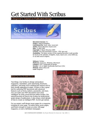
  • 1. Get Started With Scribus A Beginner’s Tutorial on Publication Design Document Version: 0.1 Project: UNESCO/DigiArts Contributed By: Sarai, India. (sarai.net) Author: Niyam Bhushan (niyam.com) Date: 23 April 2004 Copyright: © Niyam Bhushan 2004 License: Free Documentation License − FDL (gnu.org) Availability: The latest version of this ongoing document could possibly be found at the websites of DigiArts, Sarai, niyam.com, Linux-Delhi.org or via web-search engines. Software: Scribus Platforms: GnuLinux, Windows, Macintosh Category: DTP, Typography & Design Version: 1.16 or higher (preferably built from CVS) Website: www.scribus.net Level: Beginner What Can You Do With Scribus Two things. Use Scribus to design and produce magazines, newsletters, print-advertising, brochures, calendars, and pretty much anything that requires text to look visually appealing on paper. Scribus is also a great tool for authoring PDF documents with advanced features such as forms, buttons, passwords, and more. You can make your PDF documents even more 'intelligent' by using Javascript from within Scribus. Our tutorial focusses on how to use Scribus for professional- grade design of publications. It also shows a brief glimple of how to create an intelligent PDF. So let's get started. For our project, we'll design seven pages for a magazine, including its cover page. Yet within these seven pages, you'll learn enough to create an entire 100-page magazine, or even a full-blown newspaper. G E T S T A RT E D W I T H S C R I B U S • B y N i y a m B h u s h a n f or S a r a i . n e t • A p r 2 0 0 4 • 1
  • 2. Scribus And Its Sisters [Download Yesterday Night's Version] Visit www.scribus.net and head to the downloads section. Please read the instructions in the documentation section on how to install Scribus for your platform (mac, win, linux, *bsd). You could start with the stable download available. As your skills grow, may I strongly recommend you discard the stable version, and click on the 'changelogs' or 'CVS' button instead. This, because Scribus evolves rapidly on an almost nightly basis. The CVS version is equally stable, and quite often, more stable than the official stable version. It is also significantly ahead of the stable version in its features and capabilities. Every two or three days, I tend to issue the simple two-line commands from my PC, and get hold of a freshly-baked Scribus with a slew of new features added. Try it. You'll love it. Just follow the simple instructions on the Scribus site on how-to install from CVS. For those who don't know, CVS stands for Concurrent Versioning System, a clever way for several programmers from diverese geographical locations to store their software at a central repository as they dynamically work on it. Do read the requirements page on the site. This because Scribus needs some rather important files installed on your system. For GnuLinux users, I specially recommend just installing the latest release of your favourite distribution. As an example, I spent nearly three weeks trying to install Scribus 1.1.6 under RedHat8. Each time I added a required file, another dependency would crop up. Finally, I just installed the latest Fedora in a separate partition, and Scribus installed within 20 minutes without a murmur. [Get Acrobat Reader, even for GnuLinux] Scribus is a great tool for creating PDFs. Yet not all PDF viewers are created equal. Especially under GnuLinux. So, head to adobe.com and download and install the latest, native version of Acrobat Reader for your platform, even for GnuLinux. Should you find a newer release of Acrobat Reader for Windows, say Version 6 for Windows, while you have Version 5 for GnuLinux, download the Version 6 for Windows, under GnuLinux. The developers of Scribus recommend you run this version using a Windows-emulator software under GnuLinux, such as WINE or CrossOver, to run this native Windows application under GnuLinux. However, this is not mandatory. You could still work with the older version, or view your files under Windows if dual-booting, or on another machine. [Match Colors That Print] Finally, if you wish to design publications, you need to ensure colors you see on screen match colors that print. For this, you need to install a special and separate piece of software, called a Color Management System, or CMS. Windows and Macintosh come with a CMS built-in, called ICM and ColorSync, respectively. Under GnuLinux, you need to install a free CMS, called LittleCMS. Download and follow the instructions at littlecms.com. You can also install versions of this under Windows and Macintosh. For this tutorial, LittleCMS is not necessary, though quite helpful. G E T S T A R T E D W I T H S C R I B U S • B y N i y a m B h u s h a n fo r S a r a i . n e t • A p r 2 00 4 • 2
  • 3. [You Can Use Your Existing Fonts Collection] Do you have a collection of fonts that you wish to use under GnuLinux? Install your existing TrueType, Postscript, or OpenType format fonts under GnuLinux. You'll find the simple steps mentioned in the documentation section of the Scribus site. For our tutorial, we don't need to install any special fonts. So you can start right away with your first sample publication. [Sane Workflows] Our magazine is called 'FreedomYug' and it contains a lot of pictures and text. A magazine with a few hundred pages could also have several Scribus files, each with eight to 20 pages. So, it is best to create a folder for each publication. I've created one called 'Fyug'. Inside this, create atleast two distinct folders, 'Text,' and 'Images'. Using a wordprocessor, such as OpenOffice.org, author your articles and save them in the Text folder. For the moment save a version in simple text format, with the extension .txt. While I write this tutorial, the developers at Scribus assure me that soon you can save your text as Rich Text Format (.rtf) and import it into Scribus, with all your typesetting, such as bold, italic, and bold-italic text and other formatting intact. Similarly, scan or enhance photographs and store them in the 'Images' folder, mostly as *.JPG files. Empty, White Spaces A magazine or a publication design is not about text and images on the page. It is about empty, white spaces on the page. The text and images merely punctuate this emptiness. These 'breathing' spaces are important, much like gardens, parks, and other open-air sites are important to any high-density metropolis. So launch Scribus, go to the File menu, and click on New. For the rest of the tutorial, I will use the following convention to describe menu choices: File>New. [New Emptiness] The New command displays this dialog box. Click on the 'Default Unit' drop-down box, and choose 'Millimetres (mm)' rather than the default 'Points'. Click on the drop-down menu of 'Size' and choose 'Custom' for the page-size of our magazine. Enter the above dimensions for width and height. Note the level of precision beyond the G E T S T A RT E D W I T H S C R I B U S • B y N i y a m B h u s h a n f or S a r a i . n e t • A p r 2 0 0 4 • 3
  • 4. decimal-point to the right, offered by Scribus. Click on 'Facing Pages' so you can view pages side-by-side, as in a realworld magazine. Enter the above margin area, that marks off the actual printing area, inside the physical paper. Click 'OK' to view your first blank page in Scribus. Cover Page If you see too many gridlines on your blank page, goto View>Hide Grid. You will see blue-colored lines marking the outer margins of your page. The concept of Scribus is quite simple: To place a photo on the page, first you must create a photo-frame and then import the photo into this frame. Similarly, to place text on the page, you must create a text-frame first, and then insert, or type, text into this frame. You'll soon discover that this approach has some great advantages. [Insert Picture] Here is a screenshot of a panel that contains all the Tools that Scribus offers. Glide your mouse over each icon to find out what each tool does. Click on the third one. That's the one that allows you to insert a Picture frame in the page. That's what you want for placing the cover picture. Drag your mouse from the top- left of the scribus page, to the bottom-right. Don't worry if you don't get it exactly right. You'll find a picture frame drawn on your page, in the shape of a large rectangle, with black-colored diagonal lines forming a large 'X' through it. This is a traditional printing-industry custom, to distinguish picture frames from text frames. That 'X' won't ever print, so don't worry. [Soul of Scribus] From the menus, go to Tools>Properties. Along comes a dialog-box that is at the heart and soul of Scribus. All objects you add to the page, from picture frames, text frames, or even actual photos, text, or lines, are all controlled from this central dialog box. Make sure the picture frame you just created is highlighted. Usually red- colored or other colored square dots will mark all the four corners as a visual cue. If not, in the Tools palette, click on the first icon, and just click on the picture frame. The Properties dialog box will instantly show all its details. Give a human-readable label to this picture-frame, such as 'CoverPhotoFrame' in the 'Name' field of Properties. In case you do not see the 'Name' field, just click once on the top tab, that says 'X,Y,Z'. Next, precisely place the top-left of your picture frame on the top-left edge of your page. In the X-Pos and Y-Pos fields, type in the values of 0mm, each. Pos is obviously a short-form of Position. Type in the Width and Height at 210 mm and 280 mm respectively. Your frame is precisely placed on the page. G E T S T A RT E D W I T H S C R I B U S • B y N i y a m B h u s h a n f or S a r a i . n e t • A p r 2 0 0 4 • 4
  • 5. [Get Picture] Click to select the top-icon in the Tools palette, and then right-click anywhere inside this picture frame. You will see a menu pop- up right under the mouse cursor. Select 'Get Picture' from this menu. A dialog-box opens up for you to navigate into your FYug folder, and then into the images folder, so you can select the 'TitleFX.jpg' sample image. Click on the OK button. The picture frame on your Scribus page is immediately filled with the TitleFX.jpg image. [Nudge Picture to Left] Note the sculpture in the image is too much to the right. We must drag the picture inside the picture frame to the left, so that the sculpture is positioned in the centre of the picture frame. Extra parts of the picture will get automatically cropped out of view beyond the boundaries of the picture frame. So, to move the picture, make sure the picture frame is selected, go back to the Properties dialog box, and click on the top-right tab titled 'Image'. In the field marked X-Pos, just type in the value “-90mm” to move the image 90 mm to the left. Note how the image is shifted inside the picture frame. [Color Karma] At the bottom of the Properties dialog box, you may have noticed a section called 'Input Profiles.' This will only show if the LittleCMS on your PC is correctly installed and configured. The color of your images may look markedly different on your screen, and even more when you print them. This little area minimizes such color mismatch. From the pop-up for 'Input Profile', choose a color profile that closely matches your monitor. Scribus immediately re-renders the image on the screen to display colors according to that profile. The actual install of LittleCMS and how to use it under Scribus is actually quite simple, but beyond the scope of this tutorial. But here are some good tips: 1) Download a set of free profiles from the adobe site, so you can send images between Mac, Windows, and GnuLinux. 2) Create a custom color profile of your own monitor and use that instead of any other. [Save] You may want to save your file before proceeding. So head over to File>Save and type the name 'Fyug.sla' for your file. Save it in the FYug folder. You can also just click on the floppy icon in the taskbar, right underneath the menus, to save your file. G E T S T A RT E D W I T H S C R I B U S • B y N i y a m B h u s h a n f or S a r a i . n e t • A p r 2 0 0 4 • 5
  • 6. [Masthead Band] The cover page of any magazine has its name emblazoned across the top. This is called the Masthead. Ours is titled, “FreedomYug.” We'll start by creating a semi-transparant band for the Masthead. Go to Edit>Preferences>General. Click on Display, and make sure this checked: “Use PDF1.4 Transparancy Features.” Click OK. Your document now supports transparant objects. Click the fourth tool in the Tools palette. Should you hover your mouse over this, the roll-over text would display “Draw Various Shapes” or something similar. Select the rectangle shape from the drop-down menu. Click anywhere near the top-centre of the page and draw a rectangle. Make sure the rectangle is selected, and immediately go to the Properties palette, click on the 'X,Y,Z' tab, and enter the following values: X-Pos: 30mm. Y-Pos: 0mm. Width: 150mm. Height: 33mm. Give it a name, such as 'MastheadBand' in the Names field. Then click on the 'Colors' tab in Properties. Click the Pencil tool to select the stroke or outline border. Click on 'None' in the colors list. Then, click the bucket icon to select the fill color. Click on 'Black' from the list of colors, and in the opacity field, enter 69%. You will see the band has turned semi-transparant, and partly shows the image through itself, in darkened colors. Experiment with Opacity and other colors to your taste. [Add More Bands] Draw another rectangle towards the centre of the image. In the Properties, give X-Pos: 93mm. Y-Pos: 160mm. Width: 115.35mm. Height: 13.75mm. Again in 'Colors', set the stroke to None, and the fill with Black at an opacity of 69%. Call this the 'HeadlineBand'. A third rectangle, named 'SubHeadBand' can be drawn slightly underneath this, at X-Pos: 100mm. y-Pos: 180mm. Width: 109.7mm. Height: 18.35mm. The fourth and final rectangle, this time a little square box, will have the following Properties: X-Pos: 20.5mm. Y-Pos: 245mm. Width and Height will both be 9mm. G E T S T A RT E D W I T H S C R I B U S • B y N i y a m B h u s h a n f or S a r a i . n e t • A p r 2 0 0 4 • 6
  • 7. [Create Colors] Hold on! Don't fill this with the same 69% Black. Let's give it a fresh lime green color. Go to Edit>Colors... in the menus. A dialog box listing existing colors displays on your screen. Click on 'New' and give your new color swatch a name, 'Lime Green'. In the second dialog-box that opens up, choose 'CMYK' as the Color Model. This closely follows the inks of Cyan, Magenta, Yellow, and Black, used in your desktop printer and in printing plants, that mix inks to create new colors. With the sliders at the bottom, give C:69%, M: 10%, Y:100%, and K: 0%. [Locked Bands] Click OK in this dialog box, and then click OK again in the Colors dialog box, where you'll notice your new color added. Go back to your page, click on the small square you just created, and in the 'Colors' tab of Properties palette, give it a stroke of None, and a fill of LimeGreen, at 100% opacity. You cover should look like the screenshot here, with all the bands for text. One last thing. Select each semi-transparant band individually, and in the Properties palette, in the 'X,Y,Z' tab, click on the icon of the padlock at the bottom. This ensures you accidentally do not move or resize each locked object. Similarly, lock the CoverPicture Frame as well, and the green square, using this padlock. Also, uncheck 'Text flows around frame' for each of these rectangles. This keeps text that will overlap the rectangles, from jumping away from it. Working With Layers On A Page [Why We Need Layers] We are going to format the text for the magazine's masthead, the headline, and the subhead. Imagine if this magazine is published in several languages. One way to then produce this magazine would be to recreate the magazine layout for each language. The other way, is to have the text for each language on another layer. Think of layers like transparant sheets that overlap one another. You could hide or view layers, for example: hide the English text layer, and show the Hindi text layer. G E T S T A RT E D W I T H S C R I B U S • B y N i y a m B h u s h a n f or S a r a i . n e t • A p r 2 0 0 4 • 7
  • 8. Layers bring a lot of convenience into page-design. For our magazine, I will keep the background image and bands in one layer, and have the text contained in another layer. Go to Tools>Layers. In the dialog box, you will see one existing layer, that contains all your objects so far. Uncheck the 'eye' icon to the right of this, and all elements of this layer disappear, leaving you with your empty page. Click inside the name of this layer, and change it to 'Bg Photo'. Click the bottom-left icon, that adds a new layer on top of the existing layer. Change the name of this layer to 'CoverText'. Make sure this layer is highlighted, so Scribus knows whatever elements you create will exist on this layer. Ensure the 'eye' icon is checked so you can view your layer. [Enter Text in a Text Frame] Ensure the CoverText layer is highlighted in Layers. Click on the the text-frame in tools and drag a text frame across the MastheadBand. For the moment, make the text frame as wide as the page and nearly double the height of the MastheadBand. Click the 'Story Editor' icon in Tools. This is next to the 'Edit Frame Content' icon. In the screenshot here, it is circled in orange. A dialog box displays, where you can enter the text you wish to have published in the text frame. Think of the Story Editor dialog box as a mini note-pad or word- processor for each text frame. This is the second-most important dialog box in Scribus, after the Properties dialog box we saw earlier. Type the text: “FreedomYug” in the Story Editor. Then click on the File menu inside the Story Editor, and choose 'Save and Exit.' This publishes your text into the text frame, and exits the Story Editor from your screen. [Make Text Look Beautiful] 'FreedomYug' will look attractive if the gaps between the letters are reduced, and if the text fits into the MastHeadBand. The overall gap between letters is called 'Tracking.' To reduce this tracking, right-click on the text frame, and from the pop-up menu, choose 'Show Properties'. In 'X,Y,Z' uncheck 'Text flows around frame'. On the buttons at the top of this dialog box, click on 'Text'. G E T S T A RT E D W I T H S C R I B U S • B y N i y a m B h u s h a n f or S a r a i . n e t • A p r 2 0 0 4 • 8
  • 9. [Track] From the drop-down menu of Fonts in the Properties dialog box, choose 'Georgia Regular' or else Times Roman or any other font you fancy. Make the size: 84 points. Traditionally, a point is a unit of measure in the printing industry. 72.27 points make an inch. In digital print publishing, this is rounded-off to 72 points make an inch. Text size is usually measured in points. Select 'Red' from the drop-down menu next to the bucket icon, which stands for 'Fill Color' for our text. In the field labelled Kerning, enter -5 pts. Line Spacing at 72 pts. You will find the gaps between the text has squeezed, and the text has changed to the color red. [Kern] Stop reading the headline text. Look at it. You will find a larger gap between the 'm' and 'Y' of 'FreedomYug'. You will also find seemingly irregular gaps between other letters, such as between 'd' 'o' 'm', and 'Y' 'u', and even between 'u' and 'g'. This is because the shape of the Y curves in, creating an optical illusion of a bigger gap. The 'o' curves in from all sides, again creating the illusion of a bigger gap. Use the 'Edit Frame Content' icon, the one that looks like a hand next to a cursor. Click directly at the text, specifically between 'm' and 'Y'. In the Properties palette, enter '-11 pts' in the 'kerning' field. The gap shortens even more. Similarly, tighten the spaces between all the other letters individually, until the text 'FreedomYug' looks tightly kerned and tracked. Finally, drage the corner red sqaures of the text frame to the MastHeadBand, and click the padlock icon to lock its position. Use the same technique, put the text 'The new era of computing' under G E T S T A RT E D W I T H S C R I B U S • B y N i y a m B h u s h a n f or S a r a i . n e t • A p r 2 0 0 4 • 9
  • 10. 'FreedomYug' taking care to uncheck 'Text flows around frame'. Here, the text is actually set to loose tracking. I entered '+5pts' in the kerning field. For 'Why Khajuraho Needs Gnu/Linux' you need to press the return key after the word 'Khajuraho' in the Story Editor. Similarly, draw a text frame next to the green box, and enter the yellow-colored text. Use the image on Page 1 of this tutorial as a reference for all text elements. Or check the PDF file or the Scribus file of this sample magazine. Design Multiple Pages [Many Unique Page Designs] This mag's pages are 210mm x 280 mm. However, not all pages will have the same look. I need three pages with a layout meant for a Features article, with perhaps two columns, and a generous white space on the outer left or outer right edge of the page. Another page could look like a feedback form, which could have only rows and tables. Still another page could be the Contents page. Interestingly, once I decide that a Features page needs two columns, and a half-column of empty white space on the outer-left or outer-right, with a section name on the band on top, I want every page that runs a Feature story to look consistently the same. Thus, I need a 'Template Page' for Features, that defines all the columns and other common graphic elements for the Feature pages. I can then add as many pages as I wish into the actual Scribus file, from this template page, and add the actual text and photos to these pages. [Make A Page Template] Go to Edit>Templates.... A dialog box listing existing templates opens up. You will only see one default template, called 'Normal.' That's the one you've been using for the cover page. Click on the button 'New'. In the resulting dialog-box, name the template 'FeatureL' and choose 'Left Page' from the drop-down menu. You end up with a blank page, with blue lines marking the outer margins. G E T S T A RT E D W I T H S C R I B U S • B y N i y a m B h u s h a n f o r S a r a i . n e t • A p r 2 0 0 4 • 1 0
  • 11. With the 'Edit Templates' dialog box still showing, and your new empty pages on-screen, go to Page>Manage Guides, in the menus on top. We are going to add some horizontal and vertical guides, which are lines that won't print, but guide your eyes into placing columns of text, and graphics, with perfect alignment. [Operators] The left page has a 20mm margin from the left edge. Inside this margin, I wish to leave a half- column of white space, of 45mm. So in the 'Manage Guides' dialog box, click on 'Add' under the 'Vertical Guides', and in the X-Pos field, type “20+45”. Yes, Scribus will use simple math operators in all fields that require a numerical entry. (You can even enter “30 mm + 1.5 in” to operate between different units). Add the other vertical guides at 122.5 mm and 127.5mm. Look at the numerical precision with which Scribus places it. Add a Horizontal guide at 265 mm. Important: click the 'Lock Guides' button at the bottom so your guides don't accidentally move on the page. Click OK. Your page will have guides similar to the screenshot here. [Page-Numbers] Add the Red band on top, place a text frame with that loose-tracked text 'Khajuraho' at the top. Follow the steps you learnt in the previous section. Similarly, add a text frame at the bottom for the magazine name, issue detail, and page number. Except you don't type a static page number. Just press the control key + # combination. To counter-check your command, go to Edit>Preferences>General. Click on the button 'Keyboard Shortcuts...'. Scroll the list to find your shortcut. G E T S T A RT E D W I T H S C R I B U S • B y N i y a m B h u s h a n f o r S a r a i . n e t • A p r 2 0 0 4 • 1 1
  • 12. [Right Page] To create the Features page for the right hand side, click on New in Templates, choose 'Right Page' from the drop-down menu, name the template 'FeaturesR'. Bring up Page>Manage Guides, and enter the following for adding Vertical guides: 82.5mm, 87.5mm, 145mm. Add a Horizontal guide at 265mm. Like with FeaturesL, add the red band on top with text, and the page number details at the bottom. Click the 'Close' button on the Templates dialog box. You find yourself back in your Scribus document's regular pages. [Drag-'n-Drop Pages] Go to Tools>Page Palette in the menus. In the palette, you will find your existing front cover as page one, and three templates in the above section, Normal, FeaturesL, and FeaturesR. To add another page, click and drag FeaturesL from 'Available Templates' to the 'Document Pages' area, below-left to the Normal first page. Page 2 is thus automatically added, to the left side. Similarly, drag and drop a page 3 with FeaturesR, and page 4 with FeaturesL. Zoom in on the actual document pages and note the page numbers are automatically generated. [Two-Columns of Text Per Page] Using the guide-lines on each page as a cue, click and drag to create a text frame from the top-left of the first column of each page, to the bottom-left of the second column of each page. Yes, this will be one text frame per page. Select each text frame, go to the Properties palette, click on 'Shape' and at the bottom, type '2' in the 'Columns' field, and '5' in the 'Gap' field. Each text frame now contains two columns. Uncheck 'Text flows around frame' on the 'X,Y,Z' tab of the palette, for each text frame. [Use Consistent Paragraph Styles] Good publication design is about using consistent styles. The formatting for the main story, called the 'Body Text' must be the same for all pages, and all stories. Similarly, headline, captions, and sub-heads styles must also be consistently used throughout a publication or a section. Rather than manually punch in the specific font, size, and other settings each time, it helps to define the style once, and then just click on it to set a selected paragraph in that style. Automatic for the people. G E T S T A RT E D W I T H S C R I B U S • B y N i y a m B h u s h a n f or S a r a i . n e t • A p r 2 0 0 4 • 1 2
  • 13. [Define Paragraph Styles] Here is a screenshot of all the paragraph styles in my document. You can access the list using Edit>Paragraph Styles... from the menus. Let's create a new style in your document, called 'Body Text'. Click on 'New' in the Paragraph Styles palette, and in the opening dialog box, choose your font, alignment of text, size, line-spacing, and other aspects. The important thing to note here is 'Baseline grid'. A professional feature, this ensures that text across columns align to one another. Try playing with it to see how it works. This kind of precise alignment of elements across a page or a double- spread page is what differentiates professional typography from amateur work. Please define paragraph styles for all possible styles: headline, sub- head, caption, box story, or whatever. The best way to do this is to create some sample text for each type, and once satisfied, jot down all its typesetting features, and manually create a paragraph style for each. [Flow Your Text] Right-click the first text frame, on page two. From the pop-up menu, choose 'Get Text...' and hop over to the Text folder in FYug. Select the khajuraho.txt file, and press 'Open'. You will see the text flow into two columns on this page. At the bottom-right of the text frame you'll see a 'X' mark in a box, which means there's more text than can fit in this text frame. Click the first frame to select it, go to the Tools palette, and click on the second-last button with a tool-tip that displays “Link Text Frame.” Click on the text frame on the next page. Voila! Text flows from the text frame on page two, to the text frame on page three. Similarly, add links between frames for each additional page. G E T S T A RT E D W I T H S C R I B U S • B y N i y a m B h u s h a n f o r S a r a i . n e t • A p r 2 0 0 4 • 1 3
  • 14. [Format To Body Text] You'll notice the text on each page is in some random plain-text formatting. Just rclick on the first text frame of this multi-page story. That's the one on page two. Go to the Properties palette, click on the 'Text' tab, and choose 'Body Text' from the paragraph styles in the drop-down menu next to 'Style'. Note you can even choose a language from the drop-down menu below. As I write this, the developers at Scribus are working towards integrating Indic languages so you can soon have Scribus formatting text in Hindi, Tamil, or other Indian languages. Create Final Page Layouts [Make space for Photos and Headline] You've got the general idea of how Scribus creates templates, paragraph styles, and works with text frames and picture frames. Time to design all the feature pages of the cover story. Go to page two. This you can do by clicking on the page icon in the page palette, or at the extreme bottom of your screen, you will see a go forward button, a go back button, and pop-up list in-between where you can choose the page you want to visit. Click the text frame on page two, and in Properties, in 'XYZ' key-in X- Pos: 65mm, Y-Pos: 201.5, and Height: 48.5mm. The text frame shrinks to the bottom of the page. Note how the text automatically flows to the next page. Link the text frame on page three, to the subsequent text frame on page four, so text flows from page to page. [Insert Picture] Select the picture frame icon from Tools, just like you did for the cover page. This time, draw a random picture frame on the top of page two. In Properties, give it X-Pos: 20mm, Y-Pos: 35 mm, W: 135mm, H: 100mm. Right-click this picture frame. From the pop-up menu, choose 'Get Picture...'. Go to the images folder inside the FYug folder, select the file 'EnterTitle.jpg' and click 'Open.' [Resize Picture] In the Properties palette, click on the 'Image' tab, check 'Free Scaling' and then key-in X:0mm, Y:-30mm, X-Scale and Y-Scale at 32% each. This will shift the photograph 30 mm to the left, inside the frame, and then scale it down to 32% for that perfect crop. [Typeset Headline] Draw a text frame. X-Pos: 20mm, Y-Pos: 142mm, W: 165mm, H: 39mm. In the 'Text' tab, choose Georgia Roman 48 pts on line spacing of 42 pts. You could choose Garamond or Times if you wish. Set kerning to -1.0pts. Then zoom in and manually kern the individual letters until you get a crisp, neatly tucked-in headline. [Hanging Drop Cap] If you go back to Edit>Paragraph Styles... in the menus, and edit any existing style, you'll note an automatic drop-cap feature available, for your preferred number of lines. But let me show you how to create hanging drop-caps, and you'll also learn how to handle wrap-arounds the Scribus way. Take the 'Draw Shapes' tool, draw a rectangle, at X:59, Y:200, W:19, H:24.3. Fill and stroke this with 'None' in 'Colors' so it does not show. Check 'Text flows around frame' and G E T S T A RT E D W I T H S C R I B U S • B y N i y a m B h u s h a n f o r S a r a i . n e t • A p r 2 0 0 4 • 1 4
  • 15. you'll see the first para of your article flowing around this “empty” space. Next, draw a text frame at X;52, Y: 195, W: 24.5, H: 36. Uncheck 'Flow text around frame' for this. Using either the story-editor or the hand- cursor icon, enter the letter 'D' in this text frame. In Properties, set this to Georgia Roman, 87 point, with leading at 104 points. Fill this with Black. Click on 'Shade' choose 'Other' from the drop-down manu, and type 69%. Your drop-cap is done. Should you want to select the invisible rectangle used for wrapping text, and end up selecting this text frame stacked on top of it, press control+shift click and repeatedly press until you select the correct object in the stack. [Done!] Go to View menu and hide the guides, frames, margins, and grids. Your layout will look like the above screenshot. On page three, the sculpture picture frame has an invisible rectangle behind it, that wraps around the text. Just like we did with the drop-cap. The captions are just a text frame in the half-column. The generous white space at the bottom of the first column, is likewise just an invisible rectangle with 'flow text around frame' checked. Study the provided FYug.sla file for further details. [Gradient-Filled Box Story] The body text flows to page four. A single text frame in the half-column on the left contains the story and photo credits. The box-story at the bottom is a text frame that is formatted with various paragraph styles. The gradient in the text frame is applied in the 'Colors' tab of Properties. Underneath the 'bucket' icon a drop-down menu with the word 'Normal' reveals 'Vertical Gradient' among others. Choose LimeGreen at 40% as color#1, and CyanBlue at 20%. The text has a gap of 2.5mm from top, bottom, left, and right of the text frame. This is set in the 'Shape' tab of Properties. A red square is drawn to mark the story end. G E T S T A RT E D W I T H S C R I B U S • B y N i y a m B h u s h a n f o r S a r a i . n e t • A p r 2 0 0 4 • 1 5
  • 16. Design With Graphics and Freedom [Many Unique Page Designs] Page five jumps into graphics-oriented, creative freedom where page geometry is conformed to with defiance. Take a look at the screenshot here. It looks dramatic, but thanks to the power of Scribus, is quite easy to produce. [Copy Elements to Template] First, start by creating a new template in Edit>Templates.... Choose a right page from the drop-down, call it '7steps'. A blank page graces your display. Then, click on your earlier FeatureR template, and drag the mouse from the top-left to the bottom-left of the page to select the red band on top with the text, and the page folio and page number text frame at the bottom. Click on your new '7steps' template. Right- click anywhere and select 'Paste.' Alternatively, go to Edit>Paste from the menus. The elements are pasted into the exact position they belong to, thanks to the intelligence coded into Scribus. Change text to 'Newbies'. [Visual Guidance] Amazingly, the layout has 15 columns that align elements. Check the next screenshot. So, go to Page>Manage Guides.... Add a Vertical guide at 36mm. Then add 11mm to this to create another guide. Continue adding 11 mm to the result of the previous guide, until you read 179mm. Check 'Lock Guides' and click OK. Close the templates palette and add page five to your document, in the Pages palette, by dragging the '7steps' template to after page 4 in the page palette. G E T S T A RT E D W I T H S C R I B U S • B y N i y a m B h u s h a n f o r S a r a i . n e t • A p r 2 0 0 4 • 1 6
  • 17. [Seventh Wonder] In a new text frame that you draw on the page, enter the letter '7' in Georgia Roman, at say, 200 points. Right-click the text frame, and from the popup menu, choose, 'Convert To > Outlines'. The letter '7' is converted into a graphics outline. Align it to the top-left of your margin, and drag the lower-right to the second-last column, bottom- right. The graphic '7' automatically scales to fit the whole page. Do you want to tweak the shape of '7'? Go to the Properties palette, to the 'Shape' tab, and click on 'Edit Shape.' Enjoy. Finally, padlock the '7'. Important: For each text frame or other element that is placed on this page, please uncheck 'Text flows around frame' so you dont' have text jumping to another position suddenly. [Shapes for Text] Drawing the shapes is easy. Click and hold on the square icon in Tools, and discover more than 16 shapes you can freely drag and draw in Scribus. Click on the 'Polygon' tool and you can even draw stars with as many corners as you wish and other options. For each shape, choose Fill 'None' and Stroke 'Black'. The thickness and style of the line is in the 'Line' tab of Properties, where i chose a 1 point thick solid line. Discover more styles and options for yourself here. The design looks good because all shapes are aligned to any two random vertical guides. In effect, that makes the width of each shape a multiple of 11mm, since the guides are all 11mm apart. Right-click each shape, and choose 'Convert To > Text Frame'. Then, enter the text using the story editor, or type it in directly, and apply a special '7steps body text' paragraph style, defined earlier. G E T S T A RT E D W I T H S C R I B U S • B y N i y a m B h u s h a n f o r S a r a i . n e t • A p r 2 0 0 4 • 1 7
  • 18. [Use Scrapbook for Steps] For the label 'Step 01' draw a box, fill it with a color, draw a text frame on top with the text 'Step 01', draw a red line to connect it to its relevant shape, and then group the whole label with its line, using Item>Group in the menus. Go to Tools>Scrapbook menu. A dialog box displays, called the 'Scrapbook' meant for oft-used elements. Drag and drop the label into it. Also drag and drop the red- colored story-ender box. You can then drag and drop the label to any other shape, edit the text, re-draw or edit the red line to connect to it, and have lots of fun. [Rotated Text] In another fresh text frame, typeset 'Seven Steps To Software Samadhi' in all-caps, red letters. In the Properties palette, rotate it to 60 degrees in the 'X,Y,Z' tab. You could fine-tune the angle until it fits perfectly. Add all the other text on the page in their text frames, and you're done. Set Fire With SVG Graphics [Graphics R Us] The flame logo is a special type of graphic, called a 'Scalable Vector Graphic' or SVG for short. It can be enlarged to any size without loss of quality, and even the shape of the flame can be edited in Scribus. Yes, even the colors are imported from the image into the Colors palette of Scribus, and colors from within Scribus can be applied to the image, as has been done here to multiple copies of this graphic. Note how the text is set on a curve created within Scribus, and the automatic drop-caps to the text column. [Ignite] Start with a new Template, call it 'GyaanL'. Copy and paste the red band, text, and page folio and page number from another left-page template. Change the text to 'Education' in all-caps. In Page>Manage Guides, add two vertical guides at 65mm and 70mm. Lock them, and close the templates palette. Add another page using this template, in the Page palette. Or you could use Page>Insert... menu. G E T S T A RT E D W I T H S C R I B U S • B y N i y a m B h u s h a n f o r S a r a i . n e t • A p r 2 0 0 4 • 1 8
  • 19. [From Flame to Flame] You don't need a Picture frame to place an SVG, you can do it directly. Go to File>Import...>Import Svg-Image. Navigate to the 'Images' folder of FYug, and select the 'Highly-Inflammable.svg' image to import. A huge graphic fills the page. Just select it, and in Properties, give it the height and width of 45 mm. Position this graphic to the top-left margin of the page. Check Edit>Colors... and you will find the orange color in the image has been marked and imported into the Colors palette. [Colorize] Select both the frame and the orange box, go to Item>Group. Then copy and paste it right underneath the first one. In the Properties palette, type '+5mm' at the end of the Y position, to automatically move it down by 5 mm. Thus, copy and paste until you have five copies of the graphic on the page, with a 5mm gap between each one vertically. Select each graphic, ungroup it, select the background color, and change the color of each in the Properties palette. [Dragged Guides] From the horizontal rulers just below the taskbar and above the page, click and drag a horizontal guide to the bottom of each box. Toggle 'View Guides' so in the View menu, so you can see the guide. Finally, draw text frames to the height of each graphic in the column on the right, and type in the text. Define a Paragraph style that has a drop-cap of two lines, and apply that style to each text frame. [Page Number on Top] Did you note the problem of the last graphic overlapping the page number and the page folio text? Go back to the Templates palette, copy the page folio text frame that contains the page number. Close the Templates palette, go back to your page, and just paste it on top. The page number comes in automatically to this text. Draw a white box above the original page folio. Place the flame graphic above this, and finally paste the new folio text frame above this. You can use the up and down arrows in the Properties palette to change the stacking order of overlapping objects. Do ensure that the page folio you paste, is into the top- most layer of your page. Counter- check in the Layers palette. G E T S T A RT E D W I T H S C R I B U S • B y N i y a m B h u s h a n f o r S a r a i . n e t • A p r 2 0 0 4 • 1 9
  • 20. [Text on Path] The text on the curve is pretty easy. Write the text in a text frame. Draw a curve using the 'Insert lines' tool. Use the tool that has a pencil with a line shaped like an 'S' around it. To draw the curve, just click once at the starting point of the curve, and drag briefly to the top-right. Then release the button, click at the end position of the curve, and drag briefly to the bottom-left. Once you are satisfied with the curve shape, just right-click the mouse and your curve is done. Select both the text frame and the curve, and select Item>Attach Text to Path. The text will follow the curve. You can play with alignment and other settings in the Properties palette. Rotate the whole curve slightly for a better fit. Publishing Demands Freedom. PDF. [PDF-authoring] The screenshot shows the GnuLinux version of Acrobat Reader. Yes, a free version is available from the Adobe site for GnuLinux as well. The document you see inside it, is a scoreboard created from Scribus, the free desktop publishing software. The background is an SVG graphic with a tint, and the fields, check boxes, and even the 'Click to Submit' button has been authored inside Scribus. Yes, the PDF elements contain Javascript embedded from within Scribus. You guessed it. Scribus is a mature PDF-authoring software. Use it to create PDF forms, PDF documents, and you can even digitally sign your PDF documents with Scribus. Look carefully. The headline bands are semi-transparant. The flame shows through. Scribus supports PDF 1.4 transparancy too. For your convenience, this is a separate file: FyugScoreCard.sla. Also check out its PDF version. G E T S T A RT E D W I T H S C R I B U S • B y N i y a m B h u s h a n f or S a r a i . n e t • A p r 2 0 0 4 • 2 0
  • 21. [Design The PDF Layout] The design looks dramatic, but the layout is quite simple. It has only one column, which contains all the questions, in one text frame, on the left. The half-column on the right contains some information in a text frame. The headline and the Name, Address, etc, are in a text frame that spans the entire width of the page. The colored bands to mark the sections are obviously colored rectangles drawn behind the section sub-heads. The logo in the background is just the flame from the 'inflammable' SVG graphic. This time it is colored to Red at 20% shade. It is kept on another Layer stacked at the back. [Clickable PDF Elements] The real questions are, how are the text fields, number fields, check buttons, and 'submit' button drawn that they work interactively inside Acrobat Reader or other PDF viewer programs? Use the special PDF tools in Tools>Toolbars>PDF Tools. Chances are you already have it open on your screen. An almost complete array of PDF elements can be authored in Scribus. Once drawn, use the Properties palette for some cosmetic finishes. Then right-click the PDF element, and choose 'Is PDF Annotation' from the pop-up menu. Right-click again, and this time choose 'Field Properties.' You could also double-click the PDF element to configure it for PDF options. All PDF features are expressed here as screenshots. Enjoy. G E T S T A RT E D W I T H S C R I B U S • B y N i y a m B h u s h a n f or S a r a i . n e t • A p r 2 0 0 4 • 2 1
  • 22. [PDF for Press] Scribus' greatest feature is that it can create PDF files which can be handed to a publishing house or printing plant for production. Yes, PDF comes in many flavours. One size does not fit all. The flavour for pre-press is called PDF/X-3. It basically signifies a PDF based on the Postscript Language 3, and contains ICC color profiles for handling independent color-managed workflows. Anywhere on the planet. To create a PDF/X-3, or a more generic flavour of PDF that works for your desktop printer, or for the web, click the PDF icon in the taskbar at the top. One-click PDFs are always cool! The dialog box contains all you need to customize your PDF. Explore. G E T S T A R T E D W I T H S C R I B U S • B y N i y a m B h u s h a n fo r S a r a i . n e t • A p r 20 0 4 • 22
  • 23. [Choose Your Flavour] In the dialog-box, start by clicking on the 'General' tab, and selecting PDF/X-3 from the drop-down menu for 'Compatibility.' It's a good idea to Downsample images to 300 dpi, at the bottom left here. [Color Management] In the 'Fonts' tab, choose to embed all fonts and 100% of all characters. Then click on the 'Color' tab. Note you can use a source ICC profile for the file, choose its rendering intent, and also choose whether to use the source profile of the Images, or to discard it and choose your own. If you don't understand this, don't worry. It is quite simple. Head out to littlecms.com and read the documentation available there. Also read the documents on the Scribus website, and check out the links to the excellent reference material on Scribus' page. [Press Inks] Finally, click on the 'PDF/X-3' tab. You have to choose the output profile, which is basically selecting the kind of ink and paper you are printing your magazine on, and giving the job a mandatory 'Info String'. Give the name of your file here. You can also handle some amount of trimming, which is changing an existing paper- size in a document to a slightly smaller size to accommodate a print-job. Before sending your job to the press, please go to Extras> Print Preview. You can see a soft-preview of your file in the inks of Cyan, Magenta, Yellow, and Black, and even simulate a progressive proof on-screen. [Native Scribus File To Press] If you are blessed to have a Scribus-savvy printing plant, and wish to deliver a native Scribus file, go to File>Collect For Output. Select a folder and Scribus will copy your file, as well as put copies of all graphics and images, and even font files, in this directory. Transfer this folder to your press. May I recommend you throw in a copy of Scribus in this folder too. A clueless person can discover the joys of Scribus. Go ahead, this is perfectly legal, thanks to the power of GPL. G E T S T A RT E D W I T H S C R I B U S • B y N i y a m B h u s h a n f or S a r a i . n e t • A p r 2 0 0 4 • 2 3
  • 24. Travel At The Speed Of Scribus [Advanced Features] Scribus has some pretty advanced and mature features that you will appreciate as you grow familiar with its interface. For instance, Once you have dozens of pictures linked into a Scribus document, managing such links can be a nightmare, unless you use the Manage Pictures feature under the Extras menu. Broken links can then be repaired or newer versions of images can be used without having to manually delete and replace images. For special accents, diacritical marks, and special glyphs, edit text in a text frame, and click on Insert Special under the Extras menu. The complete collection of characters of a chosen font are displayed, so you can just point and click. Try it. Do you wish to quickly navigate through your pages to find a particular element? Go to the Tools menu, and select Outline. A structured view of your document, with all items per-page in a collapsible list, shows up. Scribus supports the Python language, so lots of people have written amazing scripts that automate several tasks for you, from creating custom calendars to printing out font families, all with a single click. That's what the Script menu on top does for you. If you know Python, you could create some pretty sophisticated scripts to assist your work, while you design your publication. Using the free tools at the site of LittleCMS, i managed to calibrate my monitor under GnuLinux, much like you would do yours with the Adobe Gamma utility under Mac or Windows. Here's a screenshot of my monitor's profile, plotted against a CIE color model for comparison. Ain't that cool! The 'Tables' button in the main Tools allows you to quickly generate tables in your layout. It is rather rudimentary at this moment, but within a few weeks I expect it to evolve rather rapidly. Similarly, Indic support will be available in the same time-frame. Finally, the greatest strength of Scribus is the set of people behind it. They work 24-hours, creating a new version every night. Should you get stuck, they walk you through your installation, and even assist you live over Internet Relay Chat. As you continue working, and find yourself lost for a feature, just hop over and request them. Hope you found this tutorial helpful. Please add to it, improve it, and share it with others. It belongs to everybody. [ends] G E T S T A RT E D W I T H S C R I B U S • B y N i y a m B h u s h a n f or S a r a i . n e t • A p r 2 0 0 4 • 2 4