Theoretical Framework- Explanation with Flow Chart.docx
Contents page analysis kerrang
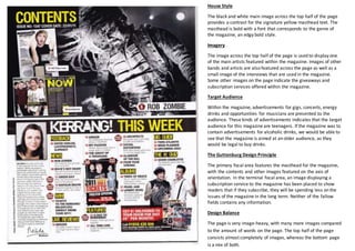
1. House Style
The black and white main image across the top half of the page
provides a contrast for the signature yellow masthead text. The
masthead is bold with a font that corresponds to the genre of
the magazine, an edgy bold style.
Imagery
The image across the top half of the page is used to display one
of the main artists featured within the magazine. Images of other
bands and artists are also featured across the page as well as a
small image of the interviews that are used in the magazine.
Some other images on the page indicate the giveaways and
subscription services offered within the magazine.
Target Audience
Within the magazine, advertisements for gigs, concerts, energy
drinks and opportunities for musicians are presented to the
audience. These kinds of advertisements indicates that the target
audience for this magazine are teenagers. If the magazine was to
contain advertisements for alcoholic drinks, we would be able to
see that the magazine is aimed at an older audience, as they
would be legal to buy drinks.
The Guttenburg Design Principle
The primary focal area features the masthead for the magazine,
with the contents and other images featured on the axis of
orientation. In the terminal focal area, an image displaying a
subscription service to the magazine has been placed to show
readers that if they subscribe, they will be spending less on the
issues of the magazine in the long term. Neither of the fallow
fields contains any information.
Design Balance
The page is very image-heavy, with many more images compared
to the amount of words on the page. The top half of the page
consists almost completely of images, whereas the bottom page
is a mix of both.