
Recommended
More Related Content
What's hot
What's hot (18)
Similar to Radial analysis of hip-hop magazine cover
Similar to Radial analysis of hip-hop magazine cover (20)
More from lukematthews
Recently uploaded
Recently uploaded (20)
Radial analysis of hip-hop magazine cover
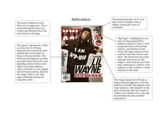
- 1. Radial analysis The personal pronoun ‘we’ll’ used The mode of address for this here creates a friendly mode of front cover is aggressive. This is address, giving off a sense of created through the direct eye community. contact and clenched fists of the main feature on the page. ‘Big Poppa’ is highlighted in red, and is in large capital letters, making it stand-out. This is a well The phrase ‘I am hip-hop’ which recognised name in the hip-hop is on the top of Lil Wayne industry, and therefore would represents him as being the most interest the target audience as this talented artist in this genre of would be what they want to read music at this present time. This about. The chosen font and colour represents the magazine as being used puts more focus on ‘Big up to date and as having the most Poppa’s’ name from the rest of the appealing content which would copy, enhancing its visibility to the appeal to its target audience. audience, as this would be a strong Also, Lil Wayne is a very popular attraction to the reader. and well-known person; therefore the image of him on the front page would help increase the magazines status. This image represents Lil Wayne as being tough and aggressive, as he has both fists clenched. This appeals to the target audience of the magazine as the genre of hip-hop often has content of violence in it, therefore this is the type of personality that they would be interested in.