SlideShare a Scribd company logo
1 of 3
This magazine has a typical colour palette of three
colours, which in this case are red, black and white.
The black colour represents power and stability,
which links with the image used as Cheryl Cole
comes across as being in control. Red also shows
passion and love and links with the sort of music
that she produces. White is also a good colour that
attracts attention and also signifies purity, which
shows the magazine houses pure content.
The black text on this magazine again
demonstrates power, and also grabs the readers
attention as it protrudes from the page. The
blue colour represents peace and tranquillity,
whilst the white font again attracts the reader,
with the white typography illustrating purity.

A blue background is used which could
again represent peace and tranquillity
and could portray the magazine having a
chilled vibe. White again shows purity
and could perhaps show that the
content and the artists focused on are
pure and original. The yellow colour
could represent fun and would suggest
the magazine is exciting to read.
If I was to create my own music magazine of an alternative style I
would have these colours. The music involved in my magazine
would be quite peaceful, and therefore the blue links in with the
theme of peace and tranquillity. The white would be used to stand
out and grab attention, whilst representing purity and the fact that
the magazine would house proper information. The yellow would
also be used to grab the readers eye and to stand out from the
blue background, it would also portray hope and happiness which I
hope my magazine would give.

If I was to create a rock magazine I would use the colours of red, black and
yellow. The red colour connotes violence and could represent blood, the
black colour portrays power and darkness, with the yellow connoting
danger- all of these features fitting in with the genre and style of rock. The
black would mainly be used as the background, as it allows the other
colours to stand out in the foreground. The red shade would mainly be used
for titles/cover lines, with the yellow fonts accompanying them in the form
of sub-cover lines.

More Related Content

Viewers also liked

Software for editing
Software for editingSoftware for editing
Software for editingshaybulms
 
My target audience profile
My target audience profileMy target audience profile
My target audience profilemattyroperccfc10
 
Instituto tecnologico 2
Instituto tecnologico 2Instituto tecnologico 2
Instituto tecnologico 2MaferLozado
 
Violencia De Género
Violencia De GéneroViolencia De Género
Violencia De Géneroalba lobera
 
Visita a la sèquia 30.05.10
Visita a la sèquia 30.05.10Visita a la sèquia 30.05.10
Visita a la sèquia 30.05.10ther
 
Contenidos Digitales Interactivos y Cambios Sociales
Contenidos Digitales Interactivos y Cambios SocialesContenidos Digitales Interactivos y Cambios Sociales
Contenidos Digitales Interactivos y Cambios SocialesGobernabilidad
 
美麗的油畫
美麗的油畫美麗的油畫
美麗的油畫mw chuang
 
Tesina sul sito
Tesina sul sitoTesina sul sito
Tesina sul sitosimone
 
Adecuación de la herramienta de costeo de evaluación de necesidades a instrum...
Adecuación de la herramienta de costeo de evaluación de necesidades a instrum...Adecuación de la herramienta de costeo de evaluación de necesidades a instrum...
Adecuación de la herramienta de costeo de evaluación de necesidades a instrum...Gobernabilidad
 
Resolucao vf 2010.1
Resolucao vf 2010.1Resolucao vf 2010.1
Resolucao vf 2010.1FA7
 
Gestão de Produtos em Startups
Gestão de Produtos em StartupsGestão de Produtos em Startups
Gestão de Produtos em StartupsNeue Labs
 
Joko Eskolarrak
Joko EskolarrakJoko Eskolarrak
Joko EskolarrakJeannette
 

Viewers also liked (19)

Software for editing
Software for editingSoftware for editing
Software for editing
 
Stereotypes
StereotypesStereotypes
Stereotypes
 
Questionnaire results
Questionnaire resultsQuestionnaire results
Questionnaire results
 
My target audience profile
My target audience profileMy target audience profile
My target audience profile
 
My artist profile
My artist profileMy artist profile
My artist profile
 
Question 3
Question 3Question 3
Question 3
 
Question 1 conventions
Question 1  conventionsQuestion 1  conventions
Question 1 conventions
 
Cover test shots
Cover test shotsCover test shots
Cover test shots
 
Morfoanatomia bauhinia
Morfoanatomia bauhiniaMorfoanatomia bauhinia
Morfoanatomia bauhinia
 
Instituto tecnologico 2
Instituto tecnologico 2Instituto tecnologico 2
Instituto tecnologico 2
 
Violencia De Género
Violencia De GéneroViolencia De Género
Violencia De Género
 
Visita a la sèquia 30.05.10
Visita a la sèquia 30.05.10Visita a la sèquia 30.05.10
Visita a la sèquia 30.05.10
 
Contenidos Digitales Interactivos y Cambios Sociales
Contenidos Digitales Interactivos y Cambios SocialesContenidos Digitales Interactivos y Cambios Sociales
Contenidos Digitales Interactivos y Cambios Sociales
 
美麗的油畫
美麗的油畫美麗的油畫
美麗的油畫
 
Tesina sul sito
Tesina sul sitoTesina sul sito
Tesina sul sito
 
Adecuación de la herramienta de costeo de evaluación de necesidades a instrum...
Adecuación de la herramienta de costeo de evaluación de necesidades a instrum...Adecuación de la herramienta de costeo de evaluación de necesidades a instrum...
Adecuación de la herramienta de costeo de evaluación de necesidades a instrum...
 
Resolucao vf 2010.1
Resolucao vf 2010.1Resolucao vf 2010.1
Resolucao vf 2010.1
 
Gestão de Produtos em Startups
Gestão de Produtos em StartupsGestão de Produtos em Startups
Gestão de Produtos em Startups
 
Joko Eskolarrak
Joko EskolarrakJoko Eskolarrak
Joko Eskolarrak
 

Similar to Colour Palettes

Colour palettes
Colour palettesColour palettes
Colour paletteslucyl0u
 
Colour palette
Colour paletteColour palette
Colour palettelucyl0u
 
Evaluation - Question 1
Evaluation - Question 1Evaluation - Question 1
Evaluation - Question 1YasmeenAl
 
Colour connotations
Colour connotationsColour connotations
Colour connotationsmunpreet
 
Colour palette
Colour paletteColour palette
Colour paletteMsiscar76
 
Presentation1111
Presentation1111Presentation1111
Presentation1111sam_sasi
 
Colour pallette
Colour palletteColour pallette
Colour palletteDanielle_W
 
Music magazine analysis
Music magazine analysis Music magazine analysis
Music magazine analysis karenmaryan
 
Analasis of the title
Analasis of the titleAnalasis of the title
Analasis of the titlelwica1999
 
Researching magazine genres
Researching magazine genresResearching magazine genres
Researching magazine genrespangratiou
 
Textual Analysis of Magazine Pages
Textual Analysis of Magazine PagesTextual Analysis of Magazine Pages
Textual Analysis of Magazine Pagescharles_spalding
 
Colour palette analysis
Colour palette analysisColour palette analysis
Colour palette analysisdavo28
 
Colour conotations
Colour conotationsColour conotations
Colour conotationsmeganlsx
 
Masthead anaylsis
Masthead anaylsisMasthead anaylsis
Masthead anaylsiseilisbell
 
Magazine masthead fonts
Magazine masthead fontsMagazine masthead fonts
Magazine masthead fontsasmediae15
 

Similar to Colour Palettes (20)

Presentation1
Presentation1Presentation1
Presentation1
 
Colour Palettes
Colour PalettesColour Palettes
Colour Palettes
 
Colour palettes
Colour palettesColour palettes
Colour palettes
 
Colour palette
Colour paletteColour palette
Colour palette
 
Presentation1
Presentation1Presentation1
Presentation1
 
Evaluation - Question 1
Evaluation - Question 1Evaluation - Question 1
Evaluation - Question 1
 
Colour connotations
Colour connotationsColour connotations
Colour connotations
 
Colour palette
Colour paletteColour palette
Colour palette
 
Presentation1111
Presentation1111Presentation1111
Presentation1111
 
Colour pallette
Colour palletteColour pallette
Colour pallette
 
Music magazine analysis
Music magazine analysis Music magazine analysis
Music magazine analysis
 
Analasis of the title
Analasis of the titleAnalasis of the title
Analasis of the title
 
Researching magazine genres
Researching magazine genresResearching magazine genres
Researching magazine genres
 
Textual Analysis of Magazine Pages
Textual Analysis of Magazine PagesTextual Analysis of Magazine Pages
Textual Analysis of Magazine Pages
 
Colour palette analysis
Colour palette analysisColour palette analysis
Colour palette analysis
 
Colour conotations
Colour conotationsColour conotations
Colour conotations
 
Q5 presentation
Q5 presentationQ5 presentation
Q5 presentation
 
Masthead anaylsis
Masthead anaylsisMasthead anaylsis
Masthead anaylsis
 
Magazine masthead fonts
Magazine masthead fontsMagazine masthead fonts
Magazine masthead fonts
 
Colour scheme
Colour schemeColour scheme
Colour scheme
 

Colour Palettes

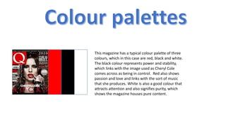
  • 1. This magazine has a typical colour palette of three colours, which in this case are red, black and white. The black colour represents power and stability, which links with the image used as Cheryl Cole comes across as being in control. Red also shows passion and love and links with the sort of music that she produces. White is also a good colour that attracts attention and also signifies purity, which shows the magazine houses pure content.
  • 2. The black text on this magazine again demonstrates power, and also grabs the readers attention as it protrudes from the page. The blue colour represents peace and tranquillity, whilst the white font again attracts the reader, with the white typography illustrating purity. A blue background is used which could again represent peace and tranquillity and could portray the magazine having a chilled vibe. White again shows purity and could perhaps show that the content and the artists focused on are pure and original. The yellow colour could represent fun and would suggest the magazine is exciting to read.
  • 3. If I was to create my own music magazine of an alternative style I would have these colours. The music involved in my magazine would be quite peaceful, and therefore the blue links in with the theme of peace and tranquillity. The white would be used to stand out and grab attention, whilst representing purity and the fact that the magazine would house proper information. The yellow would also be used to grab the readers eye and to stand out from the blue background, it would also portray hope and happiness which I hope my magazine would give. If I was to create a rock magazine I would use the colours of red, black and yellow. The red colour connotes violence and could represent blood, the black colour portrays power and darkness, with the yellow connoting danger- all of these features fitting in with the genre and style of rock. The black would mainly be used as the background, as it allows the other colours to stand out in the foreground. The red shade would mainly be used for titles/cover lines, with the yellow fonts accompanying them in the form of sub-cover lines.