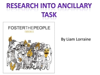
2. The font style is san Name of the band is
serif with makes the always at the top of the
album cover have a album
casual feel and isn’t
nothing to fancy
The layout of
the album
cover is very
conventional as
most albums
have the name
of band at the
This image links in top and the
with the name of image
the album as its underneath.
called “Torches”
and the characters
are all got The colours of the
something to do album are very
with torches plain and simple
contrasting with
the bands music
3. Barcode is a convention
that you would expect
to see on the back of an
album cover
The colours
are consistent
Shows what songs
are on the album, it
doesn’t have the
number of the track
next to it.
This is what label
the band are
signed to, this is These are the websites to see
normally on the exclusive information for the
album as it is a band and the music company.
convention.