2. QUESTION 1 – WHAT IS YOUR GENDER?
Out of the 18 people to answer my
survey, 12 of them were female and 6
were male. Whilst this is not quite an
equal amount it will still give me an
insight into the thoughts and opinions of
my target audience across both genders.
Furthermore, due to our main character
being female, it is likely that the majority
of our target audience for our film would
be female, as they find it easier to find
similarities between themselves and
Delilah. Overall I think that having 66% of
respondents female and 33% male is
fairly representative of what our eventual
audience would look like.
3. QUESTION 2 – WHAT IS YOUR AGE?
Sixteen people who answered our
survey are between the ages of 15 & 24,
and two between 25 & 34. Whilst this
seems like a narrow range of responses,
we believe it is a good representation of
our core target audience, as the majority
of people who are likely to be interested
in our film would be in their mid-late
teens and their early 20s. Our film would
branch out to audience members in
their 30s too but they aren’t the core
audience, however their thoughts and
opinions are still important, which is why
I included them in the survey.
4. QUESTION 3 - UPON YOUR FIRST LOOK AT OUR
POSTER, WHICH GENRE DOES IT CONVEY TO YOU?
I asked this question in order to make sure
my poster conveyed the right genre,
covering a variety of them from Romance to
Horror. The feedback shows that 89% of
respondents thought that the film was a
horror from looking at my poster, and 11%
thought it was a thriller. This is very positive
feedback as my poster meant that almost
90% of people recognised the genre of our
production, and there are many thriller-like
aspects to it, therefore the 11% who
answered that were not particularly wrong.
Nobody chose any of the genres that our
film completely contrasts, such as Romance
or Fantasy, which is very reassuring, and
suggests to me that my poster is suitable for
the genre we’re going for.
5. QUESTION 4 - OUT OF 10 (10 BEING BEST) HOW EFFECTIVE
DO YOU THINK THE POSTER IS IN TERMS OF CATCHING YOUR
ATTENTION AND CONVEYING THAT IT’S A HORROR FILM?
This question was asked in order to ensure
the quality of my poster was of a relatively
high standard. On average, my poster
received an 8.5/10, with around 17% of
people rating it as 10/10, which suggests to
me that the quality of my poster is
exceptional, with every single respondent
rating it at least 7/10. The question also
incorporates the audience’s opinion on how
effective the poster is in conveying the
horror genre, therefore showing that the
majority of people who saw my poster
thought that the horror genre was easily
recognisable. Overall, I am very pleased
with the feedback I received on my poster,
as it proved that our genre was conveyed
effectively, and the audiences suggested
that it caught their attention upon first
sight, which is needed to effectively market
an up-and-coming film.
6. QUESTION 5 – BY LOOKING AT OUR MAGAZINE
COVER, CAN YOU TELL THAT OUR PRODUCTION IS A
HORROR FILM?
This question aimed to see whether or
not our magazine cover effectively
conveyed the horror genre within the
preview of our film. 100% of
respondents said yes, ultimately
proving that our magazine cover made
the genre of our film incredibly clear,
which is absolutely necessary when
attracting more audience members.
Our magazine cover featured a very
ghostly colour palette, as well as a
conventional horror-themed weapon
(a knife). This may have helped the
audience to decipher the genre of our
production upon seeing the magazine
cover.
7. QUESTION 6 – FROM 1-10, HOW WELL DOES OUR MAGAZINE
COVER CONVEY THAT OUR PRODUCTION IS A HORROR FILM, AS
WELL AS MAKING IT SEEM ENTICING TO YOU?
This question, similarly to question 4,
aimed to see how effective our magazine
cover was in making it clear that our
production is a horror film. Our magazine
averaged around 8.7 in this respect,
proving to be exceptionally effective in
being attractive and explicitly informative
to audiences. 22% of respondents rated
our magazine cover a 10/10, with nobody
rating it any lower than a 7. Once again I
am satisfied with the feedback we
received on our magazine ancillary, as we
did not receive one negative rating,
showing the consistency in quality and
effectiveness across both our main
production and two ancillaries.
8. QUESTION 7 – IS THERE A CLEAR LINK BETWEEN
OUR FILM POSTER AND MAGAZINE COVER? (CAN
YOU EASILY TELL IT’S THE SAME FILM)
I asked this question in order to ensure that
we had a clear brand identity that was
continuous throughout both ancillaries,
making our film easily recognisable to
audiences. 100% of respondents said that
they could easily tell that the films shown on
our magazine cover and poster are visually
recognisable. The question shows that as
well as our magazine cover and poster being
at a high quality, they also fulfil their other
purpose by effectively marketing the film to
remind audiences of the film and persuade
them to look further into it (by watching our
trailer)
9. QUESTION 8 – WHAT IS
YOUR FAVOURITE FEATURE
OF EITHER THE POSTER OR
MAGAZINE COVER?
I asked this in order to find out which parts of our poster &
magazine cover ancillaries really stood out to the audience and
impressed them. I received a variety of answers that are shown
here, with various aspects of my poster standing out to different
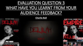
people. Some of the more popular aspects of the poster, as evident
from these comments are the red, white and black colour scheme,
which is conventional of the horror genre and stands out clearly.
The typography of ‘Delilah’ has also been praised as being ‘striking
and unusual’ whilst still conveying the horror genre clearly. One
person also said that it is easily recognisable across both products,
helping our continuity within the ancillaries. The editing of the
eyes to make them red has also been praised, as it helps to ‘create
intrigue and tension’. The simplicity of the backgrounds was
praised, as it is not ‘intricate’ and therefore doesn’t ‘distract from
the main image’. Our main images were also described as ‘striking’,
standing out clearly at the centre of both our poster and magazine
cover.