
Recommended
More Related Content
What's hot
What's hot (19)
Viewers also liked
Viewers also liked (12)
Similar to Research into similar products Album Covers
Similar to Research into similar products Album Covers (20)
More from ksinghmedia
More from ksinghmedia (15)
Recently uploaded
Recently uploaded (20)
Research into similar products Album Covers
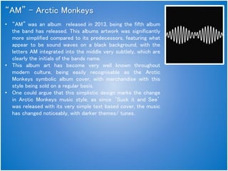
- 1. “AM” – Arctic Monkeys • “AM” was an album released in 2013, being the fifth album the band has released. This albums artwork was significantly more simplified compared to its predecessors, featuring what appear to be sound waves on a black background, with the letters AM integrated into the middle very subtlely, which are clearly the initials of the bands name. • This album art has become very well known throughout modern culture, being easily recognisable as the Arctic Monkeys symbolic album cover, with merchandise with this style being sold on a regular basis. • One could argue that this simplistic design marks the change in Arctic Monkeys music style, as since ‘Suck it and See’ was released with its very simple text based cover, the music has changed noticeably, with darker themes/ tunes.
- 2. “Blur: The Best Of” – Blur • This album art mixes several Album cover styles together quite effectively, with the inclusion of Portrait, Text Based and Simplistic album artwork. This allows for an easy way to show any viewers the bands name, and the members all in one photo, which is a method I think should be used in our media production. • The differing colours for the backgrounds of each member not only acts as a divide for each square, but could be used to represent the varying personalities of each band member, giving insight on how these people are as individuals and not just a collective group. • Using bright colours is typical of members of the Pop Genre, the opposite of what Blur are, so these colours aren't used to show the style of music they play, but as a more effective way of catching the viewers eye, appealing to a wider audience just through cover art, rather than music alone.
- 3. “Enema of the State” – Blink 182 • To Start, the name of the album, ‘Enema of the State’ is clear wordplay of the term ‘Enemy of the State’, inferring that there is some form of conflict between this band and America as a whole. The Taboo inclusion of ‘Enema’ Gives off an immature, sexualised vibe from this band just from the naming choice of their album – leaving first impressions quite unusual. • The Nurses Outfit fetishizes the album cover, as the uniform of a nurse can be viewed as quite a sexual thing. This and the pulling of the glove gives off a sense of sexual pleasure/tension too, again adding to this unique impression of the band. • The Nurses outfit being open with red lace underwear and red lipstick satisfies the male gaze, with hints of lust, which may deter female viewers as it objectifies women significantly. (The woman on the cover is Adult Porn Star Janine Lindemulder – Reading into this allows the viewer to have some form of backstory to this images Narrative) • The Inclusion of the band name on the Nurses name badge gives viewers an idea of whos album this is, giving this photo a sense of property (possibly the woman too?) • This album cover is a full sexualisation of this woman, using the male gaze to the bands advantage, catching the eye of anyone in a shop, aswell as being notably memorable to any fans of the band.