SlideShare a Scribd company logo
1 of 11
This is an example of the layout that I would
need to create for my digipak
An example of an album that uses this layout
is All Time Low’s Future Hearts
JOHN BARROWMAN – ANOTHER SIDE
• This album is entertainer’s John Barrowman’s first solo/mainstream album.
• It was produced when the artist was signed to Sony BMG – a joint venture of Sony Music
Entertainment, which is a subsidiary of Sony Corporation of America, a large media
conglomerate.
• The genre of the album is often referred to as “Easy Listening” or “Pop.”
• The target market for this type of music is often middle-aged people.
• With this mainstream genre, with a target audience who would love this type of thing, alongside
a large media conglomerate, the production of the album, including the design of the album
cover, would have been on a relatively high budget. This would have shaped how album cover
would have been designed.
• This type of style is in contrast to the digipak that I am likely to go onto create.
Sans serif font =
modern,
contemporary, non-
traditional.
1st
focal
point. Eyes
create an
emotive
response in
the audience.
Makes the
cover more
interesting.
The album cover is nearly just pure
form. This gives the image of the artist
the most focal weight, making him the
main focus of the album. John
Barrowman already had a recognisable
image, and therefore his image would
attract interest to the album through this
use of imagery.
Terminal point.
Brings the
design of the
album to a close.
Hierarchy
follows the
reading
gravity line.
This means
viewers take
in all of the
key parts of
the album.
Bull’s eye
composition.
Dramatic and
impactful, would
draw attention
on a shelf.
Browns =
Calm,
reliable,
natural. Also
more suitable
for an older
target market.
The whole mood of the album is quite
calming, and it is certainly non-
confrontational. The imagery mixed
with the colours is what helps achieve
this. This makes the album appealing to
the older target market, and suitable
for the genre of easy listening/pop.
White =
balances
out the
darkness
of the
black
and
browns.
This
makes
the
album
appear
“lighter.”
Because of its strong use of imagery, artist motifs
can already become clear, such as the positioning of
the subject. This helps make the artist more
recognisable.
There are no intertextual references or product
placement, meaning that the complete focus is on the
imagery of the subject. The voyeuristic nature in which the
subject has been presented (image shot from above, etc) in
creates a strong link between the visual and the music –
“Another Side.” In other words, the album is about him,
and he is presented in the best way possible.
• Power in the Darkness was the debut album for Punk/Post-Punk band, Tom
Robinson Band.
• It was released in 1978 by EMI, who at the time were one of the most
successful record companies at the time. However, after the short-lived
signing of Punk band the Sex Pistols, EMI seemed to flounder around how to
control its other Punk artists.
• The genre for this album is often described as Punk, or Post-Punk.
• The target market at the time for TRB would have been relatively young
people, like most Punk bands.
• These elements would have resulted in probably a relatively restricted
budget on the album, or a restriction on what the band, as a Punk band,
could do whilst under the control of a mainstream major record company.
• This album would have been made on a much cheaper design and budget ,
resulting in an entirely different aesthetic to the album I previously
looked at. However this type of style is one that I could potentially use
for my digipak as this “cheap style” has become a recognisable aesthetic.
TOM ROBINSON BAND – POWER IN
THE DARKNESS
TOM ROBINSON BAND – POWER IN
THE DARKNESS
• Power in the Darkness was the debut album for Punk/Post-Punk band, Tom
Robinson Band.
• It was released in 1978 by EMI, who at the time were one of the most
successful record companies at the time. However, after the short-lived
signing of Punk band the Sex Pistols, EMI seemed to flounder around how to
control its other Punk artists.
• The genre for this album is often described as Punk, or Post-Punk.
• The target market at the time for TRB would have been relatively young
people, like most Punk bands.
• These elements would have resulted in probably a relatively restricted
budget on the album, or a restriction on what the band, as a Punk band,
could do whilst under the control of a mainstream major record company.
• This album would have been made on a much cheaper design and budget ,
resulting in an entirely different aesthetic to the album I previously
looked at. However this type of style is one that I could potentially use
for my digipak as this “cheap style” has become a recognisable aesthetic.
Stencil font = Army,
confrontational, fighting, protest
Yellow = happiness, madness. Contrasts
HEAVILY against the black background, making
the album appear more confrontational and bold,
whilst not resorting to the classic red and black
combo, hopefully marking TRB out as something a
little different in form of protest-type music.
Black = Dark, death, sadness, balances out
the stronger, happier colours, making the
album seem more serious, and not just like
a colourful kid’s album, which it could
have been mistaken for with its use of
bright colours.
Black and white image – very in the spirit of its time
(zeitgeist). Image features the band members, but
doesn’t use them as a main focal point, as they aren’t
on the front of the album. The band also reaffirm
their political genre by featuring a stance on George
Davis in the background of the image. The band
mock The Who and Sham 69’s use of the slogan
“George Davis is Innocent,” this type of
confrontation with bands like The Who is very typical
of British Punk/Post-Punk.
1st
focal point/only focal point.
Strong, recognisable image of
protest (symbolic code) and
“power to the people.” Makes it
stand out from a shelf.
Weak follow area,
the band are presented
as unimportant,
compared to the
message of the album.
This is very typical of
the genre.
To help it draw
more attention,
the whole
album has been
placed slightly
off-centre,
almost using
the rule of
thirds. This
makes the
composition
look more
interesting.
The large amount
of intertextual
references in the
design are very
key to the genre
of which the
album comes
from as it makes
the album more
contemporary,
and reactionary.
As the album was originally an LP, the album also came with several inserts. One was an image of the band, and the
other was a stencil of the band’s logo. This encouraged customers to buy the music themselves rather than just home
tape, or borrow it from a friend. The stencil also encourages customers to engage in the messages of the album.
Black and white image – very in the spirit of its time (zeitgeist). The image features
the band members performing. Keeping any image of the artists off the front cover
of the album means that the mood created by the album is exaggerated, rather than
the brand of the band. However so that the band can still be connected with the
album it is important for the band to be somewhere on the album. Therefore placing
the image on an insert would be the perfect compromise. The fact that the image
shows movement when the band are performing also makes the image seem more
emotive and energetic. This would be very suitable for the genre and target
market.
• This album is the second album released by Hip-Hop/parody band, The Midnight Beast.
• The band remain completely unsigned, and as such, this album was released on their
own record label Sounds Like Good. “The whole album was written and produced in my
bedroom at my parents’ house. We tried other labels and it just didn’t fit into any sort of
mould so we decided to do it ourselves – Stefan (singer)
• This album can be categorized as rap/hip-hop/pop.
• This type of genre is more targeted towards young adults and teenagers, and the band
certainly do target and advertise in the right way to achieve this.
• These factors meant that although the band could basically do what they wanted in
terms of design of the album, they only had a small budget, however could save money
in other stages of production/distribution/advertising/etc as their target audience are
online natives, and could be reached for free, this way. This meant more money could
have been spent on the design of the album artwork instead.
• I chose to look at this album cover because the genre is very similar to the songs/artists
I have been looking to create a video/digipak for. All of these bands also have a very
similar situation budget and record label wise. Therefore looking at this would help me
draw inspiration for my future work.
The Midnight Beast – Shtick HeadsThe Midnight Beast – Shtick Heads
• This album is the second album released by Hip-Hop/parody band, The Midnight Beast.
• The band remain completely unsigned, and as such, this album was released on their
own record label Sounds Like Good. “The whole album was written and produced in my
bedroom at my parents’ house. We tried other labels and it just didn’t fit into any sort of
mould so we decided to do it ourselves – Stefan (singer)
• This album can be categorized as rap/hip-hop/pop.
• This type of genre is more targeted towards young adults and teenagers, and the band
certainly do target and advertise in the right way to achieve this.
• These factors meant that although the band could basically do what they wanted in
terms of design of the album, they only had a small budget, however could save money
in other stages of production/distribution/advertising/etc as their target audience are
online natives, and could be reached for free, this way. This meant more money could
have been spent on the design of the album artwork instead.
• I chose to look at this album cover because the genre is very similar to the songs/artists
I have been looking to create a video/digipak for. All of these bands also have a very
similar situation budget and record label wise. Therefore looking at this would help me
draw inspiration for my future work.
Serif
font =
DIY,
person
al,
young
and
messy.
Parental Advisory
warning = sign of
violence, bad language
etc. Has become a
badge of honour,
appealing to younger
target audience.
White =
Calming, clean,
balances out
black, red, and
violent
imagery.
Red = blood,
dangerous, violent
1st
focal point.
Eyes create
emotion, more
appealing and
interesting to
audience. Strong
imagery which
makes the album
stand out on a
shelf.
Strong violent, “horror
film” – type imagery.
Violence appealing to
younger target audience.
Shock factor attracts the
audience, and makes the
album stand out on a shelf.
2nd
focal point.
Shock factor
again with the
almost
swearing, which
would also
appeal to
younger target
audience.
Imagery on the front is
consistent throughout the
album, especially on the
back. This makes the album
look more professional,
despite having no real record
label making the decision.
Overall
mood of the
album is
quite violent
(typical of
genre),
however if
you look
closer, such
as the
expressions
or in the
inserts, it’s
more
comical. This
reflects the
band.
Lots of intertextual
references, which would
appeal to younger, more
connected target audience.
This is also typical of the
genre as well.
Bloody/messy font =
violent, “horror film
-cliché” (symbolic
code) appealing to
target audience.
Black = dark,
death.
To fully look at the whole design of the album here are the insides of the
cover.
Imagery on the outside is consistent throughout
the album. This makes the album look more
professional, despite having no real record label
making the decision.
Strong violent, “horror film” – type imagery.
Violence appealing to younger target
audience. Shock factor attracts the audience,
and makes the album stand out.
Bull’s eye
compositio
n to create
an impactful
and bold
design.
Shock factor
again with the
swearing,
which would
also appeal to
younger
target
audience, it
is also very
typical of the
genre.
Pure form. Album is made up of mainly just imagery. This
exaggerates the boldness of the album, helping it stand out
on a shelf. Could also appeal to a younger target audience as
the message of the album is conveyed through just an
image, which can be understood quickly, rather than lots of
text, which could take longer to understand.
This is
also
very
typical
of the
genre
To fully look at the whole design of the album here is the booklet for the album.
Imagery on the outside and inside is consistent
throughout the album. This makes the album
look more professional, despite having no real
record label making the decision.
Strong violent, “horror film” – type
imagery. Violence appealing to
younger target audience. Shock factor
attracts the audience, and makes the
album stand out.
Pure form balances out pure type. Half of booklet is made up of mainly just imagery. This
exaggerates the boldness of the album, giving it more impact. Could also appeal to a
younger target audience as the message of the album is conveyed through just an image,
which can be understood quickly, rather than lots of text, which could take longer to
understand. Having this large amount of imagery also balances out the large amount of text
on the other half of the booklet.

More Related Content

What's hot

A2 Media Music Video Pitch
A2 Media Music Video PitchA2 Media Music Video Pitch
A2 Media Music Video Pitchmoriamtokosi
 
Textual analysis of cd covers and print magazines
Textual analysis of cd covers and print magazinesTextual analysis of cd covers and print magazines
Textual analysis of cd covers and print magazinescobes1
 
Brandon - ATR
Brandon - ATRBrandon - ATR
Brandon - ATRB H
 
Post production features in work
Post production features in workPost production features in work
Post production features in workAminatta21
 
Digipak Analyses
Digipak AnalysesDigipak Analyses
Digipak AnalysesLornaaaa
 
Digipak and poster analysis
Digipak and poster analysisDigipak and poster analysis
Digipak and poster analysisUpsonm
 
Jessie j22new
Jessie j22newJessie j22new
Jessie j22newshaks94
 
Task 6
Task 6Task 6
Task 6PJG123
 
Too weird analysis
Too weird analysisToo weird analysis
Too weird analysisSophie Rudd
 
Poster analysis
Poster analysisPoster analysis
Poster analysisdankyjosh
 
Cd covers & prints magazine adverts
Cd covers & prints magazine advertsCd covers & prints magazine adverts
Cd covers & prints magazine advertstori98
 
Anxillary text magazine ad analysis
Anxillary text magazine ad analysisAnxillary text magazine ad analysis
Anxillary text magazine ad analysisSophie Skinner
 
Analysis of digipack a2 media
Analysis of digipack a2 mediaAnalysis of digipack a2 media
Analysis of digipack a2 mediahollylaverick
 
Album cover analysis Improvements
Album cover analysis ImprovementsAlbum cover analysis Improvements
Album cover analysis ImprovementsHollyFreeman
 
Textual analysis of 5 digi pak covers and 3 Print magazine adverts
Textual analysis of 5 digi pak covers and 3 Print magazine advertsTextual analysis of 5 digi pak covers and 3 Print magazine adverts
Textual analysis of 5 digi pak covers and 3 Print magazine advertsmaxwellmagee
 
Music Album Digipak Analysis
Music Album Digipak AnalysisMusic Album Digipak Analysis
Music Album Digipak AnalysisSymonAguilar1
 

What's hot (20)

A2 Media Music Video Pitch
A2 Media Music Video PitchA2 Media Music Video Pitch
A2 Media Music Video Pitch
 
Textual analysis of cd covers and print magazines
Textual analysis of cd covers and print magazinesTextual analysis of cd covers and print magazines
Textual analysis of cd covers and print magazines
 
Brandon - ATR
Brandon - ATRBrandon - ATR
Brandon - ATR
 
Post production features in work
Post production features in workPost production features in work
Post production features in work
 
Digipak Analyses
Digipak AnalysesDigipak Analyses
Digipak Analyses
 
Digipak and poster analysis
Digipak and poster analysisDigipak and poster analysis
Digipak and poster analysis
 
Jessie j22new
Jessie j22newJessie j22new
Jessie j22new
 
Task 6
Task 6Task 6
Task 6
 
Too weird analysis
Too weird analysisToo weird analysis
Too weird analysis
 
Digipak analysis ½
Digipak analysis ½Digipak analysis ½
Digipak analysis ½
 
Digi Adverts
Digi AdvertsDigi Adverts
Digi Adverts
 
Poster analysis
Poster analysisPoster analysis
Poster analysis
 
Cd covers & prints magazine adverts
Cd covers & prints magazine advertsCd covers & prints magazine adverts
Cd covers & prints magazine adverts
 
Anxillary text magazine ad analysis
Anxillary text magazine ad analysisAnxillary text magazine ad analysis
Anxillary text magazine ad analysis
 
Analysis of digipack a2 media
Analysis of digipack a2 mediaAnalysis of digipack a2 media
Analysis of digipack a2 media
 
Album artwork
Album artworkAlbum artwork
Album artwork
 
Evaluation Question 2
Evaluation Question 2Evaluation Question 2
Evaluation Question 2
 
Album cover analysis Improvements
Album cover analysis ImprovementsAlbum cover analysis Improvements
Album cover analysis Improvements
 
Textual analysis of 5 digi pak covers and 3 Print magazine adverts
Textual analysis of 5 digi pak covers and 3 Print magazine advertsTextual analysis of 5 digi pak covers and 3 Print magazine adverts
Textual analysis of 5 digi pak covers and 3 Print magazine adverts
 
Music Album Digipak Analysis
Music Album Digipak AnalysisMusic Album Digipak Analysis
Music Album Digipak Analysis
 

Similar to Analysis of Digipaks (Album Covers)

Digipacks
DigipacksDigipacks
DigipacksPavD95
 
Secondary audience research
Secondary audience researchSecondary audience research
Secondary audience researchfaithsavory
 
Catfish pp frankie
Catfish pp   frankieCatfish pp   frankie
Catfish pp frankieKatie Emily
 
Student ancillary task convention analysis 2
Student ancillary task convention analysis 2Student ancillary task convention analysis 2
Student ancillary task convention analysis 2Skyward9
 
Digipak Research
Digipak ResearchDigipak Research
Digipak Researchguest3d82fa
 
Digipack evaluation
Digipack evaluationDigipack evaluation
Digipack evaluationjwb300
 
Magazine analysis
Magazine analysisMagazine analysis
Magazine analysisJack Bocock
 
Magazine Poster Analysis
Magazine Poster AnalysisMagazine Poster Analysis
Magazine Poster AnalysisJack Bocock
 
Digipack and advert research
Digipack and advert researchDigipack and advert research
Digipack and advert researchTobyRiding
 
Bastille Cross-Media Case Study
Bastille Cross-Media Case StudyBastille Cross-Media Case Study
Bastille Cross-Media Case Studyleannacatherina
 
Digipack Deconstruction 4
Digipack Deconstruction 4Digipack Deconstruction 4
Digipack Deconstruction 4Katie Nicholls
 
Cd Covers Analysis
Cd Covers AnalysisCd Covers Analysis
Cd Covers AnalysisWaleedbutt5
 
Digi pak and magazine analysis
Digi pak and magazine analysisDigi pak and magazine analysis
Digi pak and magazine analysisMatAppelyardMedia
 
Kaiser chiefs case study
Kaiser chiefs case studyKaiser chiefs case study
Kaiser chiefs case studyBen Ambrose
 

Similar to Analysis of Digipaks (Album Covers) (20)

Digipak Analysis X3
Digipak Analysis X3Digipak Analysis X3
Digipak Analysis X3
 
Digipak analysis
Digipak analysisDigipak analysis
Digipak analysis
 
Digipacks
DigipacksDigipacks
Digipacks
 
Secondary audience research
Secondary audience researchSecondary audience research
Secondary audience research
 
Catfish pp frankie
Catfish pp   frankieCatfish pp   frankie
Catfish pp frankie
 
Digipaks
DigipaksDigipaks
Digipaks
 
Student ancillary task convention analysis 2
Student ancillary task convention analysis 2Student ancillary task convention analysis 2
Student ancillary task convention analysis 2
 
Digipak Research
Digipak ResearchDigipak Research
Digipak Research
 
Digipack evaluation
Digipack evaluationDigipack evaluation
Digipack evaluation
 
Magazine analysis
Magazine analysisMagazine analysis
Magazine analysis
 
Magazine Poster Analysis
Magazine Poster AnalysisMagazine Poster Analysis
Magazine Poster Analysis
 
Digipack and advert research
Digipack and advert researchDigipack and advert research
Digipack and advert research
 
Bastille Cross-Media Case Study
Bastille Cross-Media Case StudyBastille Cross-Media Case Study
Bastille Cross-Media Case Study
 
Kings of leon
Kings of leonKings of leon
Kings of leon
 
Digipack Deconstruction 4
Digipack Deconstruction 4Digipack Deconstruction 4
Digipack Deconstruction 4
 
Cd Covers Analysis
Cd Covers AnalysisCd Covers Analysis
Cd Covers Analysis
 
Digi pak and magazine analysis
Digi pak and magazine analysisDigi pak and magazine analysis
Digi pak and magazine analysis
 
Task 2
Task 2Task 2
Task 2
 
Kaiser chiefs case study
Kaiser chiefs case studyKaiser chiefs case study
Kaiser chiefs case study
 
Album analysis 2
Album analysis 2Album analysis 2
Album analysis 2
 

Recently uploaded

Employee wellbeing at the workplace.pptx
Employee wellbeing at the workplace.pptxEmployee wellbeing at the workplace.pptx
Employee wellbeing at the workplace.pptxNirmalaLoungPoorunde1
 
Presiding Officer Training module 2024 lok sabha elections
Presiding Officer Training module 2024 lok sabha electionsPresiding Officer Training module 2024 lok sabha elections
Presiding Officer Training module 2024 lok sabha electionsanshu789521
 
internship ppt on smartinternz platform as salesforce developer
internship ppt on smartinternz platform as salesforce developerinternship ppt on smartinternz platform as salesforce developer
internship ppt on smartinternz platform as salesforce developerunnathinaik
 
ENGLISH5 QUARTER4 MODULE1 WEEK1-3 How Visual and Multimedia Elements.pptx
ENGLISH5 QUARTER4 MODULE1 WEEK1-3 How Visual and Multimedia Elements.pptxENGLISH5 QUARTER4 MODULE1 WEEK1-3 How Visual and Multimedia Elements.pptx
ENGLISH5 QUARTER4 MODULE1 WEEK1-3 How Visual and Multimedia Elements.pptxAnaBeatriceAblay2
 
Science 7 - LAND and SEA BREEZE and its Characteristics
Science 7 - LAND and SEA BREEZE and its CharacteristicsScience 7 - LAND and SEA BREEZE and its Characteristics
Science 7 - LAND and SEA BREEZE and its CharacteristicsKarinaGenton
 
Proudly South Africa powerpoint Thorisha.pptx
Proudly South Africa powerpoint Thorisha.pptxProudly South Africa powerpoint Thorisha.pptx
Proudly South Africa powerpoint Thorisha.pptxthorishapillay1
 
Introduction to AI in Higher Education_draft.pptx
Introduction to AI in Higher Education_draft.pptxIntroduction to AI in Higher Education_draft.pptx
Introduction to AI in Higher Education_draft.pptxpboyjonauth
 
CARE OF CHILD IN INCUBATOR..........pptx
CARE OF CHILD IN INCUBATOR..........pptxCARE OF CHILD IN INCUBATOR..........pptx
CARE OF CHILD IN INCUBATOR..........pptxGaneshChakor2
 
Painted Grey Ware.pptx, PGW Culture of India
Painted Grey Ware.pptx, PGW Culture of IndiaPainted Grey Ware.pptx, PGW Culture of India
Painted Grey Ware.pptx, PGW Culture of IndiaVirag Sontakke
 
ECONOMIC CONTEXT - LONG FORM TV DRAMA - PPT
ECONOMIC CONTEXT - LONG FORM TV DRAMA - PPTECONOMIC CONTEXT - LONG FORM TV DRAMA - PPT
ECONOMIC CONTEXT - LONG FORM TV DRAMA - PPTiammrhaywood
 
“Oh GOSH! Reflecting on Hackteria's Collaborative Practices in a Global Do-It...
“Oh GOSH! Reflecting on Hackteria's Collaborative Practices in a Global Do-It...“Oh GOSH! Reflecting on Hackteria's Collaborative Practices in a Global Do-It...
“Oh GOSH! Reflecting on Hackteria's Collaborative Practices in a Global Do-It...Marc Dusseiller Dusjagr
 
How to Make a Pirate ship Primary Education.pptx
How to Make a Pirate ship Primary Education.pptxHow to Make a Pirate ship Primary Education.pptx
How to Make a Pirate ship Primary Education.pptxmanuelaromero2013
 
भारत-रोम व्यापार.pptx, Indo-Roman Trade,
भारत-रोम व्यापार.pptx, Indo-Roman Trade,भारत-रोम व्यापार.pptx, Indo-Roman Trade,
भारत-रोम व्यापार.pptx, Indo-Roman Trade,Virag Sontakke
 
Final demo Grade 9 for demo Plan dessert.pptx
Final demo Grade 9 for demo Plan dessert.pptxFinal demo Grade 9 for demo Plan dessert.pptx
Final demo Grade 9 for demo Plan dessert.pptxAvyJaneVismanos
 
_Math 4-Q4 Week 5.pptx Steps in Collecting Data
_Math 4-Q4 Week 5.pptx Steps in Collecting Data_Math 4-Q4 Week 5.pptx Steps in Collecting Data
_Math 4-Q4 Week 5.pptx Steps in Collecting DataJhengPantaleon
 
Class 11 Legal Studies Ch-1 Concept of State .pdf
Class 11 Legal Studies Ch-1 Concept of State .pdfClass 11 Legal Studies Ch-1 Concept of State .pdf
Class 11 Legal Studies Ch-1 Concept of State .pdfakmcokerachita
 
Solving Puzzles Benefits Everyone (English).pptx
Solving Puzzles Benefits Everyone (English).pptxSolving Puzzles Benefits Everyone (English).pptx
Solving Puzzles Benefits Everyone (English).pptxOH TEIK BIN
 
Pharmacognosy Flower 3. Compositae 2023.pdf
Pharmacognosy Flower 3. Compositae 2023.pdfPharmacognosy Flower 3. Compositae 2023.pdf
Pharmacognosy Flower 3. Compositae 2023.pdfMahmoud M. Sallam
 
call girls in Kamla Market (DELHI) 🔝 >༒9953330565🔝 genuine Escort Service 🔝✔️✔️
call girls in Kamla Market (DELHI) 🔝 >༒9953330565🔝 genuine Escort Service 🔝✔️✔️call girls in Kamla Market (DELHI) 🔝 >༒9953330565🔝 genuine Escort Service 🔝✔️✔️
call girls in Kamla Market (DELHI) 🔝 >༒9953330565🔝 genuine Escort Service 🔝✔️✔️9953056974 Low Rate Call Girls In Saket, Delhi NCR
 

Recently uploaded (20)

Employee wellbeing at the workplace.pptx
Employee wellbeing at the workplace.pptxEmployee wellbeing at the workplace.pptx
Employee wellbeing at the workplace.pptx
 
Model Call Girl in Tilak Nagar Delhi reach out to us at 🔝9953056974🔝
Model Call Girl in Tilak Nagar Delhi reach out to us at 🔝9953056974🔝Model Call Girl in Tilak Nagar Delhi reach out to us at 🔝9953056974🔝
Model Call Girl in Tilak Nagar Delhi reach out to us at 🔝9953056974🔝
 
Presiding Officer Training module 2024 lok sabha elections
Presiding Officer Training module 2024 lok sabha electionsPresiding Officer Training module 2024 lok sabha elections
Presiding Officer Training module 2024 lok sabha elections
 
internship ppt on smartinternz platform as salesforce developer
internship ppt on smartinternz platform as salesforce developerinternship ppt on smartinternz platform as salesforce developer
internship ppt on smartinternz platform as salesforce developer
 
ENGLISH5 QUARTER4 MODULE1 WEEK1-3 How Visual and Multimedia Elements.pptx
ENGLISH5 QUARTER4 MODULE1 WEEK1-3 How Visual and Multimedia Elements.pptxENGLISH5 QUARTER4 MODULE1 WEEK1-3 How Visual and Multimedia Elements.pptx
ENGLISH5 QUARTER4 MODULE1 WEEK1-3 How Visual and Multimedia Elements.pptx
 
Science 7 - LAND and SEA BREEZE and its Characteristics
Science 7 - LAND and SEA BREEZE and its CharacteristicsScience 7 - LAND and SEA BREEZE and its Characteristics
Science 7 - LAND and SEA BREEZE and its Characteristics
 
Proudly South Africa powerpoint Thorisha.pptx
Proudly South Africa powerpoint Thorisha.pptxProudly South Africa powerpoint Thorisha.pptx
Proudly South Africa powerpoint Thorisha.pptx
 
Introduction to AI in Higher Education_draft.pptx
Introduction to AI in Higher Education_draft.pptxIntroduction to AI in Higher Education_draft.pptx
Introduction to AI in Higher Education_draft.pptx
 
CARE OF CHILD IN INCUBATOR..........pptx
CARE OF CHILD IN INCUBATOR..........pptxCARE OF CHILD IN INCUBATOR..........pptx
CARE OF CHILD IN INCUBATOR..........pptx
 
Painted Grey Ware.pptx, PGW Culture of India
Painted Grey Ware.pptx, PGW Culture of IndiaPainted Grey Ware.pptx, PGW Culture of India
Painted Grey Ware.pptx, PGW Culture of India
 
ECONOMIC CONTEXT - LONG FORM TV DRAMA - PPT
ECONOMIC CONTEXT - LONG FORM TV DRAMA - PPTECONOMIC CONTEXT - LONG FORM TV DRAMA - PPT
ECONOMIC CONTEXT - LONG FORM TV DRAMA - PPT
 
“Oh GOSH! Reflecting on Hackteria's Collaborative Practices in a Global Do-It...
“Oh GOSH! Reflecting on Hackteria's Collaborative Practices in a Global Do-It...“Oh GOSH! Reflecting on Hackteria's Collaborative Practices in a Global Do-It...
“Oh GOSH! Reflecting on Hackteria's Collaborative Practices in a Global Do-It...
 
How to Make a Pirate ship Primary Education.pptx
How to Make a Pirate ship Primary Education.pptxHow to Make a Pirate ship Primary Education.pptx
How to Make a Pirate ship Primary Education.pptx
 
भारत-रोम व्यापार.pptx, Indo-Roman Trade,
भारत-रोम व्यापार.pptx, Indo-Roman Trade,भारत-रोम व्यापार.pptx, Indo-Roman Trade,
भारत-रोम व्यापार.pptx, Indo-Roman Trade,
 
Final demo Grade 9 for demo Plan dessert.pptx
Final demo Grade 9 for demo Plan dessert.pptxFinal demo Grade 9 for demo Plan dessert.pptx
Final demo Grade 9 for demo Plan dessert.pptx
 
_Math 4-Q4 Week 5.pptx Steps in Collecting Data
_Math 4-Q4 Week 5.pptx Steps in Collecting Data_Math 4-Q4 Week 5.pptx Steps in Collecting Data
_Math 4-Q4 Week 5.pptx Steps in Collecting Data
 
Class 11 Legal Studies Ch-1 Concept of State .pdf
Class 11 Legal Studies Ch-1 Concept of State .pdfClass 11 Legal Studies Ch-1 Concept of State .pdf
Class 11 Legal Studies Ch-1 Concept of State .pdf
 
Solving Puzzles Benefits Everyone (English).pptx
Solving Puzzles Benefits Everyone (English).pptxSolving Puzzles Benefits Everyone (English).pptx
Solving Puzzles Benefits Everyone (English).pptx
 
Pharmacognosy Flower 3. Compositae 2023.pdf
Pharmacognosy Flower 3. Compositae 2023.pdfPharmacognosy Flower 3. Compositae 2023.pdf
Pharmacognosy Flower 3. Compositae 2023.pdf
 
call girls in Kamla Market (DELHI) 🔝 >༒9953330565🔝 genuine Escort Service 🔝✔️✔️
call girls in Kamla Market (DELHI) 🔝 >༒9953330565🔝 genuine Escort Service 🔝✔️✔️call girls in Kamla Market (DELHI) 🔝 >༒9953330565🔝 genuine Escort Service 🔝✔️✔️
call girls in Kamla Market (DELHI) 🔝 >༒9953330565🔝 genuine Escort Service 🔝✔️✔️
 

Analysis of Digipaks (Album Covers)

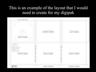
  • 1. This is an example of the layout that I would need to create for my digipak
  • 2. An example of an album that uses this layout is All Time Low’s Future Hearts
  • 3. JOHN BARROWMAN – ANOTHER SIDE • This album is entertainer’s John Barrowman’s first solo/mainstream album. • It was produced when the artist was signed to Sony BMG – a joint venture of Sony Music Entertainment, which is a subsidiary of Sony Corporation of America, a large media conglomerate. • The genre of the album is often referred to as “Easy Listening” or “Pop.” • The target market for this type of music is often middle-aged people. • With this mainstream genre, with a target audience who would love this type of thing, alongside a large media conglomerate, the production of the album, including the design of the album cover, would have been on a relatively high budget. This would have shaped how album cover would have been designed. • This type of style is in contrast to the digipak that I am likely to go onto create.
  • 4. Sans serif font = modern, contemporary, non- traditional. 1st focal point. Eyes create an emotive response in the audience. Makes the cover more interesting. The album cover is nearly just pure form. This gives the image of the artist the most focal weight, making him the main focus of the album. John Barrowman already had a recognisable image, and therefore his image would attract interest to the album through this use of imagery. Terminal point. Brings the design of the album to a close. Hierarchy follows the reading gravity line. This means viewers take in all of the key parts of the album. Bull’s eye composition. Dramatic and impactful, would draw attention on a shelf. Browns = Calm, reliable, natural. Also more suitable for an older target market. The whole mood of the album is quite calming, and it is certainly non- confrontational. The imagery mixed with the colours is what helps achieve this. This makes the album appealing to the older target market, and suitable for the genre of easy listening/pop. White = balances out the darkness of the black and browns. This makes the album appear “lighter.” Because of its strong use of imagery, artist motifs can already become clear, such as the positioning of the subject. This helps make the artist more recognisable. There are no intertextual references or product placement, meaning that the complete focus is on the imagery of the subject. The voyeuristic nature in which the subject has been presented (image shot from above, etc) in creates a strong link between the visual and the music – “Another Side.” In other words, the album is about him, and he is presented in the best way possible.
  • 5. • Power in the Darkness was the debut album for Punk/Post-Punk band, Tom Robinson Band. • It was released in 1978 by EMI, who at the time were one of the most successful record companies at the time. However, after the short-lived signing of Punk band the Sex Pistols, EMI seemed to flounder around how to control its other Punk artists. • The genre for this album is often described as Punk, or Post-Punk. • The target market at the time for TRB would have been relatively young people, like most Punk bands. • These elements would have resulted in probably a relatively restricted budget on the album, or a restriction on what the band, as a Punk band, could do whilst under the control of a mainstream major record company. • This album would have been made on a much cheaper design and budget , resulting in an entirely different aesthetic to the album I previously looked at. However this type of style is one that I could potentially use for my digipak as this “cheap style” has become a recognisable aesthetic. TOM ROBINSON BAND – POWER IN THE DARKNESS TOM ROBINSON BAND – POWER IN THE DARKNESS • Power in the Darkness was the debut album for Punk/Post-Punk band, Tom Robinson Band. • It was released in 1978 by EMI, who at the time were one of the most successful record companies at the time. However, after the short-lived signing of Punk band the Sex Pistols, EMI seemed to flounder around how to control its other Punk artists. • The genre for this album is often described as Punk, or Post-Punk. • The target market at the time for TRB would have been relatively young people, like most Punk bands. • These elements would have resulted in probably a relatively restricted budget on the album, or a restriction on what the band, as a Punk band, could do whilst under the control of a mainstream major record company. • This album would have been made on a much cheaper design and budget , resulting in an entirely different aesthetic to the album I previously looked at. However this type of style is one that I could potentially use for my digipak as this “cheap style” has become a recognisable aesthetic.
  • 6. Stencil font = Army, confrontational, fighting, protest Yellow = happiness, madness. Contrasts HEAVILY against the black background, making the album appear more confrontational and bold, whilst not resorting to the classic red and black combo, hopefully marking TRB out as something a little different in form of protest-type music. Black = Dark, death, sadness, balances out the stronger, happier colours, making the album seem more serious, and not just like a colourful kid’s album, which it could have been mistaken for with its use of bright colours. Black and white image – very in the spirit of its time (zeitgeist). Image features the band members, but doesn’t use them as a main focal point, as they aren’t on the front of the album. The band also reaffirm their political genre by featuring a stance on George Davis in the background of the image. The band mock The Who and Sham 69’s use of the slogan “George Davis is Innocent,” this type of confrontation with bands like The Who is very typical of British Punk/Post-Punk. 1st focal point/only focal point. Strong, recognisable image of protest (symbolic code) and “power to the people.” Makes it stand out from a shelf. Weak follow area, the band are presented as unimportant, compared to the message of the album. This is very typical of the genre. To help it draw more attention, the whole album has been placed slightly off-centre, almost using the rule of thirds. This makes the composition look more interesting. The large amount of intertextual references in the design are very key to the genre of which the album comes from as it makes the album more contemporary, and reactionary.
  • 7. As the album was originally an LP, the album also came with several inserts. One was an image of the band, and the other was a stencil of the band’s logo. This encouraged customers to buy the music themselves rather than just home tape, or borrow it from a friend. The stencil also encourages customers to engage in the messages of the album. Black and white image – very in the spirit of its time (zeitgeist). The image features the band members performing. Keeping any image of the artists off the front cover of the album means that the mood created by the album is exaggerated, rather than the brand of the band. However so that the band can still be connected with the album it is important for the band to be somewhere on the album. Therefore placing the image on an insert would be the perfect compromise. The fact that the image shows movement when the band are performing also makes the image seem more emotive and energetic. This would be very suitable for the genre and target market.
  • 8. • This album is the second album released by Hip-Hop/parody band, The Midnight Beast. • The band remain completely unsigned, and as such, this album was released on their own record label Sounds Like Good. “The whole album was written and produced in my bedroom at my parents’ house. We tried other labels and it just didn’t fit into any sort of mould so we decided to do it ourselves – Stefan (singer) • This album can be categorized as rap/hip-hop/pop. • This type of genre is more targeted towards young adults and teenagers, and the band certainly do target and advertise in the right way to achieve this. • These factors meant that although the band could basically do what they wanted in terms of design of the album, they only had a small budget, however could save money in other stages of production/distribution/advertising/etc as their target audience are online natives, and could be reached for free, this way. This meant more money could have been spent on the design of the album artwork instead. • I chose to look at this album cover because the genre is very similar to the songs/artists I have been looking to create a video/digipak for. All of these bands also have a very similar situation budget and record label wise. Therefore looking at this would help me draw inspiration for my future work. The Midnight Beast – Shtick HeadsThe Midnight Beast – Shtick Heads • This album is the second album released by Hip-Hop/parody band, The Midnight Beast. • The band remain completely unsigned, and as such, this album was released on their own record label Sounds Like Good. “The whole album was written and produced in my bedroom at my parents’ house. We tried other labels and it just didn’t fit into any sort of mould so we decided to do it ourselves – Stefan (singer) • This album can be categorized as rap/hip-hop/pop. • This type of genre is more targeted towards young adults and teenagers, and the band certainly do target and advertise in the right way to achieve this. • These factors meant that although the band could basically do what they wanted in terms of design of the album, they only had a small budget, however could save money in other stages of production/distribution/advertising/etc as their target audience are online natives, and could be reached for free, this way. This meant more money could have been spent on the design of the album artwork instead. • I chose to look at this album cover because the genre is very similar to the songs/artists I have been looking to create a video/digipak for. All of these bands also have a very similar situation budget and record label wise. Therefore looking at this would help me draw inspiration for my future work.
  • 9. Serif font = DIY, person al, young and messy. Parental Advisory warning = sign of violence, bad language etc. Has become a badge of honour, appealing to younger target audience. White = Calming, clean, balances out black, red, and violent imagery. Red = blood, dangerous, violent 1st focal point. Eyes create emotion, more appealing and interesting to audience. Strong imagery which makes the album stand out on a shelf. Strong violent, “horror film” – type imagery. Violence appealing to younger target audience. Shock factor attracts the audience, and makes the album stand out on a shelf. 2nd focal point. Shock factor again with the almost swearing, which would also appeal to younger target audience. Imagery on the front is consistent throughout the album, especially on the back. This makes the album look more professional, despite having no real record label making the decision. Overall mood of the album is quite violent (typical of genre), however if you look closer, such as the expressions or in the inserts, it’s more comical. This reflects the band. Lots of intertextual references, which would appeal to younger, more connected target audience. This is also typical of the genre as well. Bloody/messy font = violent, “horror film -cliché” (symbolic code) appealing to target audience. Black = dark, death.
  • 10. To fully look at the whole design of the album here are the insides of the cover. Imagery on the outside is consistent throughout the album. This makes the album look more professional, despite having no real record label making the decision. Strong violent, “horror film” – type imagery. Violence appealing to younger target audience. Shock factor attracts the audience, and makes the album stand out. Bull’s eye compositio n to create an impactful and bold design. Shock factor again with the swearing, which would also appeal to younger target audience, it is also very typical of the genre. Pure form. Album is made up of mainly just imagery. This exaggerates the boldness of the album, helping it stand out on a shelf. Could also appeal to a younger target audience as the message of the album is conveyed through just an image, which can be understood quickly, rather than lots of text, which could take longer to understand. This is also very typical of the genre
  • 11. To fully look at the whole design of the album here is the booklet for the album. Imagery on the outside and inside is consistent throughout the album. This makes the album look more professional, despite having no real record label making the decision. Strong violent, “horror film” – type imagery. Violence appealing to younger target audience. Shock factor attracts the audience, and makes the album stand out. Pure form balances out pure type. Half of booklet is made up of mainly just imagery. This exaggerates the boldness of the album, giving it more impact. Could also appeal to a younger target audience as the message of the album is conveyed through just an image, which can be understood quickly, rather than lots of text, which could take longer to understand. Having this large amount of imagery also balances out the large amount of text on the other half of the booklet.