
Recommended
More Related Content
What's hot
What's hot (20)
Similar to Movie poster mood board
Similar to Movie poster mood board (20)
More from kayleighkee
Recently uploaded
Recently uploaded (20)
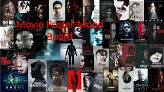
Movie poster mood board
- 2. Explanation of ideas • The majority of these film posters are similar in layout; some show two of the characters blended together, or only show half of the main characters face. There is colour scheme, usually black and red or hardly any colour at all. For my film, I think I will use a white background, like the ‘Split’ movie poster. In these film posters, there is quite good lighting on the characters shown, to make it clear that they are the protagonist. These posters to me, do not look too busy, to keep the element of mystery, as they are thriller horror hybrid films. • I like this film poster, and will consider recreating it for my own film poster. I like that only half of his face is shown, to promote the element of mystery, and the cracks across his face promote the idea that he isn’t normal. • I also like this poster, as it reflects the genre of my film and the storyline. Its creative and is a bit more drastic than the poster before. • This poster also appeals to me as it includes both characters. I may recreate this, but include a knife in the middle of them, as an indication of the main storyline in my film. • Finally, this poster is appealing as I like the blur effect. If I were to recreate this, I would use the blur effect with the green tint, but position the character differently.