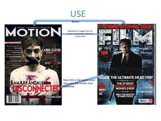
SlideShare a Scribd company logo
1 of 7
USE
        Banner


    Masthead is largest font on
   cover, is at the top and has a
             similar font


Main title is the largest cover
story size, just smaller than
masthead
USE
•   During the production for the Film Magazine Front Cover, I used inspiration from TOTAL FILM. I felt
    its house style was very slick and it always seemed to have a main cover story image; which is what
    inspired my Magazine to have one main image/character on the front.

•   The colours of Red, Black and Grey (3 colour rule) is also present in this issue of TOTAL FILM so I
    also used this too, but for mine it wasn’t to portray a similarity between the two magazines it was
    to represent the Horror genre as I feel Red is a very iconic colour for Horror.

•   I used the placement of TOTAL FILM’s masthead as well (at the top, filling the whole width) and it is
    also the largest and boldest text on the page making in the main text. I also took inspiration into
    finding a font similar to TOTAL FILM’s because it looks slick and is very representative of a film
    magazine/media work I feel.

•   The title of the film is underneath the image on both. This is to make it clear what the image is
    representing, this text is also a lot larger than all the other titles on the page making it the main
    article/the cover story.

•   I have used the typical codes and conventions of a magazine such as a barcode, the price, a main
    image, the title of the magazine and tagline, the title of film and slugline, additional stories etc.
DEVELOP
  Instead of using a banner
  I created a slugline for my
          Magazine


  The other issue stories and
  Articles are a different style
  But in a similar position


The one model image is different
  In shot type and eye contact
DEVELOP
•   Instead of using a banner for my magazine, in a similar position I created a slug line which would be
    used on all of the issues of MOTION magazine.

•   In my Masthead I have been more simplistic with the way in which I have presented my masthead
    compared to the 'Total Film' magazine. I feel this is due to genre and the plot of the films being
    represented, I feel the simplicity of the Masthead on my magazine is effective for the horror genre
    and the Masthead for TOTAL FILM is effective for the busy and crazy plotline of Inception.

•   Although I have copied the convention of having other article stories around the sides of the
    image, I have developed it by using a more creative way by using a black box behind texts and
    making the text more slick and simplistic than shiny, bold and loud. This again, is due to genre of
    the film being represented and also because I wanted a very professional looking “indie” kind of
    Film Magazine look.

•   Although I used the idea of a One Model Image, I developed this by making it a Medium Close up
    rather than a Medium Long Shot. The image on MOTION Magazine is also giving eye contact,
    whereas the TOTAL FILM is off eye contact. This is because I wanted the Film Magazine to be more
    engaging with the audience, to have speculation around whether he is a good or bad character as
    the Mise-en-scene show him to be week however the structure and pose of the model looks very
    strong.
CHALLENGE
 Black edge/Spotlight Gradient


 Genre/Mood/Theme


       Green tint
CHALLENGE
•   I have a kind of Slugline/Caption with my magazine saying THE PAST THE
    PRESENT THE FUTURE which links in nicely with the title MOTION and the
    overall theme of the Magazine. For my Magazine, I thought it could
    include films from the past, the present and the future as I thought this
    had a unique and individual but easily accessible selling point to a target
    audience.

•   I've purposefully not made my magazine cover very busy. I wanted to
    make the main focus to be on the image because I wanted
    DISCONNECTED to be the main article for this issue of MOTION magazine.

•   The overall mood and theme is different as they are different genre. On
    my magazine I added a green tinge by using the colour balance and I
    enhanced the redness of the blood by going over it with the paint brush
    on a red colour with a low opacity. I wanted to make it very vibrant but
    moody at the same time.

More Related Content

What's hot

Question1 - magazine - Rebecca McKenzie
Question1 - magazine - Rebecca McKenzieQuestion1 - magazine - Rebecca McKenzie
Question1 - magazine - Rebecca McKenzieSamArrandale94
 
My Magazine Deconstruction
My Magazine DeconstructionMy Magazine Deconstruction
My Magazine DeconstructionKathryn Peers
 
Further Evaluation Question 1
Further Evaluation Question 1Further Evaluation Question 1
Further Evaluation Question 1katarina1997
 
Griff preliminary magazine front cover and contents
Griff preliminary magazine front cover and contentsGriff preliminary magazine front cover and contents
Griff preliminary magazine front cover and contentsbir
 
Ancillary products magazine
Ancillary products magazineAncillary products magazine
Ancillary products magazinelewisjupp
 
.Effective image analysis
.Effective image analysis.Effective image analysis
.Effective image analysisJamieEgan0
 
In what ways does your media product use, develop or challenge forms and conv...
In what ways does your media product use, develop or challenge forms and conv...In what ways does your media product use, develop or challenge forms and conv...
In what ways does your media product use, develop or challenge forms and conv...jhalsallchs
 
Magazine cover analysis
Magazine cover analysisMagazine cover analysis
Magazine cover analysisjasmin_goody
 
Music magazine shot planning
Music magazine shot planningMusic magazine shot planning
Music magazine shot planningKatie Leese
 
Codes and convention of double page spread
Codes and convention of double page spread Codes and convention of double page spread
Codes and convention of double page spread 08WaittA
 
Analysis photo
Analysis photo Analysis photo
Analysis photo yngmina
 
Evaluation 3
Evaluation 3Evaluation 3
Evaluation 3RKaur12
 

What's hot (19)

Ancillary analysis
Ancillary analysisAncillary analysis
Ancillary analysis
 
Question1 - magazine - Rebecca McKenzie
Question1 - magazine - Rebecca McKenzieQuestion1 - magazine - Rebecca McKenzie
Question1 - magazine - Rebecca McKenzie
 
Magazine
MagazineMagazine
Magazine
 
Ancillary analysis
Ancillary analysisAncillary analysis
Ancillary analysis
 
Media Pitch
Media PitchMedia Pitch
Media Pitch
 
My Magazine Deconstruction
My Magazine DeconstructionMy Magazine Deconstruction
My Magazine Deconstruction
 
Evaluation Q1
Evaluation Q1Evaluation Q1
Evaluation Q1
 
Further Evaluation Question 1
Further Evaluation Question 1Further Evaluation Question 1
Further Evaluation Question 1
 
Evaluation question
Evaluation question Evaluation question
Evaluation question
 
Griff preliminary magazine front cover and contents
Griff preliminary magazine front cover and contentsGriff preliminary magazine front cover and contents
Griff preliminary magazine front cover and contents
 
Ancillary products magazine
Ancillary products magazineAncillary products magazine
Ancillary products magazine
 
.Effective image analysis
.Effective image analysis.Effective image analysis
.Effective image analysis
 
In what ways does your media product use, develop or challenge forms and conv...
In what ways does your media product use, develop or challenge forms and conv...In what ways does your media product use, develop or challenge forms and conv...
In what ways does your media product use, develop or challenge forms and conv...
 
Q1
Q1Q1
Q1
 
Magazine cover analysis
Magazine cover analysisMagazine cover analysis
Magazine cover analysis
 
Music magazine shot planning
Music magazine shot planningMusic magazine shot planning
Music magazine shot planning
 
Codes and convention of double page spread
Codes and convention of double page spread Codes and convention of double page spread
Codes and convention of double page spread
 
Analysis photo
Analysis photo Analysis photo
Analysis photo
 
Evaluation 3
Evaluation 3Evaluation 3
Evaluation 3
 

Similar to USE DEVELOP CHALLENGE Magazine Cover

Hannah evaluation question one
Hannah evaluation question oneHannah evaluation question one
Hannah evaluation question oneMcGrailHannah
 
Evaluation quest 1 magazine cover
Evaluation quest 1 magazine coverEvaluation quest 1 magazine cover
Evaluation quest 1 magazine covermattdaave123
 
Evaluation quest 1 magazine cover
Evaluation quest 1 magazine coverEvaluation quest 1 magazine cover
Evaluation quest 1 magazine covermattdaave123
 
Evaluation Question 1
Evaluation Question 1Evaluation Question 1
Evaluation Question 1meganfinchx
 
Combination of main and ancillary products
Combination of main and ancillary productsCombination of main and ancillary products
Combination of main and ancillary productsCharlotte Bowerman
 
Magazine cover analysis
Magazine cover analysisMagazine cover analysis
Magazine cover analysismrcaptainpanda
 
In what ways does your media product use
In what ways does your media product useIn what ways does your media product use
In what ways does your media product useetaylorchs
 
Pr11 production commentary
Pr11 production commentaryPr11 production commentary
Pr11 production commentaryReeceEcR
 
Pr11 production commentary
Pr11 production commentaryPr11 production commentary
Pr11 production commentaryReeceEcR
 
Evaluation Question One
Evaluation Question OneEvaluation Question One
Evaluation Question OnePapps11
 
In what ways does your media product use, develop or challenge forms and conv...
In what ways does your media product use, develop or challenge forms and conv...In what ways does your media product use, develop or challenge forms and conv...
In what ways does your media product use, develop or challenge forms and conv...kirstiemaccoy
 
As media studies – coursework evaluation
As media studies – coursework evaluationAs media studies – coursework evaluation
As media studies – coursework evaluationmflanagan95
 
Eval 1 presentation
Eval 1 presentationEval 1 presentation
Eval 1 presentationsteviemccann
 

Similar to USE DEVELOP CHALLENGE Magazine Cover (20)

Evaluation question 1
Evaluation question 1Evaluation question 1
Evaluation question 1
 
Hannah evaluation question one
Hannah evaluation question oneHannah evaluation question one
Hannah evaluation question one
 
Evaluation quest 1 magazine cover
Evaluation quest 1 magazine coverEvaluation quest 1 magazine cover
Evaluation quest 1 magazine cover
 
Evaluation quest 1 magazine cover
Evaluation quest 1 magazine coverEvaluation quest 1 magazine cover
Evaluation quest 1 magazine cover
 
Q1
Q1Q1
Q1
 
Evaluation.
Evaluation.Evaluation.
Evaluation.
 
Evaluation Question 1
Evaluation Question 1Evaluation Question 1
Evaluation Question 1
 
Combination of main and ancillary products
Combination of main and ancillary productsCombination of main and ancillary products
Combination of main and ancillary products
 
Magazine cover analysis
Magazine cover analysisMagazine cover analysis
Magazine cover analysis
 
In what ways does your media product use
In what ways does your media product useIn what ways does your media product use
In what ways does your media product use
 
Evaluation question 1
Evaluation question 1 Evaluation question 1
Evaluation question 1
 
Pr11 production commentary
Pr11 production commentaryPr11 production commentary
Pr11 production commentary
 
Question 1
Question 1Question 1
Question 1
 
7. evaluation
7. evaluation7. evaluation
7. evaluation
 
Pr11 production commentary
Pr11 production commentaryPr11 production commentary
Pr11 production commentary
 
Evaluation Question One
Evaluation Question OneEvaluation Question One
Evaluation Question One
 
In what ways does your media product use, develop or challenge forms and conv...
In what ways does your media product use, develop or challenge forms and conv...In what ways does your media product use, develop or challenge forms and conv...
In what ways does your media product use, develop or challenge forms and conv...
 
In what ways does your media product use, develop or challenge forms and conv...
In what ways does your media product use, develop or challenge forms and conv...In what ways does your media product use, develop or challenge forms and conv...
In what ways does your media product use, develop or challenge forms and conv...
 
As media studies – coursework evaluation
As media studies – coursework evaluationAs media studies – coursework evaluation
As media studies – coursework evaluation
 
Eval 1 presentation
Eval 1 presentationEval 1 presentation
Eval 1 presentation
 

USE DEVELOP CHALLENGE Magazine Cover

  • 1. USE Banner Masthead is largest font on cover, is at the top and has a similar font Main title is the largest cover story size, just smaller than masthead
  • 2. USE • During the production for the Film Magazine Front Cover, I used inspiration from TOTAL FILM. I felt its house style was very slick and it always seemed to have a main cover story image; which is what inspired my Magazine to have one main image/character on the front. • The colours of Red, Black and Grey (3 colour rule) is also present in this issue of TOTAL FILM so I also used this too, but for mine it wasn’t to portray a similarity between the two magazines it was to represent the Horror genre as I feel Red is a very iconic colour for Horror. • I used the placement of TOTAL FILM’s masthead as well (at the top, filling the whole width) and it is also the largest and boldest text on the page making in the main text. I also took inspiration into finding a font similar to TOTAL FILM’s because it looks slick and is very representative of a film magazine/media work I feel. • The title of the film is underneath the image on both. This is to make it clear what the image is representing, this text is also a lot larger than all the other titles on the page making it the main article/the cover story. • I have used the typical codes and conventions of a magazine such as a barcode, the price, a main image, the title of the magazine and tagline, the title of film and slugline, additional stories etc.
  • 3. DEVELOP Instead of using a banner I created a slugline for my Magazine The other issue stories and Articles are a different style But in a similar position The one model image is different In shot type and eye contact
  • 4. DEVELOP • Instead of using a banner for my magazine, in a similar position I created a slug line which would be used on all of the issues of MOTION magazine. • In my Masthead I have been more simplistic with the way in which I have presented my masthead compared to the 'Total Film' magazine. I feel this is due to genre and the plot of the films being represented, I feel the simplicity of the Masthead on my magazine is effective for the horror genre and the Masthead for TOTAL FILM is effective for the busy and crazy plotline of Inception. • Although I have copied the convention of having other article stories around the sides of the image, I have developed it by using a more creative way by using a black box behind texts and making the text more slick and simplistic than shiny, bold and loud. This again, is due to genre of the film being represented and also because I wanted a very professional looking “indie” kind of Film Magazine look. • Although I used the idea of a One Model Image, I developed this by making it a Medium Close up rather than a Medium Long Shot. The image on MOTION Magazine is also giving eye contact, whereas the TOTAL FILM is off eye contact. This is because I wanted the Film Magazine to be more engaging with the audience, to have speculation around whether he is a good or bad character as the Mise-en-scene show him to be week however the structure and pose of the model looks very strong.
  • 5. CHALLENGE Black edge/Spotlight Gradient Genre/Mood/Theme Green tint
  • 6. CHALLENGE • I have a kind of Slugline/Caption with my magazine saying THE PAST THE PRESENT THE FUTURE which links in nicely with the title MOTION and the overall theme of the Magazine. For my Magazine, I thought it could include films from the past, the present and the future as I thought this had a unique and individual but easily accessible selling point to a target audience. • I've purposefully not made my magazine cover very busy. I wanted to make the main focus to be on the image because I wanted DISCONNECTED to be the main article for this issue of MOTION magazine. • The overall mood and theme is different as they are different genre. On my magazine I added a green tinge by using the colour balance and I enhanced the redness of the blood by going over it with the paint brush on a red colour with a low opacity. I wanted to make it very vibrant but moody at the same time.
  • 7. CHALLENGE • I have a kind of Slugline/Caption with my magazine saying THE PAST THE PRESENT THE FUTURE which links in nicely with the title MOTION and the overall theme of the Magazine. For my Magazine, I thought it could include films from the past, the present and the future as I thought this had a unique and individual but easily accessible selling point to a target audience. • I've purposefully not made my magazine cover very busy. I wanted to make the main focus to be on the image because I wanted DISCONNECTED to be the main article for this issue of MOTION magazine. • The overall mood and theme is different as they are different genre. On my magazine I added a green tinge by using the colour balance and I enhanced the redness of the blood by going over it with the paint brush on a red colour with a low opacity. I wanted to make it very vibrant but moody at the same time.