9953330565 Low Rate Call Girls In Rohini Delhi NCR
Making a Frequency Chart in Excel
1. Making a Frequency Chart
Slide 1 – For data in this example I will go to the large set of data created by the
RAND Corporation. It is a set of uniformly distributed random digits that
we statisticians use as a basis for generating random samples when we
try out new studies, etc.
Slide 2 - I selected 100 consecutive digits. Without going into the details of how I
selected the data just accept the fact that if I get a body of digits, I should
get the whole set together, not 10 here and 10 there, etc..
Slide 3 - Open up an Excel worksheet and put one digit in a cell. Here I made a 10
by 10 arrangement because it’s pretty and I am no longer interested in the
order. You can make any rectangular arrangement you wish. A 100 by 1
arrangement is still considered a rectangle. I use a rectangular
arrangement because Excel works very well with fully filled-out rows and
columns in a rectangular arrangement. Working with an odd shaped
arrangement gets a little hairy.
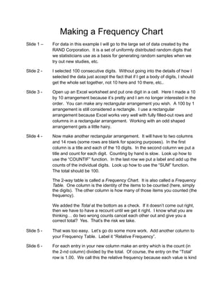
Slide 4 - Now make another rectangular arrangement. It will have to two columns
and 14 rows (some rows are blank for spacing purposes). In the first
column is a title and each of the 10 digits. In the second column we put a
title and count for each digit. Counting by hand is slow. Look up how to
use the “COUNTIF” function. In the last row we put a label and add up the
counts of the individual digits. Look up how to use the “SUM” function.
The total should be 100.
The 2-way table is called a Frequency Chart. It is also called a Frequency
Table. One column is the identity of the items to be counted (here, simply
the digits). The other column is how many of those items you counted (the
frequency).
We added the Total at the bottom as a check. If it doesn’t come out right,
then we have to have a recount until we get it right. I know what you are
thinking… do two wrong counts cancel each other out and give you a
correct total? Yes. That’s the risk we take.
Slide 5 - That was too easy. Let’s go do some more work. Add another column to
your Frequency Table. Label it “Relative Frequency”.
Slide 6 - For each entry in your new column make an entry which is the count (in
the 2-nd column) divided by the total. Of course, the entry on the “Total”
row is 1.00. We call this the relative frequency because each value is kind
2. of relative to the total. This column would make more sense if the total
count of the batch of numbers was something weird, like 537. In this
example “100” is too nice of a number.
Slide 7 - Some of you can understand things expressed as percentages. If you
want to make such a presentation at work, just change the format of your
relative frequencies. Here, I kept the 3-rd column (only for this class) and
made a 4-th column. You could throw out the 3-rd column if you want (at
work).