SlideShare a Scribd company logo
1 of 10
Download to read offline
How To Use A Spreadsheet
Excel® for the Mac and PC-Windows
by John D. Winter

Most good spreadsheets have very similar capabilities, but the syntax of the commands differs slightly.
I will use the keyboard command and mouse syntax of Excel® by Microsoft for this example. I am
assuming you have a mouse. In what follows, what you enter on the keyboard will be in bold. Special
keys, like the key labeled “Enter” will be written as: <Enter>, and menu options will be bold-italic.
Let’s suppose you have a number of data points such as data on a series of cylinders. You want to
perform some statistical analysis, perhaps to find the sum, mean and standard deviation of the various
data sets. The first step is to set up the organization of the rows and/or columns. Perhaps you decide to
list the rows as the separate measurements, and the columns as your measurements on each as follows:

Row 1 contains the titles of the columns as text. Each box in which you enter something is called a
“cell”. Excel recognizes the data in a cell as you type it in as either text or a number by the first
character. So we begin by moving the cursor (either with the mouse or the keyboard arrow keys) to the
cell A1 (column A row 1). When the cursor is in a cell, that cell appears to have a dark border. Typing
the first “C” of “Cylinder” alerts Excel that the cell will contain text, and not a number. Excel is quite
good at figuring out your input. It can recognize numbers, text, even a variety of date formats. For now
we type Cylinder in cell A1. Notice as you type, the input is shown at the top, in the “formula bar”, as
well as in the cell itself. You can backspace, delete, etc. in order to get your input correct. When it’s
OK hit the <Return> or <Enter> key to place the word in the cell. If it’s incorrect after you have hit
<Enter>, you can still correct it by simply typing it again in any highlighted cell. If the entry is a long
one, you can highlight the cell, move the mouse pointer to the incorrect spot in the formula bar, and
correct it there, and <Enter> it again.
Next we move the highlight to cell B1 and type: Diameter. There is a short-cut at this point. Rather
than hit <Enter> we can simply move the highlight to C1 and the enter will be automatic. Try it. Then
type: Length in C1. Notice that your titles are a bit crammed together. Wouldn’t it be nice if columns
B and C were a bit wider? Let’s do that first. Begin by moving the mouse cursor to the top row (with
the column letters in it: A, B, C, etc.). Go to column A and set the cursor exactly on the line that
separates the A and B columns. Notice that the cursor has changed shape to a vertical line with double
arrows across it. Press the left mouse button, and while holding it down, drag the column width to a
size that will contain the title and leave a bit of space on the sides. Release the mouse button when
you’re satisfied. Do the same for columns B and C. Excel also has a nice feature that makes column
widths fit automatically, after you’ve entered all the data: Format/Column/AutoFit Selection. The
preceeding syntax means to choose the menu items at the top of the spreadsheet in sequence. Click the
left mouse button first on the word File at the top left, then choose the Column option, and finally
choose AutoFit Selection.
Now move the highlight to cell A3. Type the numbers 1-9 for the cylinders you measure down the
column A to complete the organization. If you make any mistakes, simply type the new data over the
old. Your spreadsheet should look like the figure above. Next enter the data so that the spreadsheet
looks like this:

Notice a couple of things at this point. Text aligns to the left margin of the cells (“left-justified”) while
numbers are right-justified. This makes things look a little messy and we will fix these cosmetic things
later. Also, typing 4.0 in B11 results in a “4”. Excel takes only the number of “significant” digits that it
thinks you intend. We can treat this later as well. First let’s get some statistics on our data. Move the
highlight to cell B13. Let’s determine the sum of column B. Operations like sum, mean, etc are called
“functions”. Functions are listed in the manual for Excel, but can also be found using the Help
command in the upper right part of the menu bar. We want SUM, so we type: =SUM(B3:B11) in cell
B13 (case doesn’t matter). You must enter the “=“ sign first, which signals Excel that you are about to
enter a formula, and not a name or number. The colon means that you are specifying a range of cells,
in this case the sum of rows 3 through 11 in column B. Hit <Enter> and you have it. Some fun, huh?
Move the highlight to B14 and type: =average(B3:B11) to get the mean. Do this in lower case. Watch
the entry in the formula bar at the top of the spreadsheet. When you hit the <Enter> key, the formula in
the bar at the top changes “average” to upper case. This means that Excel recognized your entry as an
Excel function. It left “Cylinder” as it was entered before, since that isn’t a function. This is a nice
feature, and I always enter my functions in lower case, letting Excel tell me if I entered them correctly
when it changes to upper case.
Let’s do a standard deviation too, but in a different manner. Type only: =stdevp( in cell B15 for the
standard deviation, but do not yet hit <Enter>. Now move the mouse cursor to cell B3, hold down the
left button, and “drag” the highlight to cell B11. Note that it now says “=stdevp(B3:B11” in the bar at
the top. Just move the cursor to the upper function bar and add the right parenthesis and hit <Enter>.
Excel will then create the standard deviation for the column of data in cell B11.

2
In order to know what your values are, you should type: Sum in cell A13, Mean in A14, and S. Dev.
in A15. The sheet will now look like:

Explore the spreadsheet for a moment here. Move the highlight around from cell to cell, and notice that
the cell contents are always shown in the formula bar at the top of the spreadsheet. It tells you what’s
in the highlighted cell. When you highlight cell B11, you see a “4” in this line. That’s a relief, since
there’s a 4 in the cell. Now move to B13. While there’s a 51.9 in the cell, the formula bar tells us that
there is a function “=SUM(B3:B11)” there. This is a good way to check and correct errors in the
spreadsheet. Now note the number of decimals in rows 14 and 15. Excel likes to be rigorous, I guess.
However, it’s entirely misleading. Your measurements do not imply this level of accuracy. We can fix
this up quite easily. In fact let’s format a whole block for just one decimal place. Formatting works just
like in a word processor. First highlight the cell, or range of cells, and then format it. So begin by
highlighting the range to format. Using the mouse, move the highlight to cell B3. But we want a whole
block, not just a cell, so press the left button and drag the highlight to cell D15. That’s right, D15. I
have some plans for column D and you can format empty cells in advance for future use. You could
also move the cursor to the “D” at the top of the column, to highlight the whole column if you prefer.
Now, we want to format the numbers to one decimal place, so choose Format up in the menu area.
Click it with the mouse, or hit Alt-F. The underlined F in Format is the key that, if hit while working
in the menu area, will execute the selection. The <Alt> key gets you into the menus via the keyboard.
Next select Cells. Once again, you can click on it or choose “e” on the keyboard (e because C is for
Column...note that the e is underlined) You don’t need to press Alt this time, since you are already in
menus when you hit Alt the first time. Excel brings up a new menu with a number of formatting
choices. Choose Number for the formatting options that pertains to numbers. You can either select
from the offerings, or type in your own. We’ll do the latter. Move the cursor down to where it says
“General” (the default choice) by using the mouse or Tab key and type: 0.0. Excel interprets this as
any number with a single decimal. It also adds this to the list for future selection. Hit <Enter> or click
“OK” and everything will be formatted to one decimal place. Shortcut: use the “.00 →.0” icon in the
menu bar to reduce the number of decimal places in a highlighted cell by one.
Next let’s calculate the volume of our cylinder. The formula is :
Volume = area x length = πr2 x length
3
Thus each cell in the volume column = ½ the cell in the same row of the diameter column, squared,
times π times the cell in the length column. Move to cell D1 and type: Volume. Then move to D3 and
type: = to initiate a formula, and type your formula, which is: =(b3/2)^2*pi()*c3. The math functions
are like in most programming languages:
+ add
- subtract
/ divide

* multiply
^ exponent

Be careful with “priorities” when you create formulas. Exponents have priority over multiplication and
division, which, in turn, have priority over addition and subtraction. Use parentheses to change this, or
simply when in doubt. For example, 3 + 4/2^5 is the same as 3 + 4/25 which is 3.00002. ((3+4)/2)^5,
on the other hand, is (3.5)5, or 525.22. And (3+4/2)^5 is 55, or 3125. Note again, that typing in lower
case lets you know that Excel recognizes your input by changing it to upper case. “PI()” is an Excel
function for the value 3.14159... Thus in the formula above you told Excel to take the value in cell B3,
divide that by 2, and square the quotient, multiply the result by π, and then multiply the whole thing by
the value in cell C3. I repeat, the parentheses are important here, since exponents have a priority over
division. We can retype this formula for all of the cylinders, but here’s a shortcut that really makes
spreadsheets fast. We can copy cell D3 to cells D4 through D11 and the cell references in the formula
will change relative to the proper row!! To see how this works, be sure D3 is still highlighted. Now
select Edit in the menu area, and then Copy. (Excel’s menu tells you that there is a keyboard short-cut
for this function. You could simply hold down the <Ctrl> key while hitting the “C” key to copy a
highlighted cell.) An even easier way to copy is to click the mouse on the little double-sheet-of-pater
icon in the menu area (it’s just to the right of the little scissors icon, which means “cut”). When you
have copied, the cell D3 has a weird margin, indicating a process in transition. Now look down at the
left corner of the very bottom line. This is called the “Status bar”. It usually says “Ready” (a nice
status), but now it says “Select destination and press ENTER or choose Paste”. So, we do what it says:
highlight the cells D4 through D11 (remember how? Move to D4, press the left mouse button, and drag
to D11). Now either simply hit <Enter> (which “pastes” the copied cell into the destination cell (or
range of cells in the present case) and column D is now filled with the volumes for all 9 cylinders!
Move the cursor down column D and note the formulas in the formula bar. Although we copied the
formula for row 3 to the other rows, the references to B3 and C3 were automatically adjusted to B4
and C4 for row 4, B5 and C5 for row 5, etc. These are called “relative references”, meaning that the
cell references are determined relative to the cell to which you copy them. If, on the other hand, you
don’t want the reference to shift, you must use an “absolute reference”. Suppose that you want to use a
constant, such as the gravitational constant, or a fixed length, or π, that you have stored in a specific
cell, like A2. If you copy this reference in the method above, when the formula is copied down a row,
the next row will think p is in cell A3, and not A2. To avoid this, type in the absolute reference by
using the $ sign. $A$2 is the absolute reference for cell A2. It will not change as you copy. For
example, if you had copied the formula: =(B3/2)^2*PI()*$C$3 above instead of the formula that you
did, copying it down a row would result in: =(B4/2)^2*PI()*$C$3. The relative reference to B3
changed to B4, but cell C3, referenced as $C$3, stayed the same. You can use the $ independently in
the reference: $C3 makes only the column absolute, while C$3 makes only the row absolute.
Forgetting to “anchor” absolute references is one of the most common errors made with spreadsheets.
As a final step, we will compute the sum, average, and standard deviation for columns C and D. We
could do this by typing in the functions for the data as we did for the lengths, but this is a waste of
time. Try to do this all at once using the Copy-Paste shortcut. If you have trouble, here’s the method in
shorthand:
4
1) Highlight B13:B15.
2) Copy (either Edit-Copy on the menu, Control-C, or the copy icon).
3) Highlight C13:D15.
4) <Enter>.
This copied the sum, average, and standard deviation for the diameter data to both the length and
volume data at the same time. The spreadsheet will look like this:

In Pat’s Paleo class, he asks students to calculate individual deviations from the mean. This requires a
new column after each measurement column. This can be done at this point by inserting columns after
columns B and C. To insert a column after B, move the cursor to the cell labelled “C” at the very top
of the C column. This will highlight all of the column. Then select Insert/Columns. This procedure
inserts columns to the left of the column containing the highlight, so be sure you highlight column C to
insert a column between B and C. The new column becomes column C, and all columns to the left of it
change labels to D, E, F, etc, but the formulas shift too, so the calculations remain the same. We
won’t add any columns in this exercise.
Let’s save the file at this point. Use File-Save from the menu (or the little diskette icon in the menu
area) and make up a name for the file, like “Cyl”. Excel adds an extension “.xls”.
As a further exercise, let’s create two graphs of our data. The first is a histogram of the volume data.
We’d like to know the “frequency distribution” of calculated volumes that we have in various ranges.
Excel fails miserably at creating histograms, but it has a very powerful “macro” language that is really
a programming language, like Basic. It’s quite opaque to learn (the manual is nearly worthless for
this). With some experience you can write macros to do almost anything. I’ve written a macro to do
histograms. If you are on the Geology Department machine, it’s already there. If you have your own
computer and want a copy, feel free to copy it. Excel requires that the macro is loaded with the
spreadsheet in order to run. I find this a nuisance, but I suppose it was designed to keep down the
clutter for big businesses with lots of macros. However, one can save a macro with a spreadsheet so
they will always be used together by saving them as a “worksheet”. But this is a digression. Let’s load
the macro.

5
Select File/Open. Then look for a macro called “HIST.XLM”. The extension “xlm” means it’s a
macro. The macro covers the spreadsheet, and we don’t want that, so select Window then CYL.XLS to
get it back. Excel can hold several spreadsheets, macros, and graphs at once. You can switch from one
to another by using the Window menu.
First we must choose the ranges that we want to use for the histogram. Look at the data in column D.
The values range from 39 to 301. From this data we might choose the intervals 0-50, 50-100, 100-150,
150-200, 200-250, 250-300, and 300-350. Begin the histogram by highlighting the data to plot, in this
case the range D3:D11. Next execute the macro by clicking Macro:Run or use the “hot-key” assigned
to the macro: Ctrl-h (hold down the <Ctrl> key and hit “h”, for you Mac folks you must hold down
both the “option” and keys while hitting “h”) The hist macro should be on the list if you’ve loaded it
correctly above, so choose it by double-clicking the left mouse button on it, or select it and hit OK.
The macro copies the block and then prompts you for the low range (not 0). This means the first
increment above 0, and for us this is 50. So type: 50 and <Enter>. Next it prompts for the high range,
so enter 350. Finally it asks for the increment, so we enter 50. The spreadsheet will then look like this:

Note that the data in column G says there are 2 values below 50, 2 between 50-100, etc.
Next we graph the data. Excel is rather “intuitive” about graphs. It attempts to pre-empt your choices,
and it usually does a good job. When it doesn’t, you may have some trouble getting what you want at
first. Excel was designed as a business tool, so thinks bar charts are the norm. In the sciences we prefer
Cartesian (x-y) graphs, but this is a bar graph, so we have an easy start. Excel even calls them
“Charts”, true to its business origins. Making charts can become quite complex, and you can
experiment around with multiple data sets, formatting, labels, etc. for a long time. I’ll just supply you
with the quickest way to get a graph created, and you can explore the options at a later date. The
simplest method is to use the nifty “Chart Wizard”. Begin the graph by highlighting the data to plot, in
this case columns cells F3:G10. Next click the Chart Wizard icon in the menu area. It looks like a bar
graph with one of the bars crashing and burning (I think Microsoft wanted it to look like a magic
wand). Then just choose from the options offered. First choose the chart type, in this case Column.
Next choose the sub-type: I chose #1 (the default value). Select Next, and you are presented with
options to change the data choice information, most of which is applicable to multiple data sets. It is all
6
correct in this case, so proceed to the next menu. Choose No Legend, and ander Titles, pick labels,
such as “Frequency Distribution of Cylinder Volumes” as the chart title, “Number of Cylinders” for
the Y-axis caption, and “Volume Range” for the X-axis caption. Choose Finish, and you have your
chart. If the chart does not look as you might like, experiment with resizing it (drag the little dark
square “handles” on the margins), or double-click the chart itself and format parts. You do this by
double-clicking the object you want to reformat, and choose among the options. You may also use the
Format option in the menu area. For example, let’s reformat the y-axis. Double-click the chart, then
double-click any y-axis label. You should have a menu area pop up onto the screen. Choose the Scale
label. Then click on and overtype the Maximum to make it 5, the Major tick is better as 1 also. Click
OK, and it is reformatted. The bar labels are better if they are printed vertically. Double click them and
choose Alignment to adjust them. Then your histogram is done.

Let’s do one more graph, a comparison of diameters and lengths to see if there is a correlation of
length and width in the samples. That means graphing C3:C11 vs. B3:B11. Begin by highlighting
(dragging) rows 3 through 11 of columns B and C with the mouse. Next click the Wizard, and progress
through the menus as before, Except, this time choose the XY Scatter chart type, and subtype 1. Add
an appropriate title and axis captions. There is our chart with the Diameter as X and the Length as Y.
On your own adjust the scales for X as 4 to 8 and for Y as 3 to 7. The graph is done.
You might wonder how to graph two non-adjacent columns. Like perhaps Diameter vs. Volume. To do
this you highlight one, like Diameter. Then hold down the Control key as you highlight the other, and
proceed as usual. Note that Excel naturally chooses the first column in your highlight as the x-axis.
How to reverse the axes so that you can plot the second column as the x axis in Excel is not easy, and
invovles reformatting the data choices in the chart once you have created it. It is much better if you
plan ahead. In your future spreadsheets, if you plan to make x-y graphs, always attempt to have the
data for the x-axis in the left-most data column.
We can see that there is a good correlation between length and diameter, in other words the cylinders
have very similar shapes, regardless of their size. We can test the linearity of the fit, and even get the
7
equation of the line of best fit by performing a linear regression. The equation we seek is a simple
line, with the familiar equation
or for us:

y = mx + b
Length = m(Diameter) + b

Excel has a Function that calculates a linear regression. The name of the function is LINEST. The
format is LINEST(y-range, x-range, C,S), where C is a switch to force the y-intercept (b in the
equation above) to zero. If C =“False”, the line is forced through the origin (b = 0), if C is “True” b is
calculated. If S is “False” only m and b are calculated. If S is “True”, more regression statistics are
calculated. An added complexity, is that the regression function returns more than one number. The
return data is called an array by Excel. We rarely want all of the statistics in the array. Suppose we
want only m, b, and the r2 value. r2 is called the “coefficient of determination”, and is an estimate of
the degree to which the data fits a linear relationship. These three values are in the first three rows in
the 2 columns of the array. To get all there we must highlight a range of three rows by 2 columns
where we want the results. Lets choose F12:G14.
Highlight this range. Next type the formula “=linest(c3:c11,b3:b11, true,true)”. But this is to be an
array, not a simple formula. To enter it as an array, hold down both the <Ctrl> and <Shift> keys as you
hit <Enter>. Your spreadsheet will look like this:

The first value returned (cell F12) is the slope, m, and equals 0.967. The intercept, b, is in cell G12 and
equals -0.997. If you want only the slope and intercept you could define two individual cells for that
data only and avoid the array of statistics, etc. You could type: =linest(c3:c11,b3:b11)” in cell E12 for
the slope and “=index(linest(c3:c11,b3:b11),2)” in cell E13 for the intercept. Excel 5.0 permits
another easier and more straightforward option: the slope now is slope(c3:c11,b3:b11) and the
intercept is intercept(c3:c11,b3:b11). The r2 value is rsq(c3:c11,b3:b11). However you do it, the
resulting equation is:
Length = 0.967 x Diameter - 0.997
8
Excel version 6 and later have a snappy new way to do regressions if you don’t want all the statistical
information. Click and highlight the chart. Then choose Chart/Add Trendline. Then click on the
Linear box (for a linear regression) and Options. Put a check mark in the Display equation on chart
and the Display R-squared value on chart options. Then click OK. You get the regression line drawn
on your chart and the formula for the regression printed as well. You can drag the formula to some
more convenient position if you like.

Notice that the regression values are the same as in our previous method.
Let’s take a diameter value and calculate a Length from it using this formula. I took row 7 and plugged
7.1 in for the diameter and got 5.8 for the Length, as compared to 6.2 as the measured length. I
repeated the regression forcing b to zero and got: Length = 0.802 x Diameter + 0 and calculated a
length of 5.7 from the 7.1 diameter. The r2 value is a measure of how good a linear fit we have, and
would be 1.0 for a perfect fit. The value of 0.96 isn’t too bad. With b = 0, r2 was 0.93, suggesting a
relatively good fit as well (could you imagine a cylinder with zero length and any diameter other than
zero?).
I mentioned that the spreadsheet might look better if the names weren’t left-justified and the numbers
right-justified. You can fix up this cosmetic touch by highlighting the cells and selecting
Format/Cells/Alignment/Center (or clicking the center icon in the menu area). However, this will
lose the nice decimal point alignment and make column D look worse.
The most important part of a spreadsheet is the initial organization. A good spreadsheet is properly
labeled. Begin with a shreadsheet title in row 1. Excel will let long titles extend into neighboring rows
to the right if they are empty. Then leave a blank row. Label each data column column, and any
constants that you plan to use (π, the gas constant, the gravitational constant, etc.). The label and the
constant must be in two adjacent cells, since Excel can only recognize a number in a cell if it is alone.
Place the constants in the beginning, and then create your columns and rows of data below that. Use
whatever formulas you need to manipulate the data, and be sure to refer to your constants with
absolute references ($). If you plan to graph the results, be sure that your x-axis data is in the left-most
column of data. A little time spent at the beginning visualizing the overall organization can save you
lots of time and work later.
Excel is full of other goodies, which you can explore in the future. This was only an introduction, but it
covers most of what we’ll do in class. Save the file if you wish, on your own diskette (use the
File/Save command or the diskette icon). If you want to print the spreadsheet, choose File/Print from
9
the menu (or use the printer icon). Most spreadsheets and graphs look best when printed in landscape
mode (rows parallel to the long dimension of the paper) which can be done by
File/Print/Options/Page Setup.

10

More Related Content

What's hot

Quick MS Excel Learning Guide for Fresher
Quick MS Excel Learning Guide for FresherQuick MS Excel Learning Guide for Fresher
Quick MS Excel Learning Guide for FresherSHAON84
 
Data management( on computer)
Data management( on computer)Data management( on computer)
Data management( on computer)elvieantony
 
03 Excel formulas and functions
03 Excel formulas and functions03 Excel formulas and functions
03 Excel formulas and functionsBuffalo Seminary
 
Excel 2007 slide enter formulas
Excel 2007 slide    enter formulasExcel 2007 slide    enter formulas
Excel 2007 slide enter formulasrezaulslide
 
Creating Formulas in Excel
Creating Formulas in ExcelCreating Formulas in Excel
Creating Formulas in ExcelKim Estes
 
Microsoft Excel 2007 Tutorial
Microsoft Excel 2007 TutorialMicrosoft Excel 2007 Tutorial
Microsoft Excel 2007 TutorialKereen Tatham
 
Open Office Calc : Lesson 05
Open Office Calc : Lesson 05Open Office Calc : Lesson 05
Open Office Calc : Lesson 05thinkict
 
Excel 2007 tutorial
Excel 2007 tutorialExcel 2007 tutorial
Excel 2007 tutorialsumatipuri
 
Excel short cut keys and tips remaining
Excel short cut keys and tips remainingExcel short cut keys and tips remaining
Excel short cut keys and tips remainingNitin Aggarwal
 
Excel Formulas Functions
Excel Formulas FunctionsExcel Formulas Functions
Excel Formulas Functionssimply_coool
 

What's hot (19)

MS Excel Tips & Tricks
MS Excel Tips & TricksMS Excel Tips & Tricks
MS Excel Tips & Tricks
 
Quick MS Excel Learning Guide for Fresher
Quick MS Excel Learning Guide for FresherQuick MS Excel Learning Guide for Fresher
Quick MS Excel Learning Guide for Fresher
 
Excelformulas
ExcelformulasExcelformulas
Excelformulas
 
AAG_Excel_2010_Formulas_and_Functions
AAG_Excel_2010_Formulas_and_FunctionsAAG_Excel_2010_Formulas_and_Functions
AAG_Excel_2010_Formulas_and_Functions
 
Data management( on computer)
Data management( on computer)Data management( on computer)
Data management( on computer)
 
03 Excel formulas and functions
03 Excel formulas and functions03 Excel formulas and functions
03 Excel formulas and functions
 
Excel 2007 slide enter formulas
Excel 2007 slide    enter formulasExcel 2007 slide    enter formulas
Excel 2007 slide enter formulas
 
Real World Excel Formulas
Real World Excel FormulasReal World Excel Formulas
Real World Excel Formulas
 
Creating Formulas in Excel
Creating Formulas in ExcelCreating Formulas in Excel
Creating Formulas in Excel
 
Excel Basics 2
Excel Basics 2Excel Basics 2
Excel Basics 2
 
Excel Training
Excel TrainingExcel Training
Excel Training
 
Microsoft Excel 2007 Tutorial
Microsoft Excel 2007 TutorialMicrosoft Excel 2007 Tutorial
Microsoft Excel 2007 Tutorial
 
Excel for beginners class 3
Excel for beginners class 3Excel for beginners class 3
Excel for beginners class 3
 
Open Office Calc : Lesson 05
Open Office Calc : Lesson 05Open Office Calc : Lesson 05
Open Office Calc : Lesson 05
 
Excel 2007 tutorial
Excel 2007 tutorialExcel 2007 tutorial
Excel 2007 tutorial
 
03 ms excel
03 ms excel03 ms excel
03 ms excel
 
Excel short cut keys and tips remaining
Excel short cut keys and tips remainingExcel short cut keys and tips remaining
Excel short cut keys and tips remaining
 
Excel 2007 tut
Excel 2007 tutExcel 2007 tut
Excel 2007 tut
 
Excel Formulas Functions
Excel Formulas FunctionsExcel Formulas Functions
Excel Formulas Functions
 

Viewers also liked

Presentation–ფუტკარი
Presentation–ფუტკარი Presentation–ფუტკარი
Presentation–ფუტკარი tamartvaliashvilii
 
My present, study produktif.
My present, study produktif.My present, study produktif.
My present, study produktif.Linda Linda
 
що ми знаємо про веб 2
що ми знаємо про веб 2що ми знаємо про веб 2
що ми знаємо про веб 2zhudkova21pgf
 
презентация1
презентация1презентация1
презентация1zhudkova21pgf
 
Neurologic manifestations in porphyria
Neurologic manifestations in porphyriaNeurologic manifestations in porphyria
Neurologic manifestations in porphyriaAviraj Deshmukh
 
Java Aktuell Bernd Zuther Canary Releases mit der Very Awesome Microservices ...
Java Aktuell Bernd Zuther Canary Releases mit der Very Awesome Microservices ...Java Aktuell Bernd Zuther Canary Releases mit der Very Awesome Microservices ...
Java Aktuell Bernd Zuther Canary Releases mit der Very Awesome Microservices ...Bernd Zuther
 
How to create calibration curve?
How to create calibration curve?How to create calibration curve?
How to create calibration curve?Mahmood Iqbal
 
6-cı sinif (cari planlaşdırma)
6-cı sinif (cari planlaşdırma)6-cı sinif (cari planlaşdırma)
6-cı sinif (cari planlaşdırma)Parvana Hatamova
 

Viewers also liked (17)

Presentation–ფუტკარი
Presentation–ფუტკარი Presentation–ფუტკარი
Presentation–ფუტკარი
 
Internet of Things
Internet of ThingsInternet of Things
Internet of Things
 
Cog vi qs
Cog vi qsCog vi qs
Cog vi qs
 
Italya
ItalyaItalya
Italya
 
My present, study produktif.
My present, study produktif.My present, study produktif.
My present, study produktif.
 
Food --english
Food --englishFood --english
Food --english
 
Ca march-2013 qa
Ca march-2013 qaCa march-2013 qa
Ca march-2013 qa
 
Character profiles
Character profilesCharacter profiles
Character profiles
 
Xogo do peon
Xogo do peonXogo do peon
Xogo do peon
 
що ми знаємо про веб 2
що ми знаємо про веб 2що ми знаємо про веб 2
що ми знаємо про веб 2
 
Excel
ExcelExcel
Excel
 
презентация1
презентация1презентация1
презентация1
 
The sun
The sunThe sun
The sun
 
Neurologic manifestations in porphyria
Neurologic manifestations in porphyriaNeurologic manifestations in porphyria
Neurologic manifestations in porphyria
 
Java Aktuell Bernd Zuther Canary Releases mit der Very Awesome Microservices ...
Java Aktuell Bernd Zuther Canary Releases mit der Very Awesome Microservices ...Java Aktuell Bernd Zuther Canary Releases mit der Very Awesome Microservices ...
Java Aktuell Bernd Zuther Canary Releases mit der Very Awesome Microservices ...
 
How to create calibration curve?
How to create calibration curve?How to create calibration curve?
How to create calibration curve?
 
6-cı sinif (cari planlaşdırma)
6-cı sinif (cari planlaşdırma)6-cı sinif (cari planlaşdırma)
6-cı sinif (cari planlaşdırma)
 

Similar to Excel

22-excel-basics-15511.ppt
22-excel-basics-15511.ppt22-excel-basics-15511.ppt
22-excel-basics-15511.ppt20ArnavKumar8F
 
How to use a spreadsheet
How to use a spreadsheetHow to use a spreadsheet
How to use a spreadsheetSwarnima Tiwari
 
Pc package i excel
Pc package i   excelPc package i   excel
Pc package i excelEswariS4
 
Introduction to Microsoft Excel for beginners
Introduction to Microsoft Excel for beginnersIntroduction to Microsoft Excel for beginners
Introduction to Microsoft Excel for beginnersBlogger Mumma
 
Ms excel 2007 tutorial
Ms excel 2007 tutorialMs excel 2007 tutorial
Ms excel 2007 tutorialjks2010
 
PPT On Microsoft Excel 2007 Full Information.
PPT On Microsoft Excel 2007 Full Information.PPT On Microsoft Excel 2007 Full Information.
PPT On Microsoft Excel 2007 Full Information.Umesh Kumar
 
Microsoft 2007 Basics
Microsoft 2007 BasicsMicrosoft 2007 Basics
Microsoft 2007 BasicsJulie Van Noy
 
Excel Powerpoint class with video
Excel Powerpoint class with videoExcel Powerpoint class with video
Excel Powerpoint class with videoRich Johnson
 
Introduction to micro soft Training ms Excel.ppt
Introduction to micro soft Training ms Excel.pptIntroduction to micro soft Training ms Excel.ppt
Introduction to micro soft Training ms Excel.pptdejene3
 
Intro to Excel Basics: Part I
Intro to Excel Basics: Part IIntro to Excel Basics: Part I
Intro to Excel Basics: Part ISi Krishan
 
Excell%20basic%20training(3) 143
Excell%20basic%20training(3) 143Excell%20basic%20training(3) 143
Excell%20basic%20training(3) 143Ramesh Meti
 
Using tables and columns in Microsoft Word
Using tables and columns in Microsoft WordUsing tables and columns in Microsoft Word
Using tables and columns in Microsoft WordAngelaMcGaffin
 
Microsoft Excel Glossary & Keyboard Shortcuts-Function Keys
Microsoft Excel Glossary & Keyboard Shortcuts-Function KeysMicrosoft Excel Glossary & Keyboard Shortcuts-Function Keys
Microsoft Excel Glossary & Keyboard Shortcuts-Function Keyssdturton
 
Using tables in Microsoft Word
Using tables in Microsoft WordUsing tables in Microsoft Word
Using tables in Microsoft WordAngelaMcGaffin
 
Excel Data Management
Excel Data ManagementExcel Data Management
Excel Data ManagementRachel Espino
 

Similar to Excel (20)

22 Excel Basics
22 Excel Basics22 Excel Basics
22 Excel Basics
 
22-excel-basics-15511.ppt
22-excel-basics-15511.ppt22-excel-basics-15511.ppt
22-excel-basics-15511.ppt
 
How to use a spreadsheet
How to use a spreadsheetHow to use a spreadsheet
How to use a spreadsheet
 
Pc package i excel
Pc package i   excelPc package i   excel
Pc package i excel
 
Introduction to Microsoft Excel for beginners
Introduction to Microsoft Excel for beginnersIntroduction to Microsoft Excel for beginners
Introduction to Microsoft Excel for beginners
 
Excel module 1 PowerPoint
Excel module 1  PowerPoint Excel module 1  PowerPoint
Excel module 1 PowerPoint
 
Ms excel 2007 tutorial
Ms excel 2007 tutorialMs excel 2007 tutorial
Ms excel 2007 tutorial
 
PPT On Microsoft Excel 2007 Full Information.
PPT On Microsoft Excel 2007 Full Information.PPT On Microsoft Excel 2007 Full Information.
PPT On Microsoft Excel 2007 Full Information.
 
Mop excel proj 1 power point
Mop excel proj 1   power pointMop excel proj 1   power point
Mop excel proj 1 power point
 
Microsoft 2007 Basics
Microsoft 2007 BasicsMicrosoft 2007 Basics
Microsoft 2007 Basics
 
Excel Powerpoint class with video
Excel Powerpoint class with videoExcel Powerpoint class with video
Excel Powerpoint class with video
 
Basic Ms excel
Basic Ms excelBasic Ms excel
Basic Ms excel
 
Introduction to micro soft Training ms Excel.ppt
Introduction to micro soft Training ms Excel.pptIntroduction to micro soft Training ms Excel.ppt
Introduction to micro soft Training ms Excel.ppt
 
Intro to Excel Basics: Part I
Intro to Excel Basics: Part IIntro to Excel Basics: Part I
Intro to Excel Basics: Part I
 
Excell%20basic%20training(3) 143
Excell%20basic%20training(3) 143Excell%20basic%20training(3) 143
Excell%20basic%20training(3) 143
 
Using tables and columns in Microsoft Word
Using tables and columns in Microsoft WordUsing tables and columns in Microsoft Word
Using tables and columns in Microsoft Word
 
Microsoft Excel Glossary & Keyboard Shortcuts-Function Keys
Microsoft Excel Glossary & Keyboard Shortcuts-Function KeysMicrosoft Excel Glossary & Keyboard Shortcuts-Function Keys
Microsoft Excel Glossary & Keyboard Shortcuts-Function Keys
 
Using tables in Microsoft Word
Using tables in Microsoft WordUsing tables in Microsoft Word
Using tables in Microsoft Word
 
Excel Data Management
Excel Data ManagementExcel Data Management
Excel Data Management
 
MS Excel Training 01
MS Excel Training 01MS Excel Training 01
MS Excel Training 01
 

Recently uploaded

presentation ICT roal in 21st century education
presentation ICT roal in 21st century educationpresentation ICT roal in 21st century education
presentation ICT roal in 21st century educationjfdjdjcjdnsjd
 
Scaling API-first – The story of a global engineering organization
Scaling API-first – The story of a global engineering organizationScaling API-first – The story of a global engineering organization
Scaling API-first – The story of a global engineering organizationRadu Cotescu
 
Powerful Google developer tools for immediate impact! (2023-24 C)
Powerful Google developer tools for immediate impact! (2023-24 C)Powerful Google developer tools for immediate impact! (2023-24 C)
Powerful Google developer tools for immediate impact! (2023-24 C)wesley chun
 
2024: Domino Containers - The Next Step. News from the Domino Container commu...
2024: Domino Containers - The Next Step. News from the Domino Container commu...2024: Domino Containers - The Next Step. News from the Domino Container commu...
2024: Domino Containers - The Next Step. News from the Domino Container commu...Martijn de Jong
 
Bajaj Allianz Life Insurance Company - Insurer Innovation Award 2024
Bajaj Allianz Life Insurance Company - Insurer Innovation Award 2024Bajaj Allianz Life Insurance Company - Insurer Innovation Award 2024
Bajaj Allianz Life Insurance Company - Insurer Innovation Award 2024The Digital Insurer
 
Data Cloud, More than a CDP by Matt Robison
Data Cloud, More than a CDP by Matt RobisonData Cloud, More than a CDP by Matt Robison
Data Cloud, More than a CDP by Matt RobisonAnna Loughnan Colquhoun
 
Top 5 Benefits OF Using Muvi Live Paywall For Live Streams
Top 5 Benefits OF Using Muvi Live Paywall For Live StreamsTop 5 Benefits OF Using Muvi Live Paywall For Live Streams
Top 5 Benefits OF Using Muvi Live Paywall For Live StreamsRoshan Dwivedi
 
Apidays Singapore 2024 - Building Digital Trust in a Digital Economy by Veron...
Apidays Singapore 2024 - Building Digital Trust in a Digital Economy by Veron...Apidays Singapore 2024 - Building Digital Trust in a Digital Economy by Veron...
Apidays Singapore 2024 - Building Digital Trust in a Digital Economy by Veron...apidays
 
TrustArc Webinar - Stay Ahead of US State Data Privacy Law Developments
TrustArc Webinar - Stay Ahead of US State Data Privacy Law DevelopmentsTrustArc Webinar - Stay Ahead of US State Data Privacy Law Developments
TrustArc Webinar - Stay Ahead of US State Data Privacy Law DevelopmentsTrustArc
 
Strategies for Landing an Oracle DBA Job as a Fresher
Strategies for Landing an Oracle DBA Job as a FresherStrategies for Landing an Oracle DBA Job as a Fresher
Strategies for Landing an Oracle DBA Job as a FresherRemote DBA Services
 
From Event to Action: Accelerate Your Decision Making with Real-Time Automation
From Event to Action: Accelerate Your Decision Making with Real-Time AutomationFrom Event to Action: Accelerate Your Decision Making with Real-Time Automation
From Event to Action: Accelerate Your Decision Making with Real-Time AutomationSafe Software
 
Strategize a Smooth Tenant-to-tenant Migration and Copilot Takeoff
Strategize a Smooth Tenant-to-tenant Migration and Copilot TakeoffStrategize a Smooth Tenant-to-tenant Migration and Copilot Takeoff
Strategize a Smooth Tenant-to-tenant Migration and Copilot Takeoffsammart93
 
Exploring the Future Potential of AI-Enabled Smartphone Processors
Exploring the Future Potential of AI-Enabled Smartphone ProcessorsExploring the Future Potential of AI-Enabled Smartphone Processors
Exploring the Future Potential of AI-Enabled Smartphone Processorsdebabhi2
 
Artificial Intelligence: Facts and Myths
Artificial Intelligence: Facts and MythsArtificial Intelligence: Facts and Myths
Artificial Intelligence: Facts and MythsJoaquim Jorge
 
HTML Injection Attacks: Impact and Mitigation Strategies
HTML Injection Attacks: Impact and Mitigation StrategiesHTML Injection Attacks: Impact and Mitigation Strategies
HTML Injection Attacks: Impact and Mitigation StrategiesBoston Institute of Analytics
 
Axa Assurance Maroc - Insurer Innovation Award 2024
Axa Assurance Maroc - Insurer Innovation Award 2024Axa Assurance Maroc - Insurer Innovation Award 2024
Axa Assurance Maroc - Insurer Innovation Award 2024The Digital Insurer
 
Cloud Frontiers: A Deep Dive into Serverless Spatial Data and FME
Cloud Frontiers:  A Deep Dive into Serverless Spatial Data and FMECloud Frontiers:  A Deep Dive into Serverless Spatial Data and FME
Cloud Frontiers: A Deep Dive into Serverless Spatial Data and FMESafe Software
 
Mastering MySQL Database Architecture: Deep Dive into MySQL Shell and MySQL R...
Mastering MySQL Database Architecture: Deep Dive into MySQL Shell and MySQL R...Mastering MySQL Database Architecture: Deep Dive into MySQL Shell and MySQL R...
Mastering MySQL Database Architecture: Deep Dive into MySQL Shell and MySQL R...Miguel Araújo
 
Manulife - Insurer Innovation Award 2024
Manulife - Insurer Innovation Award 2024Manulife - Insurer Innovation Award 2024
Manulife - Insurer Innovation Award 2024The Digital Insurer
 
AWS Community Day CPH - Three problems of Terraform
AWS Community Day CPH - Three problems of TerraformAWS Community Day CPH - Three problems of Terraform
AWS Community Day CPH - Three problems of TerraformAndrey Devyatkin
 

Recently uploaded (20)

presentation ICT roal in 21st century education
presentation ICT roal in 21st century educationpresentation ICT roal in 21st century education
presentation ICT roal in 21st century education
 
Scaling API-first – The story of a global engineering organization
Scaling API-first – The story of a global engineering organizationScaling API-first – The story of a global engineering organization
Scaling API-first – The story of a global engineering organization
 
Powerful Google developer tools for immediate impact! (2023-24 C)
Powerful Google developer tools for immediate impact! (2023-24 C)Powerful Google developer tools for immediate impact! (2023-24 C)
Powerful Google developer tools for immediate impact! (2023-24 C)
 
2024: Domino Containers - The Next Step. News from the Domino Container commu...
2024: Domino Containers - The Next Step. News from the Domino Container commu...2024: Domino Containers - The Next Step. News from the Domino Container commu...
2024: Domino Containers - The Next Step. News from the Domino Container commu...
 
Bajaj Allianz Life Insurance Company - Insurer Innovation Award 2024
Bajaj Allianz Life Insurance Company - Insurer Innovation Award 2024Bajaj Allianz Life Insurance Company - Insurer Innovation Award 2024
Bajaj Allianz Life Insurance Company - Insurer Innovation Award 2024
 
Data Cloud, More than a CDP by Matt Robison
Data Cloud, More than a CDP by Matt RobisonData Cloud, More than a CDP by Matt Robison
Data Cloud, More than a CDP by Matt Robison
 
Top 5 Benefits OF Using Muvi Live Paywall For Live Streams
Top 5 Benefits OF Using Muvi Live Paywall For Live StreamsTop 5 Benefits OF Using Muvi Live Paywall For Live Streams
Top 5 Benefits OF Using Muvi Live Paywall For Live Streams
 
Apidays Singapore 2024 - Building Digital Trust in a Digital Economy by Veron...
Apidays Singapore 2024 - Building Digital Trust in a Digital Economy by Veron...Apidays Singapore 2024 - Building Digital Trust in a Digital Economy by Veron...
Apidays Singapore 2024 - Building Digital Trust in a Digital Economy by Veron...
 
TrustArc Webinar - Stay Ahead of US State Data Privacy Law Developments
TrustArc Webinar - Stay Ahead of US State Data Privacy Law DevelopmentsTrustArc Webinar - Stay Ahead of US State Data Privacy Law Developments
TrustArc Webinar - Stay Ahead of US State Data Privacy Law Developments
 
Strategies for Landing an Oracle DBA Job as a Fresher
Strategies for Landing an Oracle DBA Job as a FresherStrategies for Landing an Oracle DBA Job as a Fresher
Strategies for Landing an Oracle DBA Job as a Fresher
 
From Event to Action: Accelerate Your Decision Making with Real-Time Automation
From Event to Action: Accelerate Your Decision Making with Real-Time AutomationFrom Event to Action: Accelerate Your Decision Making with Real-Time Automation
From Event to Action: Accelerate Your Decision Making with Real-Time Automation
 
Strategize a Smooth Tenant-to-tenant Migration and Copilot Takeoff
Strategize a Smooth Tenant-to-tenant Migration and Copilot TakeoffStrategize a Smooth Tenant-to-tenant Migration and Copilot Takeoff
Strategize a Smooth Tenant-to-tenant Migration and Copilot Takeoff
 
Exploring the Future Potential of AI-Enabled Smartphone Processors
Exploring the Future Potential of AI-Enabled Smartphone ProcessorsExploring the Future Potential of AI-Enabled Smartphone Processors
Exploring the Future Potential of AI-Enabled Smartphone Processors
 
Artificial Intelligence: Facts and Myths
Artificial Intelligence: Facts and MythsArtificial Intelligence: Facts and Myths
Artificial Intelligence: Facts and Myths
 
HTML Injection Attacks: Impact and Mitigation Strategies
HTML Injection Attacks: Impact and Mitigation StrategiesHTML Injection Attacks: Impact and Mitigation Strategies
HTML Injection Attacks: Impact and Mitigation Strategies
 
Axa Assurance Maroc - Insurer Innovation Award 2024
Axa Assurance Maroc - Insurer Innovation Award 2024Axa Assurance Maroc - Insurer Innovation Award 2024
Axa Assurance Maroc - Insurer Innovation Award 2024
 
Cloud Frontiers: A Deep Dive into Serverless Spatial Data and FME
Cloud Frontiers:  A Deep Dive into Serverless Spatial Data and FMECloud Frontiers:  A Deep Dive into Serverless Spatial Data and FME
Cloud Frontiers: A Deep Dive into Serverless Spatial Data and FME
 
Mastering MySQL Database Architecture: Deep Dive into MySQL Shell and MySQL R...
Mastering MySQL Database Architecture: Deep Dive into MySQL Shell and MySQL R...Mastering MySQL Database Architecture: Deep Dive into MySQL Shell and MySQL R...
Mastering MySQL Database Architecture: Deep Dive into MySQL Shell and MySQL R...
 
Manulife - Insurer Innovation Award 2024
Manulife - Insurer Innovation Award 2024Manulife - Insurer Innovation Award 2024
Manulife - Insurer Innovation Award 2024
 
AWS Community Day CPH - Three problems of Terraform
AWS Community Day CPH - Three problems of TerraformAWS Community Day CPH - Three problems of Terraform
AWS Community Day CPH - Three problems of Terraform
 

Excel

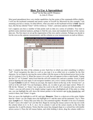
  • 1. How To Use A Spreadsheet Excel® for the Mac and PC-Windows by John D. Winter Most good spreadsheets have very similar capabilities, but the syntax of the commands differs slightly. I will use the keyboard command and mouse syntax of Excel® by Microsoft for this example. I am assuming you have a mouse. In what follows, what you enter on the keyboard will be in bold. Special keys, like the key labeled “Enter” will be written as: <Enter>, and menu options will be bold-italic. Let’s suppose you have a number of data points such as data on a series of cylinders. You want to perform some statistical analysis, perhaps to find the sum, mean and standard deviation of the various data sets. The first step is to set up the organization of the rows and/or columns. Perhaps you decide to list the rows as the separate measurements, and the columns as your measurements on each as follows: Row 1 contains the titles of the columns as text. Each box in which you enter something is called a “cell”. Excel recognizes the data in a cell as you type it in as either text or a number by the first character. So we begin by moving the cursor (either with the mouse or the keyboard arrow keys) to the cell A1 (column A row 1). When the cursor is in a cell, that cell appears to have a dark border. Typing the first “C” of “Cylinder” alerts Excel that the cell will contain text, and not a number. Excel is quite good at figuring out your input. It can recognize numbers, text, even a variety of date formats. For now we type Cylinder in cell A1. Notice as you type, the input is shown at the top, in the “formula bar”, as well as in the cell itself. You can backspace, delete, etc. in order to get your input correct. When it’s OK hit the <Return> or <Enter> key to place the word in the cell. If it’s incorrect after you have hit <Enter>, you can still correct it by simply typing it again in any highlighted cell. If the entry is a long one, you can highlight the cell, move the mouse pointer to the incorrect spot in the formula bar, and correct it there, and <Enter> it again. Next we move the highlight to cell B1 and type: Diameter. There is a short-cut at this point. Rather than hit <Enter> we can simply move the highlight to C1 and the enter will be automatic. Try it. Then type: Length in C1. Notice that your titles are a bit crammed together. Wouldn’t it be nice if columns B and C were a bit wider? Let’s do that first. Begin by moving the mouse cursor to the top row (with the column letters in it: A, B, C, etc.). Go to column A and set the cursor exactly on the line that separates the A and B columns. Notice that the cursor has changed shape to a vertical line with double arrows across it. Press the left mouse button, and while holding it down, drag the column width to a
  • 2. size that will contain the title and leave a bit of space on the sides. Release the mouse button when you’re satisfied. Do the same for columns B and C. Excel also has a nice feature that makes column widths fit automatically, after you’ve entered all the data: Format/Column/AutoFit Selection. The preceeding syntax means to choose the menu items at the top of the spreadsheet in sequence. Click the left mouse button first on the word File at the top left, then choose the Column option, and finally choose AutoFit Selection. Now move the highlight to cell A3. Type the numbers 1-9 for the cylinders you measure down the column A to complete the organization. If you make any mistakes, simply type the new data over the old. Your spreadsheet should look like the figure above. Next enter the data so that the spreadsheet looks like this: Notice a couple of things at this point. Text aligns to the left margin of the cells (“left-justified”) while numbers are right-justified. This makes things look a little messy and we will fix these cosmetic things later. Also, typing 4.0 in B11 results in a “4”. Excel takes only the number of “significant” digits that it thinks you intend. We can treat this later as well. First let’s get some statistics on our data. Move the highlight to cell B13. Let’s determine the sum of column B. Operations like sum, mean, etc are called “functions”. Functions are listed in the manual for Excel, but can also be found using the Help command in the upper right part of the menu bar. We want SUM, so we type: =SUM(B3:B11) in cell B13 (case doesn’t matter). You must enter the “=“ sign first, which signals Excel that you are about to enter a formula, and not a name or number. The colon means that you are specifying a range of cells, in this case the sum of rows 3 through 11 in column B. Hit <Enter> and you have it. Some fun, huh? Move the highlight to B14 and type: =average(B3:B11) to get the mean. Do this in lower case. Watch the entry in the formula bar at the top of the spreadsheet. When you hit the <Enter> key, the formula in the bar at the top changes “average” to upper case. This means that Excel recognized your entry as an Excel function. It left “Cylinder” as it was entered before, since that isn’t a function. This is a nice feature, and I always enter my functions in lower case, letting Excel tell me if I entered them correctly when it changes to upper case. Let’s do a standard deviation too, but in a different manner. Type only: =stdevp( in cell B15 for the standard deviation, but do not yet hit <Enter>. Now move the mouse cursor to cell B3, hold down the left button, and “drag” the highlight to cell B11. Note that it now says “=stdevp(B3:B11” in the bar at the top. Just move the cursor to the upper function bar and add the right parenthesis and hit <Enter>. Excel will then create the standard deviation for the column of data in cell B11. 2
  • 3. In order to know what your values are, you should type: Sum in cell A13, Mean in A14, and S. Dev. in A15. The sheet will now look like: Explore the spreadsheet for a moment here. Move the highlight around from cell to cell, and notice that the cell contents are always shown in the formula bar at the top of the spreadsheet. It tells you what’s in the highlighted cell. When you highlight cell B11, you see a “4” in this line. That’s a relief, since there’s a 4 in the cell. Now move to B13. While there’s a 51.9 in the cell, the formula bar tells us that there is a function “=SUM(B3:B11)” there. This is a good way to check and correct errors in the spreadsheet. Now note the number of decimals in rows 14 and 15. Excel likes to be rigorous, I guess. However, it’s entirely misleading. Your measurements do not imply this level of accuracy. We can fix this up quite easily. In fact let’s format a whole block for just one decimal place. Formatting works just like in a word processor. First highlight the cell, or range of cells, and then format it. So begin by highlighting the range to format. Using the mouse, move the highlight to cell B3. But we want a whole block, not just a cell, so press the left button and drag the highlight to cell D15. That’s right, D15. I have some plans for column D and you can format empty cells in advance for future use. You could also move the cursor to the “D” at the top of the column, to highlight the whole column if you prefer. Now, we want to format the numbers to one decimal place, so choose Format up in the menu area. Click it with the mouse, or hit Alt-F. The underlined F in Format is the key that, if hit while working in the menu area, will execute the selection. The <Alt> key gets you into the menus via the keyboard. Next select Cells. Once again, you can click on it or choose “e” on the keyboard (e because C is for Column...note that the e is underlined) You don’t need to press Alt this time, since you are already in menus when you hit Alt the first time. Excel brings up a new menu with a number of formatting choices. Choose Number for the formatting options that pertains to numbers. You can either select from the offerings, or type in your own. We’ll do the latter. Move the cursor down to where it says “General” (the default choice) by using the mouse or Tab key and type: 0.0. Excel interprets this as any number with a single decimal. It also adds this to the list for future selection. Hit <Enter> or click “OK” and everything will be formatted to one decimal place. Shortcut: use the “.00 →.0” icon in the menu bar to reduce the number of decimal places in a highlighted cell by one. Next let’s calculate the volume of our cylinder. The formula is : Volume = area x length = πr2 x length 3
  • 4. Thus each cell in the volume column = ½ the cell in the same row of the diameter column, squared, times π times the cell in the length column. Move to cell D1 and type: Volume. Then move to D3 and type: = to initiate a formula, and type your formula, which is: =(b3/2)^2*pi()*c3. The math functions are like in most programming languages: + add - subtract / divide * multiply ^ exponent Be careful with “priorities” when you create formulas. Exponents have priority over multiplication and division, which, in turn, have priority over addition and subtraction. Use parentheses to change this, or simply when in doubt. For example, 3 + 4/2^5 is the same as 3 + 4/25 which is 3.00002. ((3+4)/2)^5, on the other hand, is (3.5)5, or 525.22. And (3+4/2)^5 is 55, or 3125. Note again, that typing in lower case lets you know that Excel recognizes your input by changing it to upper case. “PI()” is an Excel function for the value 3.14159... Thus in the formula above you told Excel to take the value in cell B3, divide that by 2, and square the quotient, multiply the result by π, and then multiply the whole thing by the value in cell C3. I repeat, the parentheses are important here, since exponents have a priority over division. We can retype this formula for all of the cylinders, but here’s a shortcut that really makes spreadsheets fast. We can copy cell D3 to cells D4 through D11 and the cell references in the formula will change relative to the proper row!! To see how this works, be sure D3 is still highlighted. Now select Edit in the menu area, and then Copy. (Excel’s menu tells you that there is a keyboard short-cut for this function. You could simply hold down the <Ctrl> key while hitting the “C” key to copy a highlighted cell.) An even easier way to copy is to click the mouse on the little double-sheet-of-pater icon in the menu area (it’s just to the right of the little scissors icon, which means “cut”). When you have copied, the cell D3 has a weird margin, indicating a process in transition. Now look down at the left corner of the very bottom line. This is called the “Status bar”. It usually says “Ready” (a nice status), but now it says “Select destination and press ENTER or choose Paste”. So, we do what it says: highlight the cells D4 through D11 (remember how? Move to D4, press the left mouse button, and drag to D11). Now either simply hit <Enter> (which “pastes” the copied cell into the destination cell (or range of cells in the present case) and column D is now filled with the volumes for all 9 cylinders! Move the cursor down column D and note the formulas in the formula bar. Although we copied the formula for row 3 to the other rows, the references to B3 and C3 were automatically adjusted to B4 and C4 for row 4, B5 and C5 for row 5, etc. These are called “relative references”, meaning that the cell references are determined relative to the cell to which you copy them. If, on the other hand, you don’t want the reference to shift, you must use an “absolute reference”. Suppose that you want to use a constant, such as the gravitational constant, or a fixed length, or π, that you have stored in a specific cell, like A2. If you copy this reference in the method above, when the formula is copied down a row, the next row will think p is in cell A3, and not A2. To avoid this, type in the absolute reference by using the $ sign. $A$2 is the absolute reference for cell A2. It will not change as you copy. For example, if you had copied the formula: =(B3/2)^2*PI()*$C$3 above instead of the formula that you did, copying it down a row would result in: =(B4/2)^2*PI()*$C$3. The relative reference to B3 changed to B4, but cell C3, referenced as $C$3, stayed the same. You can use the $ independently in the reference: $C3 makes only the column absolute, while C$3 makes only the row absolute. Forgetting to “anchor” absolute references is one of the most common errors made with spreadsheets. As a final step, we will compute the sum, average, and standard deviation for columns C and D. We could do this by typing in the functions for the data as we did for the lengths, but this is a waste of time. Try to do this all at once using the Copy-Paste shortcut. If you have trouble, here’s the method in shorthand: 4
  • 5. 1) Highlight B13:B15. 2) Copy (either Edit-Copy on the menu, Control-C, or the copy icon). 3) Highlight C13:D15. 4) <Enter>. This copied the sum, average, and standard deviation for the diameter data to both the length and volume data at the same time. The spreadsheet will look like this: In Pat’s Paleo class, he asks students to calculate individual deviations from the mean. This requires a new column after each measurement column. This can be done at this point by inserting columns after columns B and C. To insert a column after B, move the cursor to the cell labelled “C” at the very top of the C column. This will highlight all of the column. Then select Insert/Columns. This procedure inserts columns to the left of the column containing the highlight, so be sure you highlight column C to insert a column between B and C. The new column becomes column C, and all columns to the left of it change labels to D, E, F, etc, but the formulas shift too, so the calculations remain the same. We won’t add any columns in this exercise. Let’s save the file at this point. Use File-Save from the menu (or the little diskette icon in the menu area) and make up a name for the file, like “Cyl”. Excel adds an extension “.xls”. As a further exercise, let’s create two graphs of our data. The first is a histogram of the volume data. We’d like to know the “frequency distribution” of calculated volumes that we have in various ranges. Excel fails miserably at creating histograms, but it has a very powerful “macro” language that is really a programming language, like Basic. It’s quite opaque to learn (the manual is nearly worthless for this). With some experience you can write macros to do almost anything. I’ve written a macro to do histograms. If you are on the Geology Department machine, it’s already there. If you have your own computer and want a copy, feel free to copy it. Excel requires that the macro is loaded with the spreadsheet in order to run. I find this a nuisance, but I suppose it was designed to keep down the clutter for big businesses with lots of macros. However, one can save a macro with a spreadsheet so they will always be used together by saving them as a “worksheet”. But this is a digression. Let’s load the macro. 5
  • 6. Select File/Open. Then look for a macro called “HIST.XLM”. The extension “xlm” means it’s a macro. The macro covers the spreadsheet, and we don’t want that, so select Window then CYL.XLS to get it back. Excel can hold several spreadsheets, macros, and graphs at once. You can switch from one to another by using the Window menu. First we must choose the ranges that we want to use for the histogram. Look at the data in column D. The values range from 39 to 301. From this data we might choose the intervals 0-50, 50-100, 100-150, 150-200, 200-250, 250-300, and 300-350. Begin the histogram by highlighting the data to plot, in this case the range D3:D11. Next execute the macro by clicking Macro:Run or use the “hot-key” assigned to the macro: Ctrl-h (hold down the <Ctrl> key and hit “h”, for you Mac folks you must hold down both the “option” and keys while hitting “h”) The hist macro should be on the list if you’ve loaded it correctly above, so choose it by double-clicking the left mouse button on it, or select it and hit OK. The macro copies the block and then prompts you for the low range (not 0). This means the first increment above 0, and for us this is 50. So type: 50 and <Enter>. Next it prompts for the high range, so enter 350. Finally it asks for the increment, so we enter 50. The spreadsheet will then look like this: Note that the data in column G says there are 2 values below 50, 2 between 50-100, etc. Next we graph the data. Excel is rather “intuitive” about graphs. It attempts to pre-empt your choices, and it usually does a good job. When it doesn’t, you may have some trouble getting what you want at first. Excel was designed as a business tool, so thinks bar charts are the norm. In the sciences we prefer Cartesian (x-y) graphs, but this is a bar graph, so we have an easy start. Excel even calls them “Charts”, true to its business origins. Making charts can become quite complex, and you can experiment around with multiple data sets, formatting, labels, etc. for a long time. I’ll just supply you with the quickest way to get a graph created, and you can explore the options at a later date. The simplest method is to use the nifty “Chart Wizard”. Begin the graph by highlighting the data to plot, in this case columns cells F3:G10. Next click the Chart Wizard icon in the menu area. It looks like a bar graph with one of the bars crashing and burning (I think Microsoft wanted it to look like a magic wand). Then just choose from the options offered. First choose the chart type, in this case Column. Next choose the sub-type: I chose #1 (the default value). Select Next, and you are presented with options to change the data choice information, most of which is applicable to multiple data sets. It is all 6
  • 7. correct in this case, so proceed to the next menu. Choose No Legend, and ander Titles, pick labels, such as “Frequency Distribution of Cylinder Volumes” as the chart title, “Number of Cylinders” for the Y-axis caption, and “Volume Range” for the X-axis caption. Choose Finish, and you have your chart. If the chart does not look as you might like, experiment with resizing it (drag the little dark square “handles” on the margins), or double-click the chart itself and format parts. You do this by double-clicking the object you want to reformat, and choose among the options. You may also use the Format option in the menu area. For example, let’s reformat the y-axis. Double-click the chart, then double-click any y-axis label. You should have a menu area pop up onto the screen. Choose the Scale label. Then click on and overtype the Maximum to make it 5, the Major tick is better as 1 also. Click OK, and it is reformatted. The bar labels are better if they are printed vertically. Double click them and choose Alignment to adjust them. Then your histogram is done. Let’s do one more graph, a comparison of diameters and lengths to see if there is a correlation of length and width in the samples. That means graphing C3:C11 vs. B3:B11. Begin by highlighting (dragging) rows 3 through 11 of columns B and C with the mouse. Next click the Wizard, and progress through the menus as before, Except, this time choose the XY Scatter chart type, and subtype 1. Add an appropriate title and axis captions. There is our chart with the Diameter as X and the Length as Y. On your own adjust the scales for X as 4 to 8 and for Y as 3 to 7. The graph is done. You might wonder how to graph two non-adjacent columns. Like perhaps Diameter vs. Volume. To do this you highlight one, like Diameter. Then hold down the Control key as you highlight the other, and proceed as usual. Note that Excel naturally chooses the first column in your highlight as the x-axis. How to reverse the axes so that you can plot the second column as the x axis in Excel is not easy, and invovles reformatting the data choices in the chart once you have created it. It is much better if you plan ahead. In your future spreadsheets, if you plan to make x-y graphs, always attempt to have the data for the x-axis in the left-most data column. We can see that there is a good correlation between length and diameter, in other words the cylinders have very similar shapes, regardless of their size. We can test the linearity of the fit, and even get the 7
  • 8. equation of the line of best fit by performing a linear regression. The equation we seek is a simple line, with the familiar equation or for us: y = mx + b Length = m(Diameter) + b Excel has a Function that calculates a linear regression. The name of the function is LINEST. The format is LINEST(y-range, x-range, C,S), where C is a switch to force the y-intercept (b in the equation above) to zero. If C =“False”, the line is forced through the origin (b = 0), if C is “True” b is calculated. If S is “False” only m and b are calculated. If S is “True”, more regression statistics are calculated. An added complexity, is that the regression function returns more than one number. The return data is called an array by Excel. We rarely want all of the statistics in the array. Suppose we want only m, b, and the r2 value. r2 is called the “coefficient of determination”, and is an estimate of the degree to which the data fits a linear relationship. These three values are in the first three rows in the 2 columns of the array. To get all there we must highlight a range of three rows by 2 columns where we want the results. Lets choose F12:G14. Highlight this range. Next type the formula “=linest(c3:c11,b3:b11, true,true)”. But this is to be an array, not a simple formula. To enter it as an array, hold down both the <Ctrl> and <Shift> keys as you hit <Enter>. Your spreadsheet will look like this: The first value returned (cell F12) is the slope, m, and equals 0.967. The intercept, b, is in cell G12 and equals -0.997. If you want only the slope and intercept you could define two individual cells for that data only and avoid the array of statistics, etc. You could type: =linest(c3:c11,b3:b11)” in cell E12 for the slope and “=index(linest(c3:c11,b3:b11),2)” in cell E13 for the intercept. Excel 5.0 permits another easier and more straightforward option: the slope now is slope(c3:c11,b3:b11) and the intercept is intercept(c3:c11,b3:b11). The r2 value is rsq(c3:c11,b3:b11). However you do it, the resulting equation is: Length = 0.967 x Diameter - 0.997 8
  • 9. Excel version 6 and later have a snappy new way to do regressions if you don’t want all the statistical information. Click and highlight the chart. Then choose Chart/Add Trendline. Then click on the Linear box (for a linear regression) and Options. Put a check mark in the Display equation on chart and the Display R-squared value on chart options. Then click OK. You get the regression line drawn on your chart and the formula for the regression printed as well. You can drag the formula to some more convenient position if you like. Notice that the regression values are the same as in our previous method. Let’s take a diameter value and calculate a Length from it using this formula. I took row 7 and plugged 7.1 in for the diameter and got 5.8 for the Length, as compared to 6.2 as the measured length. I repeated the regression forcing b to zero and got: Length = 0.802 x Diameter + 0 and calculated a length of 5.7 from the 7.1 diameter. The r2 value is a measure of how good a linear fit we have, and would be 1.0 for a perfect fit. The value of 0.96 isn’t too bad. With b = 0, r2 was 0.93, suggesting a relatively good fit as well (could you imagine a cylinder with zero length and any diameter other than zero?). I mentioned that the spreadsheet might look better if the names weren’t left-justified and the numbers right-justified. You can fix up this cosmetic touch by highlighting the cells and selecting Format/Cells/Alignment/Center (or clicking the center icon in the menu area). However, this will lose the nice decimal point alignment and make column D look worse. The most important part of a spreadsheet is the initial organization. A good spreadsheet is properly labeled. Begin with a shreadsheet title in row 1. Excel will let long titles extend into neighboring rows to the right if they are empty. Then leave a blank row. Label each data column column, and any constants that you plan to use (π, the gas constant, the gravitational constant, etc.). The label and the constant must be in two adjacent cells, since Excel can only recognize a number in a cell if it is alone. Place the constants in the beginning, and then create your columns and rows of data below that. Use whatever formulas you need to manipulate the data, and be sure to refer to your constants with absolute references ($). If you plan to graph the results, be sure that your x-axis data is in the left-most column of data. A little time spent at the beginning visualizing the overall organization can save you lots of time and work later. Excel is full of other goodies, which you can explore in the future. This was only an introduction, but it covers most of what we’ll do in class. Save the file if you wish, on your own diskette (use the File/Save command or the diskette icon). If you want to print the spreadsheet, choose File/Print from 9
  • 10. the menu (or use the printer icon). Most spreadsheets and graphs look best when printed in landscape mode (rows parallel to the long dimension of the paper) which can be done by File/Print/Options/Page Setup. 10