The Codex of Business Writing Software for Real-World Solutions 2.pptx
2 page spread research
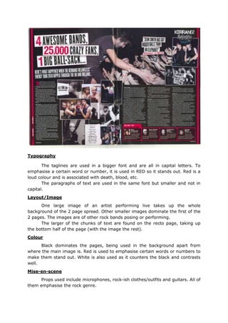
1. Typography
The taglines are used in a bigger font and are all in capital letters. To
emphasise a certain word or number, it is used in RED so it stands out. Red is a
loud colour and is associated with death, blood, etc.
The paragraphs of text are used in the same font but smaller and not in
capital.
Layout/Image
One large image of an artist performing live takes up the whole
background of the 2 page spread. Other smaller images dominate the first of the
2 pages. The images are of other rock bands posing or performing.
The larger of the chunks of text are found on the recto page, taking up
the bottom half of the page (with the image the rest).
Colour
Black dominates the pages, being used in the background apart from
where the main image is. Red is used to emphasise certain words or numbers to
make them stand out. White is also used as it counters the black and contrasts
well.
Mise-en-scene
Props used include microphones, rock-ish clothes/outfits and guitars. All of
them emphasise the rock genre.