↑Top Model (Kolkata) Call Girls Rajpur ⟟ 8250192130 ⟟ High Class Call Girl In...
2 page research
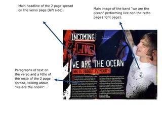
1. Main headline of the 2 page spread
on the verso page (left side). Main image of the band “we are the
ocean” performing live non the recto
page (right page).
Paragraphs of text on
the verso and a little of
the recto of the 2 page
spread, talking about
“we are the ocean”.
2. Typography
The headlines are in bigger, bolder letters so they stick out more and give the gist of what the paragraphs of text are
about; from the words “INCOMING”, “LIVE” and “WE ARE THE OCEAN” we can deduce that the text is about the band “we
are the ocean” . All text is in a similar if not the same font. The roughness and distortion of the text can be related back to
the rock genre.
Layout/Images
The main image is used as the background for the whole of the 2 page spread. Headlines are placed in the top left
corner of the verso page and the paragraphs of text bellow. A graffiti image of a microphone in red is in the top left corner of
the verso page; this represents music and the way the graffiti is done represents the rock genre.
Colours
Generally darker colours are used such as red and dark blue/black. Red can be associated to blood (and from blood
possibly heavy rock) and the darker blue sets a moodier atmosphere for the rock genre. The text in white is only used in
white so it sticks out from the darker background.
Mise-en-scene
Props used are guitars and microphones which you can instantly link to music, and in his case, distorted guitars are
generally used for heavier songs in rock. Low-key lighting is used for the main image to create a darker mood for the rock
genre.