How magazines structure their contents pages differently
1. Both pages are fairly image heavy which is effective as it attracts an audience. However this may attract a more immature target
audience for both magazines as it is less to read and more to look at. This is effective for Kerrang! as the target audience is more of a
teen/young adult audience, however it may not be as effective for NME as it is targeted to a more young adult/middle aged adult
audience. But, although both pages use more images, still text is used a fair amount. For NME, the images lead the reader to look at the Each magazine
text and to read about what is to come in the magazine. Whereas in Kerrang! the text simply just gives the article name and the page takes a very
number to direct the reader around the magazine. different approach
towards the
As both
structure of the
magazines attract
contents page. In
different target
NME, the structure
audiences, they
seems to be set
both take fairly
out in columns,
different
like a newspaper
approaches. NME
article. However
has gone for a
within the
more simplistic
columns there
and sophisticated
seems to be
design, however
boxes to split up
Kerrang! has gone
each section of
for a more bright
the page and each
and vibrant
story advertised.
design. Both
This is quite easy
magazines have a
to understand for
different way in
a reader and
displaying their
directs the reader
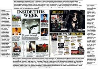
contents page.
well around the
Kerrang! simply
magazine. On the
just uses the word
other hand, in
‘contents’ in the
Kerrang! the page
primary optical
seems to be split
area whereas NME
in to two sections,
uses the words
the top half of the
‘INSIDE THIS
page which is
WEEK’ making the
simply just an
page seem more
image of a rock
like a newspaper
artist with a
article. This
couple of other
shows two
images
different ways to
overlapping, and
inform a reader of
then the bottom
what the page is.
half of the page
which is very text
When it comes to directing the reader of where he/she wants to go, both magazines use different techniques. Kerrang! simply lists their stories
heavy and informs
out with page numbers, and on some of them small 2 line insights of the story. This is clearly stated. Also, all the stories are organised into
the reader all what
sections such as ‘Feedback’, ‘News’ and ‘Win!’. This makes it easier for a reader to direct their way around the magazine. This is because if a
is to come in the
reader enjoyed reading more sections than other, they can be lead to the section they enjoy through the contents page. In NME, with each
magazine.
image there is a sub header, mostly quotes, and a short explanation of the article being advertised. This gives a reader a lot of insight of each
article and of what is to come in the magazine. If a reader in a shop picked up the magazine and was flicking through, it could help a reader
make the decision of whether to buy it or not as a very detailed insight is given.