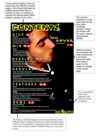
1. I have used six heading, which by
researching into different contents
pages; I have found that these are
suitable because they offer an
incentive to carry on reading, for
example the second section offers
readers a chance to win a PS3. The contents
masthead is in the
same style has the
front cover
masthead,
therefore readers
are familiar with
the colour scheme,
causing brand
identity.
Different sections
are numbered with
large numbers and
a red stroke
around the letter.
This makes it
easier for the
reader to navigate
to the correct
page.
I have included the
name of my
magazine at the
bottom for brand
recognition.
By looking at different magazines I have found that they all use
different ways to separate the front cover articles and the normal
articles. For my magazine, I changed the colour of certain articles
from white, to blue, in order to establish if they are a cover story
or not.