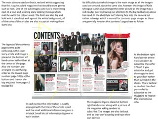
1. Its difficult to say which image is the main image as all the images
used are around about the same size, however the image of Kylie
Minogue stands out amongst the other picture as the image has a
red header over it drawing our attention to the big red banner above
her head. In the shot Kylie isn’t staring face into the camera but
rather sideways which is normal for contents page images as there
are generally no rules that contents’ pages have to follow
The main colours used are black, red and white suggesting
that this is quite a dark magazine that would feature genres
such as rock. One of the sub images used is of a man sitting
next to a skull and wearing scary looking makeup which
matches with the colours used. The fonts are also big and
bold which stand out well against the white background, all
of the titles of the articles are also in capitals making them
stand out
The layout of the contents
page seems quite
confusing as the cover
story article and image is
placed at the bottom left
hand corner rather than at
the centre of the page.
Also the numbers are
arranged in a confusing
order as the lowest page
number (page 10) is at the
bottom and then at the
top we jump from page 42
to page 65
The magazine logo is placed at bottom
right hand corner along with a picture of
the magazine asking readers to
subscribe. The images are also laid out
well as they don’t overlap and have their
own section
At the bottom right
hand corner where
it asks readers to
subscribe they offer
37% off if you
subscribe and get
the magazine sent
to your door rather
than buying it in the
shops. This is tactical
as readers then feel
persuaded to
subscribe to the
magazine to receive
this promotional
offer
In each section the information is neatly
arranged with the title of the article in red
and the small additional information given is
in black. Small bits of information is given in
each section