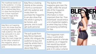
1. The masthead stands out
to the audience – it is big,
bold and in capital letters.
As it is behind Katy Perry
it is clear that the photo of
her is more important
than the image of the
magazine’s logo.
Katy Perry is looking
directly at the camera,
it forms a connection
with the audience and
invites them to
purchase the magazine.
It can also show that
the article is going to
be honest, and
genuine, and it could
get quite personal.
Katy Perry isn’t wearing
much, this shows that she
is trying to appeal to the
male audience. Her outfit
has some pink in it, and
her hair is black. This
helps the cover image link
to the colour scheme of
the magazine, which is
predominantly black and
pink.
The pull quote from
Katy Perry’s featured
article, this intrigues the
audience to buy and
read the article that is
inside the magazine
about Katy Perry.
The skyline of the
magazine goes over the
model, unlike the actual
title of the magazine.
Showing that this
information is more
important than her. ‘Free
Downloads’ would entice
a lot of potential readers,
as when they buy it they
are receiving something
for free.
The magazines main
colour is pink which
would appeal to a female
audience, as a magazine
men would buy would
stereotypically not have
pink in it’s colour scheme.