
Recommended
More Related Content
What's hot
What's hot (19)
Similar to Attack the block
Similar to Attack the block (20)
More from haverstockmedia
More from haverstockmedia (20)
Recently uploaded
Recently uploaded (20)
Attack the block
- 2. I'm going to analyse the film 'Attack the Block' which is directed by Joe Cornish. Attack the Block has two genres in it one of them being a very popular genre which is urban comedy and the other one being sci-fi. The company that made this film was Studio Canal (presents) (as Studio Canal Features), Film4 (presents), UK Film Council (presents), Big Talk Productions (as Big Talk Pictures). 'Attack the block was released 13 may 2011. Attack the block is targeted for young teenagers and young adult around the age of 15- 30 because it has young teenagers playing the main roles in it which is appealing to the target audience because they can relate to the characters. They have also included two adults in the film to broaden the audience by them being able to relate to these two characters. Film poster is a really good way to promote something you want because it can be put in place where people would see it for example underground, buses, billboards and online. A lot of people travel on underground train every day and whilst waiting for the train they would read the posts which can make them want to go and watch it. Buses are seen every time you go out and on the side would be a poster which would advertise either a certain movie or a product, having the Attack the Block posted there would attract people age 15-30 or 35 and make them want to go and watch it which would raise money for the company.
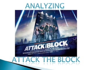
- 3. In the poster Attack the Block there are a lot on genre signifiers. When creating a poster for films it is important to make the genre signifiers of the film clear because audience select films to watch through the genre of it. In attack the block poster the asteroids falling show the sci-fi elements of the film of the film, this is appealing to the audience because its gives them something different and more interesting as its something coming out of space which would encourage them to go and watch it. Having a bunch of teenagers at the front represents the urban side of the film this shows the audience the main characters that are going to be in the film. Having teenagers on the front is appealing to the audience because it gives them an idea of how they look which would encourage teenagers to go and watch it because they would want to see someone who represents them. The clothing of the characters represent urban society due to there baggy jeans and hoodies, this constructs to the audience that the poster is mostly aimed at young teenager because this is the kind of drama teenagers are into The tagline ‘inner city vs outer space’ immediately provides the target audience with pre-conceptions of the binary opposition of what is seen and related to by the audience as the norm and the unknown and somewhat terrifying extra-terestrial environment that is ‘outer space’
- 4. Having this women in the poster makes it more appealing to the audience (mostly women) because women would think maybe they can relate to her which would encourage them to go and watch the film. The clothing she has on is appealing to the audience because it shows them that she's a normal lady, nothing big. The man in the film also widens the audience because he's a 30 year old man which would attached adults around that age because they would like to see how they’re represented.
- 5. The characters in the poster Attack the Block has been constructed to appeal to the target audience which is young teenagers. They used people like that because teenagers can relate to them, putting the teenagers all together suggest to the audience that they’re in a gang which would make it more interested and exciting to the target audience because most teenager enjoy films that have young thugs in them. The two characters on the side of the poster look older than all the ones in the middle the reason the director included these two characters was to make the audience wider, this is appealing to the audience because it makes the poster look more interesting and encourages adults to go and watch it as they would be able to relate to the characters. In the poster they have included character of different ethnicity's black, white and mixrace, having different ethnicity's helps widen the audience because the audience can be one of them ethnicity's which they would be able to relate to them, as you can see in the poster they have different ethnicity's which shows that in London areas you would find people of different ethnicity's in gangs etc.
- 6. Audience like to know where the film is set because it helps them establish the genre and also the narrative of the film. Showing the audience where the film is set could make them want to go and watch it because if its set in London people from London would like to go and see if they have ever been there. Attack the Block poster shows that it is set in London because they have the London gherkin at the back of it and whenever people see that they would know it is set in London, they have then covered it with smoke so that the audience know its not set there, but it is set somewhere else in London. They have used a low angle shots, this makes the block look more menacing, this is more appealing to the audience because they know that there’s going to be trouble and they would want to find out why the block looks so threatening. Having the main block as the background is appealing to the audience because it lets them know where its set and would encourage the target audience to go and watch it because they would like to find out what’s happening in that block. The font of the title is bold and big which is appealing to the audience because if they see this poster any where on the street and like it the title would stand out which they would be able to remember.
- 7. The reason why they included this on the poster is because ‘Shaun of the Dead’ was a really popular film which made a lot of money, using this may have audience thinking it could be similar to that and maybe even more interested which would lead to them going to watch it. Having this is also appealing to the audience because people that are not the target audience might go and watch it because they liked ‘Shaun of the dead’ so it basically widens the audience. Attack the Block has also included a facebook page for the film, this helps the audience find out more information about the film. Having a social networking site for a film is a really good idea because a lot of people use facebook. The audience for attack the block can communicate by facebook for example they can comment on status, like status and see photos.