
Recommended
More Related Content
More from Hashan Ariyawansa
More from Hashan Ariyawansa (20)
Recently uploaded
Recently uploaded (20)
Gone Film Poster Analysis
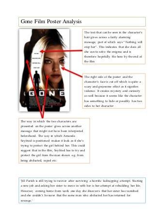
- 1. Gone Film Poster Analysis The text that can be seen in the character’s hair gives across a fairly alarming message, part of which says “Nothing will stop her”. This indicates that she does all she can to solve the enigma and is therefore hopefully the hero by the end of the film The right side of the poster and the character’s face is cut off which is quite a scary and gruesome effect as it signifies violence. It creates mystery and curiosity as well because it seems like the character has something to hide or possibly has two sides to her character The way in which the two characters are presented on the poster gives across another message that might not have been interpreted beforehand. The way in which Amanda Seyfried is positioned makes it look as if she’s trying to protect the girl behind her. This could suggest that in the film, Seyfried has to try and protect the girl from the man shown e.g. from being abducted, raped etc. ‘Jill Parish is still trying to recover after surviving a horrific kidnapping attempt. Starting a new job and asking her sister to move in with her is her attempt at rebuilding her life. However, coming home from work one day she discovers that her sister has vanished and she couldn’t be surer that the same man who abducted her has returned for revenge.’
- 2. Lighting The use of lighting in this poster is extremely effective and will strike an audience in different ways. The outline of the poster resembles a girl’s figure which indicates to the audience straight away that the film involves a girl or girls as the main character(s). Audiences of both genders would be appealed to this image as young males would inevitably be interested due to the whole idea of sex appeal and young women would find it appealing as they would feel they can relate to the character. The reason a mainly youthful audience would be enticed by the poster is because the character on the front, played by Amanda Seyfried, is a young actress especially at the time when the film was released. Another important aspect of the lighting used is low-key and high-key lighting. Low-key lighting is evident in the outline of the poster which creates a sense of looming/approaching doom for the character(s) in the film. The character’s face, Amanda Seyfried, in the middle of the poster is presented in high-key lighting which shows that she is at the centre of the all the action/events occurring and could also suggest that she is the hero in the end – she brings light and hope to the audience. In addition to this, her hair being blonde is made even brighter and a man’s silhouette can be seen here. This creates alarm and panic amongst the audience as they will start to think that she is either being followed or in danger of some sort and it involves this man. Costumes The poster doesn’t reveal to the audience any clues on the sort of costume that they might see in the film which would inform them, to an extent, of what the film is possibly about. In terms of the reasons behind this, it is likely that the creators behind the film poster intended to show minimal signs of costume in order to enhance the audiences’ focus on the characters on the poster and the way they’re portrayed. In addition to this, costume may not be that significant in the film so it wasn’t a necessary component for the film poster.
- 3. Settingand Location Again, with regards to setting and location the poster doesn’t reveal anything about it which could also mean that it isn’t a hugely significant part of the film. The film poster producers may have had a very clear intention when designing the poster – all the attention has to be towards the characters, the girl(s) and the man, and the audience are made to infer as much as possible from this. Props Similarly to costume and setting/location, the use of props aren’t evident in the film poster which again could prove to be a significant choice. The appearance of props such as knives, guns, torches etc on a film poster would be very indicative to an audience about the genre and nature of the film. However, keeping the audience in the dark through the absence of these sort of props is often more effective as they want to know more and therefore are more likely to watch the film. It enables them to go and watch the film with an open mind. It is not completely evident but the part of the girl’s face that is cut off could possibly resemble the shape of the blade of a knife. This could be a clue as to what the film entails so the audience can formulate their own ideas and thoughts about it.