College Calls
•Download as PPTX, PDF•
0 likes•112 views

The document summarizes the student's reflections on their magazine design project. It provides feedback on what aspects of their design worked well, including the cover photo, magazine name, and use of columns. It also notes what didn't work as well, such as not including many features and having an empty cover. Producing the contents page and choosing appropriate fonts were identified as challenges. Overall, the student learned about magazine layout conventions and the importance of establishing a house style.

Recommended
More Related Content
What's hot
What's hot (20)
Viewers also liked
Viewers also liked (14)
Similar to College Calls
Similar to College Calls (20)
College Calls
- 1. 23/10/2012
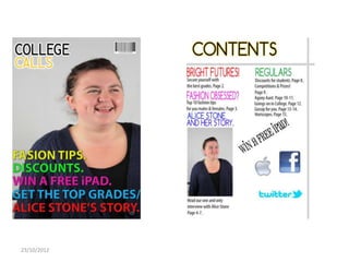
- 2. What works? FRONT COVER • The photo I have used works really well because the model is the age genre of college students and she looks as though she is a happy student, this will therefore portray the magazine in a positive way. • The name masthead of my magazine also works well; ‘College Calls’, because the alliteration used makes it more memorable and catchy, this will hopefully make my magazine easy to remember and recognise as it’s not too short, and not too long. • The glow around the magazine masthead is a good feature as it makes the name stand out more, which is the aim as it is supposed to be the most important aspect of the magazine. CONTENTS • The columns work well as they make the magazine have more of a layout to it. 23/10/2012
- 3. What doesn’t work? FRONT COVER • I haven’t put much on my front cover, this doesn’t work as it could be seen as boring, and may not attract readers. • The use of all the colours, although it looks nice, you can’t tell what the house style is. CONTENTS • I haven’t included as much features as you would see in a magazine. 23/10/2012
- 4. What was difficult? FRONT COVER • I thought that finding appropriate font style was difficult, because you need it to match the house style, however you want it to look presentable. CONTENTS • Designing the contents and making it look good without ‘white space’. 23/10/2012
- 5. What was easy? • Designing the masthead was the easiest thing to do, I think this is because I had already planned roughly what I was going to do on my flat plan so I had the idea in my head already. 23/10/2012
- 6. What have I learnt? • I’ve learnt how a magazine should be set out, for example, there shouldn’t be much white space within your magazine as it won’t be very interesting. • I’ve also learnt I need to think about my house style before I make a start on my magazine. 23/10/2012
- 7. If I had all the money and time in the world what would I do? • I’d get professional, well recognised models for my photos, I would also have an interview with someone famous so the magazine would instantly become more popular. • I would also get a designer to help me make the magazine cover and contents page. • If I had more time I would have spent more time planning before jumping into the designing. 23/10/2012
- 8. Magazines to compare too? • The ‘Really Great Magazine’ – I can compare it to this one as I liked the look of this magazine in my research so I used a few ideas with some tweaking. 23/10/2012