

Recommended
More Related Content
Viewers also liked
Editor's Notes
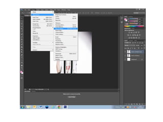
- This is how I first decided to have my masthead for my magazine, however I wanted to try out other things as it didn’t stand out to me enough.
- After trying out different designs, this is the design I decided looked best.
- I thought the font for my double page spread looked too bold to the point it was difficult to read.
- I therefore changed my font to a much more simpler one, which however still worked well.