
Recommended
More Related Content
What's hot
What's hot (20)
Similar to Fidlar Digipak and Poster Deconstruction
Similar to Fidlar Digipak and Poster Deconstruction (20)
More from guils9201as
Recently uploaded
Recently uploaded (20)
Fidlar Digipak and Poster Deconstruction
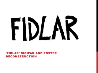
- 1. ‘FIDLAR’ DIGIPAK AND POSTER DECONSTRUCTION
- 2. DIGIPAK DECONSTRUCTION This album cover repeatedly shows the bands name over and over again in almost ‘Punk’ style print letters. Although this is an Indie Rock band, there are strong elements of Punk music in this band, and therefore this album is also quite conventional to the Punk genre to. This is not unusual for Indie Rock bands, this is because ‘Indie’ is quite a broad music genre so bands tend to overlap into different music genres. This is a very simple album cover design. This is because the Indie music genre focuses much more on the band rather then its image. Therefore there are no visual images on this album design. This album cover is completely black and white which is another recurring Indie music genre convention.
- 3. DIGIPAK DECONSTRUCTION Inside the Digipak is a wide shot of a mixing desk. This also highlights how this band focuses on the music purely rather then their image. It could also represent how they use real instruments and they are not computer generated effects. There is also a sign on the mixing desk. This fits more in the Punk convention as it follows the rebellious and anarchistic attitude of Punks.
- 4. DIGIPAK DECONSTRUCTION Inside the Digipak case there contained a small double sided poster with the song lyrics on one side and band members on the other. The song lyrics have been included because the genre is strongly orientated around the actual music. The lyrics have been written by hand or in a font which makes it look like it has been written by hand. This suggests it was not produced professionally or with a large budget. This fits into the Indie music genre conventions. The other side has the pictures of the band members. The musicians are not posing for the photo and are looking purposefully unattractive. This reveals how they do not care about their image and that it is purely about the music and live shows. This fits into both the Punk and Indie music genre conventions.
- 5. POSTER DECONSTRUCTION This poster shows a FIDLAR live gig. It uses the black and white design throughout, except for the cartoon band member in the middle which follows the black and white convention. It also has a rebellious side to it as it shows the character showing his middle finger, however this fits more with the punk conventions. Because it is advertising for a live show it also highlights how the band focuses on its music because they enjoy playing live and do it for fun, rather then for money or success. This is the same throughout the Indie genre.