Delhi Call Girls Preet Vihar 9711199171 ☎✔👌✔ Whatsapp Body to body massage wi...
poster analysis
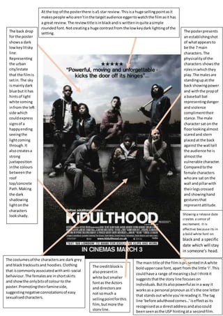
1. The posterpresents
an establishingshot
of whatappearsto
be the 7 main
characters.The
physicalityof the
characters showsthe
rolesinwhichthey
play.The malesare
standingupat the
back showingpower
and withthe propof
a baseball bat
representingdanger
and violence
complimenttheir
stance.The male
character sat on the
floorlookingalmost
scaredand stern
placedat the back
againstthe wall tell
the audience he is
almostthe
vulnerable character.
Comparedtothe
female characters
whoare sat on the
wall andpillarwith
theirlegscrossed
and showinghand
gesturesthat
representattitude.
The back drop
for the poster
showsa dark
lowkeylitsky
line.
Representing
the urban
city/estate
that the filmis
setin.The sky
ismainlydark
blue butit has
hintsof light
white coming
infrom the left
side which
couldexpress
signsof a
happyending
seeingthe
lightcoming
through.It
alsocreatesa
strong
juxtaposition
inthe colours
betweenthe
roof
top/concrete
Path.Making
the dark
shadowing
lightonthe
characters
lookshady.
The costumesof the charactersare dark grey
and blacktracksuitsand hoodies.Clothing
that iscommonlyassociatedwithanti-social
behaviour.The femalesare inshortskirts
and showthe onlybitsof colour to the
poster.Promotingtheirfamineside,
suggestingnegative connotationsof easy
sexualisedcharacters.
The main title of the filmispresentedInA white
bolduppercase font, apart from the little ‘I’.This
couldhave a range of meaningsbut I thinkit
suggeststhatthe story line focuseson
individuals.Butitsalsopowerfulasina way it
worksas a personal pronounasit’sthe one letter
that standsout while you’re reading it.The tag
line ‘before adulthoodcomes…’iseffectasits
recognisedasa directaddressandalsocould
beenseenasthe USP hintingata secondfilm.
The creditblockis
alsopresentin
white butsmaller
fontas the Actors
and directorsare
not somuch a
sellingpointforthis
film, butmore the
storyline.
Showing a release date
creates a sense of
excitement. It Is
effective because its in
a bold white font on
black and a specific
date which will stay
in someone’s head.
At the top of the posterthere isa5 star review.Thisisa huge sellingpointasit
makespeople whoaren’tinthe targetaudience eggertowatchthe filmasit has
a great review.The reviewtitleisinblackandis writteninquite asimple
roundedfont.Notcreatinga huge contrastfrom the low keydark lightingof the
setting.
2. The title Snatchis simplyatthe top inroundedblacklowercase letters.The lettersbeingroundand
almostsoftcouldconveythe comical hybridof the filmworkswell withthe juxtaposition of the bold
blackletteringona white background showingthatitstill isa powerful crime film.
The Actors namesare separatedfromthe creditblock.
Thisemphasisesthe highclassactorsthat are in the film
whichisa significantsellingpointtothe film.
The ‘ comingsoon ‘ title isthe
secondbiggestfontonthe
poster.Givingthe viewera
sense of anticipationand
excitingthatthe filmiscoming
soon.It followsthe same
conventionsof the snatchfont
keepingitsimple.
There isno backgroundfor
the snatch poster,
highlightingthe characters
as the most important
elementtothe film.The
characters are in powerful
costumeswhichreflectvery
clearlythere personality.
For example BradPittis
wearinga mix matchoutfit
conformingtothe
traditional ‘Gypsy’
stereotype. The
connotationsof darkred
and deepblue relate tohis
dangerousbutcool
character. He ispositioned
inthe centre of the
characters suggestinghe is
the most significanttothe
film.
The characters are
all layeredontop
of eacho0ther
givingthema
sense of closeness
and presentingthe
theme of gangs.
The Characters are
all lookingforward
withsternfacial
expressions and
uprightstrong
bodylanguage.
Withthe dog– ( a
white pit-bull with
blackeye patch.)
Theyhave created
am almost3G
effect,Jumpingout
at the viewerof
the postergivingit
a sense of tension/
dangeras all the
energyof the
characters is
directedinfrontof
them,to you.
The website forthe filmisina redfont.This isthe brightestcolouronthe filmpostermakingitstand
out.Encouragingfilmfansto go ontothe website tofind outmore aboutthe filmandthenspreadthe
word.The actors are all wearingdifferentclothing showingthattheyare all clear individualsmakingit
excitingforthe viewer,anythingcouldhappen. Ilike thisposterasitissimple yeteffective andwe are
planningonusingthe same theme of the charactersbeingthe mosticonicimagine inours.
3. In the shutterislandposterthere isanunusual use of bothcharacter and setting,almostlike asplitscreen.This
couldrelate tothe confusingandfull onnarrative.Itisalsoeffectiveasitshowsthe twomain USP of the film.A
famousactor LeonardoDiCaprioandthe settingof the filmtitle,‘shutterisland.’The actual titlesof these twoare
placedcentral onthe poster,inboldwhite fontcreatingastrongcontrast to the dark blackbackground.
The lightingisvery
low key,andthe
pitchblack
backgroundfades
inonto hisface.He
showsan almost
confusedand
concernedfacial
expression,which
expressesthe
psychological
nature of the film.
The prop of a
brightorange
flame froma
match ispresented
closelytohisface.
Thisis the
brightestpartof
the posterand
couldsignifyhis
tryingto findhis
way;whichrelates
to the story.
The creditblockis shown
ina grey fontagainstthe
dark blue almostsinister
sea.Thisis importantas
the nameslistedall add
credibilitytothe film.Big
productioncompany
logosare recognisedby
people andtherefore
that drawsattentionto
the poster.
The layeringof
imagesonthe
posterworkwell
togetherwith
the dominate
coloursof black
blue andred.
The stormy
weathercreates
a pathetic
fallacyfeel to
the filmand
emphasisthe
thrillergenre.
There isa
mysterious
white/blue glow
aroundthe
islanditself
drawingthe
viewerin.
The tag line iswrittenin
redwhichcould
connate dangerand
lover,andisplacedon a
deepblue background
whichsymbolisesdeep
meanings.The tagline
ispunchyand powerful.
Withthe use of the
word‘you’is
automaticallyconnects
the audience of the
posterto the poster.
Additionallyit
automaticallycreates
unansweredquestions
inthe audience’smind.
Creatingyetanother
intriguingfactortothe
poster.Whichisaided
by the mysterious
atmosphere of the
postercreatedbythe
mise enscene.
The release date isalsoshownina red
font.The use of a specificdate ismore
effectiveaspeople will rememberthe
date.
I like thisposterasI thinkitis unique andalthoughitis
dark and sinisteritisalmostaestheticallypleasingtothe
eye fora trailerof thisgenre.The juxtapositionof the
coloursand layeredimagessetsthe posterasidefromall
otherfilmposters.Iwill take influence fromthe posters
coloursand fontas I thinktheyreallydraw the viewerin.