Measures of Dispersion and Variability: Range, QD, AD and SD
Dafont test
1. I went on dafont.com to look at a wider variety of fonts. I selected the fonts which I thought
best suited the theme and genre of the song and music video.
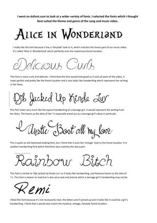
I really like this font because it has a ‘fairytale’ look to it, which matches the forest part of our music video.
It’s called ‘Alice in Wonderland’ which perfectly suits the mysterious forest location.
This font is more curly and delicate. I think that this font would look good as it suits all parts of the video, it
looks perfect and pretty like the forest location and it also looks like handwriting which represents her writing
in her diary.
This font looks very much like the typical handwriting of a teenage girl, it would represent the writing from
her diary. The hearts as the dots of the ‘i’s especially stand out as a teenage girl’s diary in particular.
This is quite an old fashioned looking font, but I think that it suits the ‘vintage’ look to the forest location. It is
another handwriting font which therefore also matches the diary part.
This font is similar to ‘Djb Jacked Up Kinda Luv’ as it looks like handwriting, and features hearts as the dots of
‘i’s. This font is clearer to read but is also very neat and precise which a teenage girl’s handwriting may not be.
I liked this font because it’s not necessarily neat, the letters aren’t joined up and it looks like it could be a girl’s
handwriting. I think that is would also match the mystical, vintage, fairytale forest location.