1. 2. How effective is the combination of your main product and ancillary texts?
I am happy with my final pieces, and feel that the final pieces are an effective combination
which create an effective median between the two. To start with my digipak and advert, I
have managed to link them both pretty well, making it clearly noticeable that they link
together and are the same artist/album, I managed to do this by using the same fonts, and
colour scheme on them. This makes it instantly recognisable and easy to link the two. I have
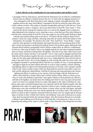
also managed to create a ‘religious’ feel across them both, In God We Trust Amen ✝ Was
used on the advert creating the religious side on it, and on the digipak I have created two
sides dedicated to his religious views, inserting a cross, a font that says Pray (also linking in
with the title), and inserting In God We Trust once again on one of the panels-linking it again
with the same phrase being used on the advert. To finish with the religious theme I have
created, I chose my songs carefully, choosing some that are clearly obviously linked in with
Christianity, for example ‘No church in the wild’ ‘New God Flow’ ‘Jesus Walks’. I again
used the same sponsors on both products and made this pretty obvious placing them in the
same corners giving them a professional looking finish to the products again making the link
between them instantly recognisable which I believe makes them an effective combination.
At first my video may be hard to link to my digipak and advert, but when compared together
there are many similarities linking them all together. The start of my final video I have used
the same colour scheme and have even used the ‘Travis’ logo (used on digipak and advert) to
help link all the products together the mise en scene used on both the digipak and within the
video are the same again making the link easy to see. And perhaps the most obvious link to
make is the artist-Travis. He is on the Digipak as well as being the main star in his video. On
my digipak I decided to use blurred effects I did this in a number of ways, I used programmes
and apps to help me use their effects and tools as well as using contrasts, colours, blurring
and lighting effects to improve the final products/pictures to be used, I also wanted a similar
effect in the video to make it look a little less than perfectly neat but I also didn’t want it to
look scruffy and poorly edited/filmed. I did this by playing and experimenting with colours,
lighting and effects I could use on my camera, and I am happy with the final piece as I
believe they both have similar effects and a similar finish to them. When we focus on my
mise en scene and clothing in particular I once again I think my final products are effective
and link well together, my instructions for clothing and what to wear was quite relaxed and
wasn’t too strict, for example for the two males that appear in the video I told them to wear
skinny jeans and a sweatshirt/jumper hats were optional, and for the female member who also
appeared in the video was again quite relaxed on what to wear, I simply asked for pre-party
/house party wear, this consisted off mini shorts, a classic white vest top with logos, and quite
heavy makeup, all the cast wore vans which matched the rest of their outfit. The location in
which we chose to film in majorly consisted within my house, this was simple and an obvious
place to decide to film, it fitted well with the ‘pre drinking’ scene and it allowed us to easily
show them having fun before the real party began. Also this location allowed us to include
walking in and walking out of the house to show that they were going out. It gave us a nice
beginning and ending to the video in which made it clear what they were doing and were they
were.