Download to read offline
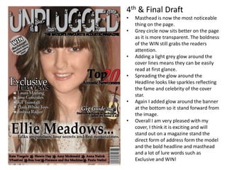
This document summarizes revisions made across 4 drafts of a magazine cover design. The key changes included making the masthead bolder and adding shadows to make it stand out more, adding glows and transparency to cover lines and headlines to increase readability, balancing design elements, and removing distracting patterns and words to better suit the target audience. The final draft was praised for having a masthead, headline, and cover lines that stood out while maintaining an exciting and celebrity-focused overall design.


