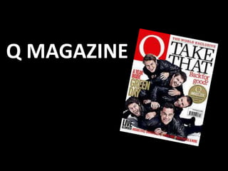
3. Representation
The double page spread
features Take That – an
English five-piece pop
group formed in 1990,
reformed in 2005. Take
That are being
represented as a
stereotypical boy-band
of their time.
4. Mise-En-Scene
The anchorage image on the first
page of the double page spread is
a photo of Take That. All of the
members of the band are looking
at the camera and therefore the
reader, this has been to done to
establish a relationship with
readers. They are all wearing
similar clothing, mainly black T-
Shirts, this is very stereotypical of a boy-band/pop group.
The musicians are standing in front of a completely plain,
white background to make sure focus remains on them.
5. Typography
The quote on the left-hand page of
the double page spread is in a
different, larger font than the rest
of the text, this attracts the readers
attention to it. The quote really
stands out as it is in the same
bright red as Q’s brand logo which
is features on the second page of
the double page spread. The title of the article is ‘Take
THAT’, is in a larger font than the rest of the article so that
it stands out. ‘Take’ is in italics and ‘THAT’ is in capitalised
letters. All of the text on the Q&A page of the double
6. page spread is in a sophisticated font
and is all black, this has connotations
of being more mature, reflecting Take
That after their reformation. The
questions in the interview are in a
bold font, as well as the initials
of the member of the band
answering the question, this
text stands out amongst the
rest. A much larger font has
been used for the first letter of
each paragraph, this makes it
very clear where paragraphs
start and end.
7. Language
The artists use slang such as
‘dunno’ and curses this gives
the interview an informal
register.
When asked if he had
anything else to declare
Robbie Williams replied, ‘I’m
not gay’, this humour sets
the tone for the rest of the
article and again, gives the
interview an informal
register.