Automating Google Workspace (GWS) & more with Apps Script
Media
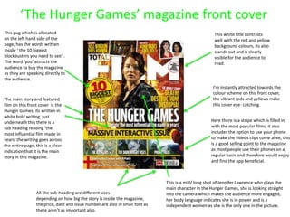
1. ‘The Hunger Games’ magazine front cover
This white title contrasts
well with the red and yellow
background colours, its also
stands out and is clearly
visible for the audience to
read.
I’m instantly attracted towards the
colour scheme on this front cover,
the vibrant reds and yellows make
this cover eye- catching.
This pug which is allocated
on the left hand side of the
page, has the words written
inside ‘ the 10 biggest
blockbusters you need to see’ .
The word ‘you’ attracts the
audience to buy the magazine
as they are speaking directly to
the audience.
The main story and featured
film on this front cover is the
Hunger Games, its written in
white bold writing, just
underneath this there is a
sub heading reading ‘the
most influential film made in
years’ the writing goes across
the entire page, this is a clear
indication that it is the main
story in this magazine.
This is a mid/ long shot of Jennifer Lawrence who plays the
main character in the Hunger Games, she is looking straight
into the camera which makes the audience more engaged,
her body language indicates she is in power and is a
independent women as she is the only one in the picture.
All the sub-heading are different sizes
depending on how big the story is inside the magazine,
the price, date and issue number are also in small font as
there aren’t as important also.
Here there is a stripe which is filled in
with the most popular films, it also
includes the option to use your phone
to make the videos clips come alive, this
is a good selling point to the magazine
as most people use their phones on a
regular basis and therefore would enjoy
and find the app beneficial.
2. The word ‘mean’ is written
slightly larger font, which
implies that the storyline
involves something to do
with something or someone
being mean.
‘Mean Girls’ film poster
Having two pictures on the front
cover draws the audiences attention.
The girl in the red is standing
significantly closer to the camera whilst
looking away from the camera lens,
whilst the other picture is of three
girls standing further back looking
directly into the camera.
From this poster we can make the
assumption that there is a divide
between the girls, and its a 3 against 1
situation.
This girl is looking in the opposite
direction to where the camera is
facing, this clearly shows that she
is a more vulnerable and innocent
character in this movie, she has little
confidence hence why she isn’t
engaging with the audience.
These three girls are standing with their
hands on the hips and looking straight into
the camera, they are giving off this attitude
trying to act like they are better and have
more power than everyone else.
The purple background also makes
this poster stand out from others, and
allows us to realise that the film is
aimed a lot more towards teenage
girls as stereotypically the colour pink
and purple are associated with females.
The title in allocated here at the top of the page,
where its clear and easy to read, its significantly
bigger than all the rest of the writing on the page as
it’s the most important thing.
Here they’ve included peoples opinions on what they thought
the film was like. They’ve have purposely used someone’s feedback
which have included the words like ‘awesome’ and ‘wicked’ in as
this will persuade more people to go and watch the film.