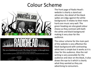
1. Colour Scheme The front page of Radio Head’s website is clearly a stand out attraction, the detail of the black spikes are edgy against the white background. It relates to their more hard core music very well. The green heading are also good colour choice as they contrast with both the white and black background making it very clear for the audience. The colour scheme for the main part of the website is very effective the black background with contrasting white text is simple but it works as it is clear for the audience. Also the red writing is very accessible for the audience and clear on the black, it also draws the eye to it which is clearly what they wanted as they are advertising to consumers.
2. Layout The layout of the website is very organised and clear, the writing here is listed in columns which makes it very easy for the audience to read. It clearly helps the readers to follow each line flowingly from left to right and down the columns, therefore they are more likely to read each bit of information provided on the website. Also Several common key pages branch off from the main site on the band websites. Examples of this include, Interviews, Forums, Gig Dates, Merchandise and Gallery. The idea of this is to give fans any additional information they want about the band, which of course crafts and image of the band to the consumer. Information, gig dates, and forums not only give the audience an entertainment factor but make each band appear more credible. These additional pages usually found of the main homepage, are either located at the top of the site on a navigation bar, or down the side vertically for easy to use access by users.
3. Typography The typography used on the website is extremely clear, the name of the band is made the center title for attention which is what you would expect as you are selling the band and advertising them. There is a large and bold font in white against and dark background which is very appealing. It is also in a simple text which isn't cursive or artistic therefore easy for everyone to read. For the main body of the text, a simple times new roman font is used which is not too cursive or creative however it is easy and accessible for the audience to read as the slight tails help connect each letter to another and therefore is made easier to flow whilst reading.