
Recommended
More Related Content
What's hot
What's hot (20)
Viewers also liked
Viewers also liked (18)
Similar to Media Evaluation
Similar to Media Evaluation (20)
Recently uploaded
Recently uploaded (20)
Media Evaluation
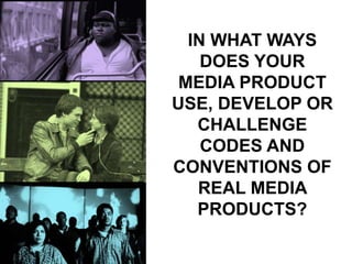
- 1. IN WHAT WAYS DOES YOUR MEDIA PRODUCT USE, DEVELOP OR CHALLENGE CODES AND CONVENTIONS OF REAL MEDIA PRODUCTS?
- 2. Our trailer is from the teen crime drama genre, and in order to make it as conventional as possible we looked at a series of real and successful media products to mimic their features and characteristics to create a successful set of film promotional products of our own.
- 3. We noticed a lot of teen drama trailers began with an emotional and thought provoking monologue as a voiceover (like Precious, and Freedom Writers and The Perks of Being a Wallflower), which introduced the protagonist and their situation. We used this convention in our own work. We also featured the Lionsgate logo and the MPAA screen in our own work because we saw that a majority of teen dramas were produced by Lionsgate so by using their logo, our trailer would be easily recognisable as a teen drama and also be classed with the other successful movies produced by Lionsgate.
- 4. All the teen gang dramas we used as examples, mainly featured actors who were black as that was the race that was stereotypically associated with gangs. Using this convention, we casted an actor who resembled the actors in other teen gang films; tall, black and well built. However the antagonist in teen gang movies like ours in traditionally also black. We challenged this convention by casting a white actor- equally as tall and menacing looking, but of a different race. We thought by doing this, it would give our film a small twist without making it unrecognisable as a gang drama.
- 5. The music traditionally featured in a teen gang trailer is rap music- more specifically, American rap music. While we wanted to be conventional, we thought it was more important that we follow the convention of a British film trailer. So we challenged the convention of using rap music and used grime music instead, which is more suited to British gangs.
- 6. On our poster, we decided to use red and white text to contrast with the dark background. These colours would conventionally suggest that our film is one from the horror genre which could be misleading as our film is a teen gang drama. Teen dramas normally feature blues, whites and greys or bright colours mixed with black (depending on the subject of the film) but we thought neither colour scheme was appropriate for the dark and violent nature of our film so we challenged this convention and used red, white and black instead.
- 7. For the poster image, we used the Kidulthood poster for inspiration. We liked the grey tones and the use of a cloudy sky to create a depressing and gloomy vibe for the audience so we did the same (but on the magazine cover instead). On the Kidulthood poster, there are seven characters being featured. While we liked the idea of having more than just the protagonist on our poster, we thought any more than three characters would make it look like a music band poster and not conventional of a film poster at all. So we looked at other posters and conformed to the convention of having just 2 characters on the poster- the antagonist and the protagonist.