Call Girls Miyapur 7001305949 all area service COD available Any Time
Magazine analysis totp 1
1. Colour: Bright pinks yellows & blue’s are
used as they are eye-catching, they standout
and the create a happy and girly atmosphere
which connects with the target audience. They
are inviting colours which make the reader
want to see inside.
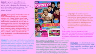
Design: The image is of One Direction which the
target audience (teenage girls) are completely
obsessed with. The puff is linked to the image
using the buzz word ‘WIN’, this will make the
reader want to win the t-shirts because they are
associated with One Direction. Also capital letters
are used for cover lines to convey that that is the
most important information on the cover. The
word ‘unleashed’ creates excitement making the
readers want to find out more. They use informal
lexis e.g. “phew” – this is associated with the
target audience and creates a humorous friendly
inviting atmosphere.
Images: The main image is of One Direction, these boys
attract the reader because they are seen as attractive and
girls desperately want to meet them. This also links to the
main story, you are getting to know them so the readers
feel on a more personal level. There is also images of the
poster which are included inside, therefore if the reader
wants that poster they will buy the magazine.
The use of words: The ‘1D UNLEASHED’
suggests the interest of the readers because they
want to know more about them. This is big enough
to read from a distance so it is the first thing you
notice therefore being the most important focus.
Language: The word ‘outrageous’
associated with Union J has connotations
that something bad has happened and there
is gossip, the readers will want to read the
magazine to find out what the boy band has
done. I cannot see any language features,
therefore to improve I would add an
onomatopoeia word to grab the attention
even more.
Impression: The cover gives a really good
impression of what’s inside because there’s stories with
1D etc. It is designed to appeal to the readers interests
by using boy bands which girls appear to be obsessed
with.
Pose, style, hair, makeup: The poses of the models
are all happy and cheeky which creates a fun and happy
mood. They are very fashionable, it is what the target
audience would want boys their age to wear so therefore
is appealing. In addition all of the hair is different, this
could create an opinion where the reader chooses which
one they prefer which again creates a more personal
level. Their skin is clear which highlights their ‘perfection’.
Institution: Immediate Media Company
publish this magazine, they publish all BBC
related magazines. This magazine would be
distributed in most newsagents and big
supermarkets.
2. I do not think they have made it very
clear that it is the contents page because
the word ‘contents’ is in plain black and
white contrasting to all the other colours
going on around.
They have added a picture of the
front cover to analyse, this is a great
skill because then if you only want
to find one thing on the front cover
then it gives you a direct page
number to go to, therefore it makes
it quick, simple and easy which is
incredibly useful for the target
audience.
The images appeal to the
reader, the magazine has
images of what the reader
might buy when they are out
shopping, this conveys that
they are representing the
reader.
There is an editor’s note which
addressed the readers, it is very
informal by using the language
‘hey’ and ‘love’ – also we know
that the target audience is girls
as it has now been said. This is
accompanied by an image to
create a more personal level. In
addition, the language used is
very personal with the word
‘your’ – it makes the reader feel
special as it is ‘theirs’.
A puff has been included in the
contents page, about loving boys.
This challenges conventions as these
are normally only found on the front
cover. However I think this is
effective because it fits in with the
style and design on the magazine.
The overall impression of this contents page is very fun and quirky, it would not appeal to
boys because stereotypically they do not love all the gossip and boy information. In
addition older people would not be interested either because it is all very new and
upcoming modern information about teenagers themselves.
3. They have used a landscape
picture rather than all
portrait here, this is to
make the magazine more
interesting so not
everything is the same. The
gutter separating the image
is all equal and quite large, I
think this is good because it
spaces everything out and
makes it seem bigger and
bolder therefore more eyecatching. They have
obviously used a flat plan to
work of the dimensions.
The spot colour theme for
this double page spread is
red, this is a bright friendly
colours which attracts
attention.
It is mainly dominated
by pictures, this is
because the target
audience doesn’t want
to read loads and load of
writing, they would
rather have illustrations
to look at with quirky
captions.
Funny captions are used to add humour and
create a light hearted atmosphere. This
double page spread is mainly about mocking
celebrities, this is very humorous and the
reader feels on a personal level with them. It
isn’t a serious topic which portrays that this
isn’t a serious corporate magazine.
The overall impression of this double page
spread is that it is designed for people who
are celebrity mad and like to keep up to
date with that world, but not only the good
news, the funny news too. This draws in
readers because the artists and celebrities
are representing them.
‘AWKWARD’ grabs the
attention of the reader, they
are interested to find out
what is so awkward? It makes
them read on and become
engaged in the magazine.
4. Colour: The red background connotes to
blood which is associated with ‘emos’ which
is the target audience. The yellow connotes
to dangerous which is possibly how they like
to be perceived. The cover gives off a dark
mysterious mood which reflects the target
audience. The masthead is yellow which is
harsh on the eyes but grabs your attention
and stands out.
Design: ‘Bite’ is symbolised by the two
Rottweiler's with their mouths open, these
have connotations of danger which interests
the reader. The capital letters grab the
attention of the reader, it highlights the
importance and interests the reader.
Images: The Of mice and men band member
has tattoos, this could represents what the
reader would like to aspire to be like.
Image: Again the Rottweiler’s symbolise risk
and danger which is how emos like to be
perceived. The main image is a long shot,
this is challenging conventions because it is
normally a medium close up, however it
works as he is a slim, well groomed man.
Pose, style, hair and makeup: The pose of the
model is camp and he is protected by dogs
which are seen as scary. One image is of a
man screaming, this could be foreshadowing
that the information inside the magazine is
about screamo.
Words: ‘PANIC’ makes you want to know
what the problem is so the reader will turn
the page and read the magazine to find
out therefore this is a very effective
technique. ‘BITE’ connotes to snap, feisty,
dangerous, this could be the image the
target audience is trying to portray. The
cover lines are very big, they would
definitely be able to be read from a
distance, you are then drawn into the
smaller text. The colour’s of red and yellow
makes the magazine stand on a shelf.
Language techniques: This magazine
contains alliteration: “fights, fury and
future” this creates a fun and quirky feel.
‘PANIC’ grabs attention, it seems like there
is something cool and catching to read
inside.
Overall Impression: There is a good
indication of what is inside because the
cover lines are specific. All apart form
‘panic’ which makes you think there is
something exciting but it is just about a
band. It is designed for punk rock people,
the bands represent the readers interests.
Stereotypically young girls and the elderly
would not be interested because it is not
their genre and nothing interests them.
Institution: Bauer media group publishes
this in London, they also publish Q.
5. Colour: The main colour theme of yellow and
red is carried through to the contents page,
the titles are yellow and page numbers red, I
think this is a good consistency and creates a
theme and house style. The background is
white which could be perceived as boring
however I think this works well because if it
was a bright colour there would be too much
going on, however if it was a pastel colour it
wouldn’t fit in with the overall impression of
the magazine.
Images: The theme of danger is continued
through the picture of the Rottweiler,
however there are glasses added on to add
humour to it. All images are landscape or
square, this is because it fits with the house
style and fits to the flat plans dimensions.
Pose, style, hair, make-up: The middle image
conveys a singer (Kellin) performing, this is
used to attract the readers because that is
the sort of concert/gig they would go to. The
main image at the top of the page has direct
eye contact, this brings it down to a personal
level to the reader. It gives the impression
that they too want you to read the magazine.
Words: I think if you know the magazine and
regularly subscribe then you would know
where the contents page is, also the use of
the white writing on the black background
contrasts and stands out. However I think it
is on the wrong side of the page, it is not the
first thing you look at.
Language: On the image of Kellin it has a
caption “Kellin’s nipple was a little cold” –
this is mocking him but not in a nasty way
because he is a favourite artist. However it
would appeal to the humour of the readers.
This is colloquial language which represents
the target audience.
Overall impression: The overall impression
gives a good indication to what is inside
because it includes the bands which have
stories, articles, interviews and pictures
inside. It appeals to the same target
audience as the front cover. I would make the
gradients a little smaller so it is not so spaced
out to make it look a little more brought
together. On the other hand I think the
consistency of the colours, images and house
style add to the overall feel.
6. Design: The words ‘hearts’ and ‘souls’ really stand out,
they have connotations of desire, love and happiness.
This could be the feeling which the band are trying to
spread to the reader. These words fit with the images
because they look passionate. The fact that the words
heart and soul stand out so much shows that that is what
it is all really about.
Images & pose, style, hair, make-up: the band members
are all pulling weird faces, this is to symbolise their
individuality. In addition the image represents the ideal
that the target reader would like to aspire too, especially
young males who want tattoos, they could be inspired by
this photo. The men are seen as attractive to the female
audience so dressing them in tight clothing (far left)
appeals to them.
Colour: Again the colour is consistent, the reds and yellows and been
transferred through to create this feel of a house style. Also the colours are
effective on the page because the picture is all dull colours so you are instantly
drawn to the bright colours which makes you read the headline.
Language: Again the headline is the only thing which
grabs the attention of the reader due to the colours and
the boldness. In addition there is a puff which I think is
situated in the correct place because it is related to the
image and text.
Overall impression: The font is the biggest attention
seeking item on this page, the font type compliments the
type of band that they are as well.
7. This magazine has been published since march 1952, it was Britain's
best selling music magazine during the seventies and it is still very
popular. It mainly features on indie/rock bangs, for example Arctic
Monkeys, the target audience is young adults and teens.
The main image is relevant to the main cover line, he is dressed quite
smartly which could represent that he is trying to look cool and trendy
as it is his comeback and he wants to make a good impression.
The colours are mainly simple and corporate except the origami birds,
they are yellow and blue which draws attention to him, they could
symbolise his success. The colours of the birds also link to the colour of
the text which creates a good house style.
The design is bold and clear so it can be easily understood, the
important information is underlined. I think to improve the front cover
they should have used bigger font for the cover stories to attract more
attention.
8. The Contents page is not very good, it
is very cluttered because you don’t
know what is going on or where to
look. It does not appeal to young
people because there is too much
writing. The colour theme of red is
carried through to create a house style
for this magazine.
I do not think it is easy to tell that this
is a contents page because there isn’t
actually a headline saying ‘contents’
just ‘INSIDE NME’ which I do not think
is effective.
I liked how the page numbers are bold
so It is easy to navigate around the
magazine. However in the top right
there are even bigger numbers which
you are immediately drawn to because
their white font stands out on the red
background. I think this could become
confusing because at first glance you
would think they are page numbers,
but they are not.
The front covers main image is a
medium close up of David
Bowie therefore you would
think that he would have a large
image on the contents but he
just has a small image. This is
bad because obviously the main
cover line isn’t that important
which goes against traditional
conventions.
In the middle of the contents
the caption is very catching as it
is using the literary device of a
rhetorical question, this is a
question that does not acquire
an answer.
You can tell that the designer
has used a flat plan to work out
a grid for this contents page. A
grid is a shape for the design of
the pages in a magazine which
creates the width of columns
and margins.
9. The image is very large and
addresses the audience, it enhances
the reader and makes them want to
buy the magazine because the
celebrity is looking straight at the
audience which encourages them.
The celebrity (Jake Bugg)’s name is in
bold which makes them stand out
more as celebrities. There is also a
stand first, this is an introduction to
the celebrity. Some readers may not
know who he is so by introducing
him they know that they are going to
read about. Most images in double
page spreads are on the left,
however this one goes against codes
and conventions and it based mainly
to the right. The picture relates to
the article and the artist and is
pleasing. This double page spread
also includes by-lines, which is put
on the right of this image in yellow to
give credit to the photographer and
writer.
The headline is short, this is to make the reader intrigued. The article is written in
informal mode to relax to the reader. It follows the same colour scheme as the rest of
the magazine, it is simple so it doesn’t overpower the magazine, the colour of Jake
Bugg’s tracksuit is the same as the colour blue of the origami on the front cover.