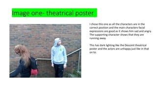
1. Image one- theatrical poster
I chose this one as all the characters are in the
correct position and the main characters facial
expressions are good as it shows him sad and angry.
The supporting character shows that they are
running away.
This has dark lighting like the Descent theatrical
poster and the actors are unhappy just like in that
on to.
2. Image one- theatrical poster
I did not choose this image as the main character
does not look sad and the supporting character
does not look like their in mid step.
3. Image one- Quade theatrical poster
I picked this one as it shows the main character scared and is
in the middle of the forest showing how he ran away and lost
his sister.
This image has the main character in the middle of it just like
in The Amityville Horror and it is in the middle of a forest just
like in Friday the 13th.
4. Image one- Quade theatrical
I will not use this image as it is to blurry and to dark so it will
be difficult to see what is on the image and the audience will
be confused and loss interest in the movie.
5. Image two- Quade theatrical poster
This location if in the forest creating a creepy atmosphere
which is common in horror for example in Friday the 13th.
In the photo it is dark and fog creating a scary atmosphere
as the audience and the characters can't see much creating
fear.
6. Image three- Quade theatrical poster
This photo is good as there are blinding's showing a city
and the sky is cloudy creating a creepy atmosphere. The
weather is the same in the theatrical posters of Friday
the 13th and The Amityville Horror.
7. Image three- Quade theatrical
I will not uses this image as the main part of
the image is bleary and does not show the
city will.
8. Teaser poster-
image one
• This is a pool of blood and I will
use it as it is vibrant enough to
stick out and it looks like blood.
The light from the bottom makes it
look more scary. A pool of blood
also feathers in the Descent.
9. Teaser poster-
image one
• I will not use this image as it looks
to dark and the redness of the
blood is to dark making it look
bland and boring.
10. Image of house
• I will use this image as the image
of the house it look dark and
intimidating and makes you
scared to enter.
12. Shadows fighting
• I will use this as the shows look angry and conflicted and like they
both do not like one another.
• In the Descent theatrical poster we
also see shadow figures on it.
13. Will use
I will use this image as It looks scary and gives a good
idea of the genre of the movie and gives I idea of what
is going to happen and with what weapon it will be
done.